

Gel Plate Printing Tip – Colour and Composition

Do you feel comfortable arranging elements on your gelatin plate to create a satisfying and balanced composition or design?
I’ve said it before, and I’ll say it again … gel plate printing, aka gelli printing, aka gelatin plate printing, is one of life’s simple pleasures. It’s spontaneous, fun and immensely satisfying. Therapeutic. And there are many different ways to approach the medium.
With this process, I firmly believe that there is no such thing as a mistake; and there is no right or wrong way to print with gelatin plates. When teaching this process, I encourage students to release the attachment to the outcome and enter a state of play. The more they explore the process and experiment with layers, printing and ghost printing, the more I see their confidence grow 🙂
During workshops I share a few tips around composition; but for the most part, I encourage play and experimentation. I believe that ‘doing’ in the process builds confidence and hones intuition.
Below I’m sharing 3 composition tips I share in my workshops, and my thoughts around colour in this process.
It was a combination of releasing the attachment to the outcome with this process and working with my luscious Golden OPEN acrylic paints that helped me overcome my fear of working with colour.
I am often asked by students “which colour should I use next”, and much to their dismay, that is the one question I won’t answer.
Colour is very subjective, and people are drawn to some colours more than others. I don’t mix my colours on the plate – I love to work with a thin translucent layer of colour on the plate and allow the colours to interacted with each other on the paper with each impression. And with that interaction can come the most surprising results. That makes answering the question”which colour should I use next” very tricky to answer.

I encourage students to step outside their comfort zone and work with colours they would not normally be drawn to. I have to admit that some of my best work has come about when I wasn’t attached to the outcome of the print and I picked a colour that felt the total opposite to what I would normally work with.
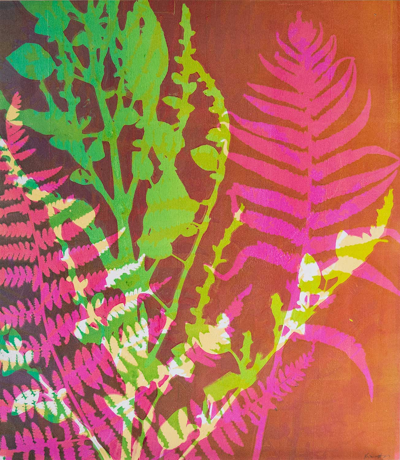
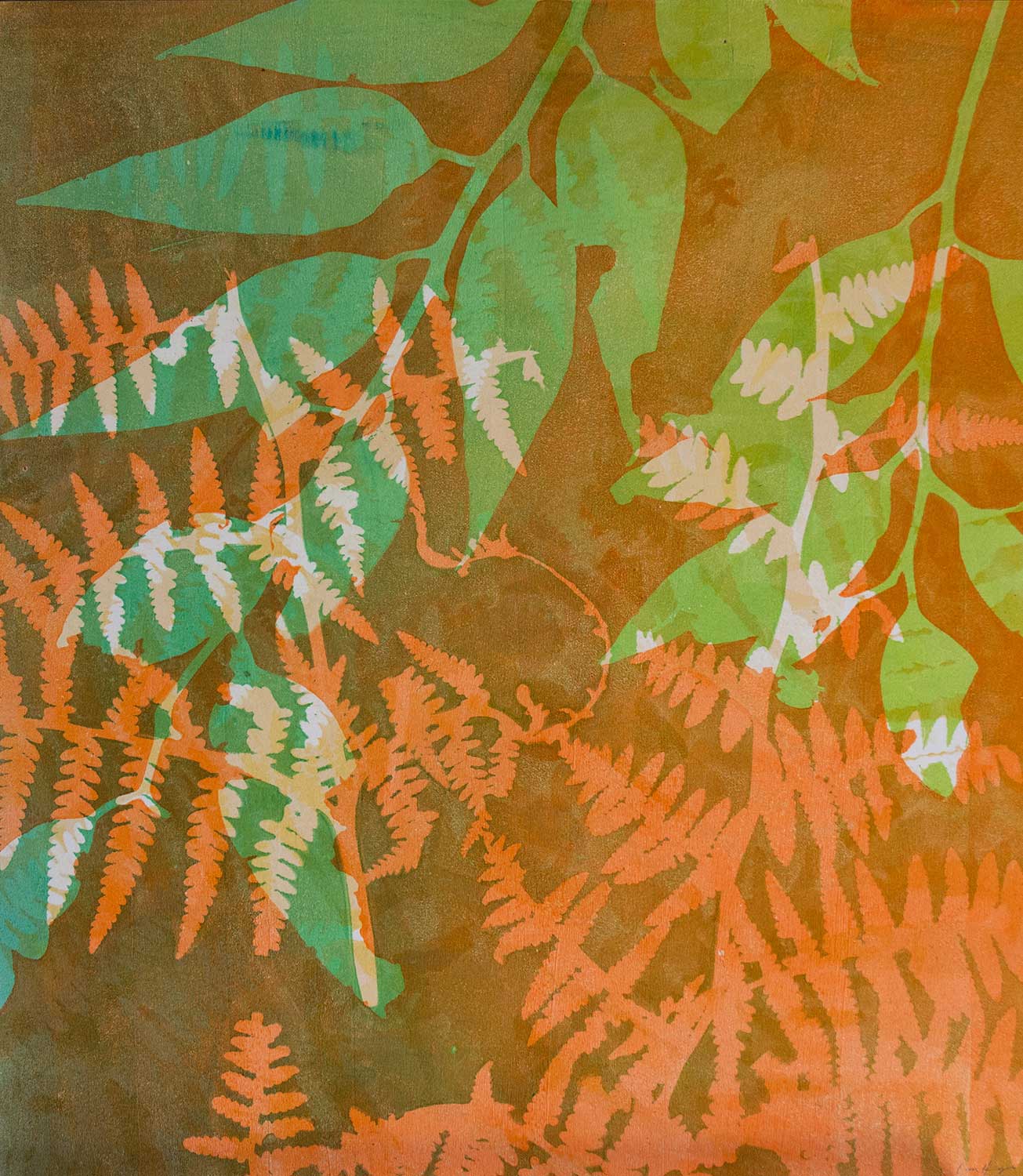
The image above is an example of where I wasn’t attached to the print in progress. I had put it aside to think while I worked on other prints. I felt that print needed something, but I didn’t know what. So I reached for a colour that I would never normally print with – orange! On green! I had nothing to lose. And to my surprise … I loved the result. I found the contrast exciting. I loved how the green eucalyptus leaves popped against the orange.
So my advice, or tip, around colour … start with what you feel naturally drawn to. Print a few layers of colour. Then challenge yourself to add colours outside your comfort zone to your base palette – I think you will surprise yourself with the results. You might find it helpful to take a note of the colours your using with each layer. I personally don’t, as it doesn’t work for me and my personal approach to the process – but some students absolutely find it helpful. Remember – there is no right or wrong way to work with this process 🙂
Composition Tip 1 – Size and Shape
I find that this is the easiest starting point when I think about how and what I want to print – the size of the different elements I’m going to print with. For me – those elements are generally different botanical materials – leaves, vines, grasses.
The overall size of the plant material I use is relative to the size of the gelatin plate I am printing with. I print across a range of plate sizes – 6”x6”, 8″x10″ and most recently (and excitedly) with my 16”x20” Gelli plate, and sometimes my homemade 9”x13” plate.
But regardless of the plate size, I’m looking for variety and contrast in the size and shape of my plant materials to create interest on the plate. I start by looking at:
- Big vs small leaves
- Round and bulbous leaves vs long and thin leaves and stems
- Smooth solid leaf shapes vs serrated, pointy and/or eaten textured leaf shapes
- Large irregular shaped leaves vs long, thin vines
- Branches full of tiny, short leaf shapes vs needle-like narrow leaves
These all work to create contrast and interest, creating an asymmetrically balanced composition.
But don’t overthink it … just pick contrasting size and shape and start to print and play. Try different combinations – big/small on the same printed layer, big on one layer, small on the other. With the action of printing and doing and creating, you’ll start to build confidence and connect with your own intuition when it comes to how you want to place your elements on the gel plate.
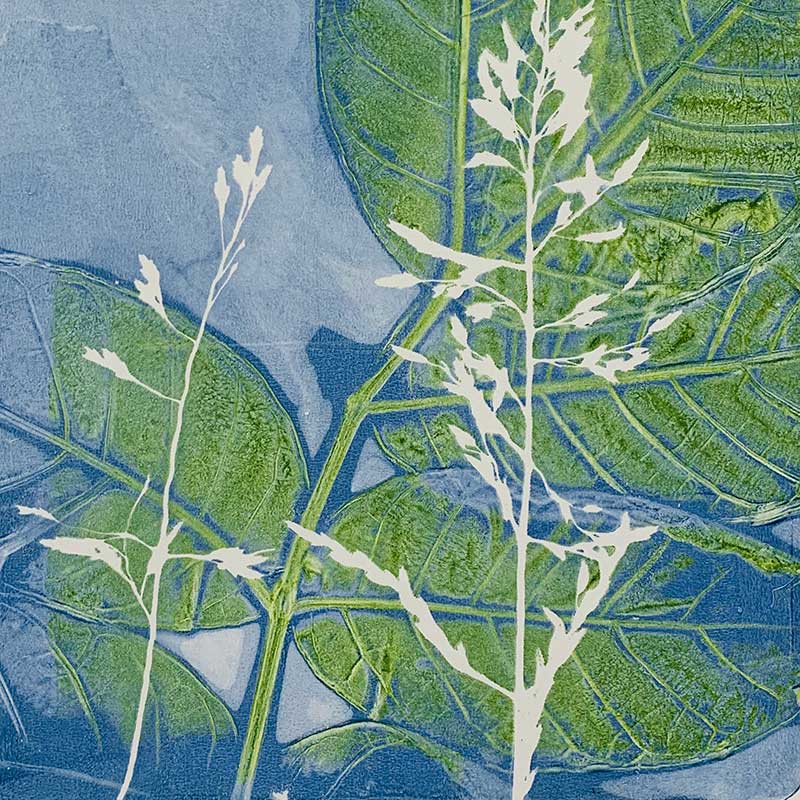
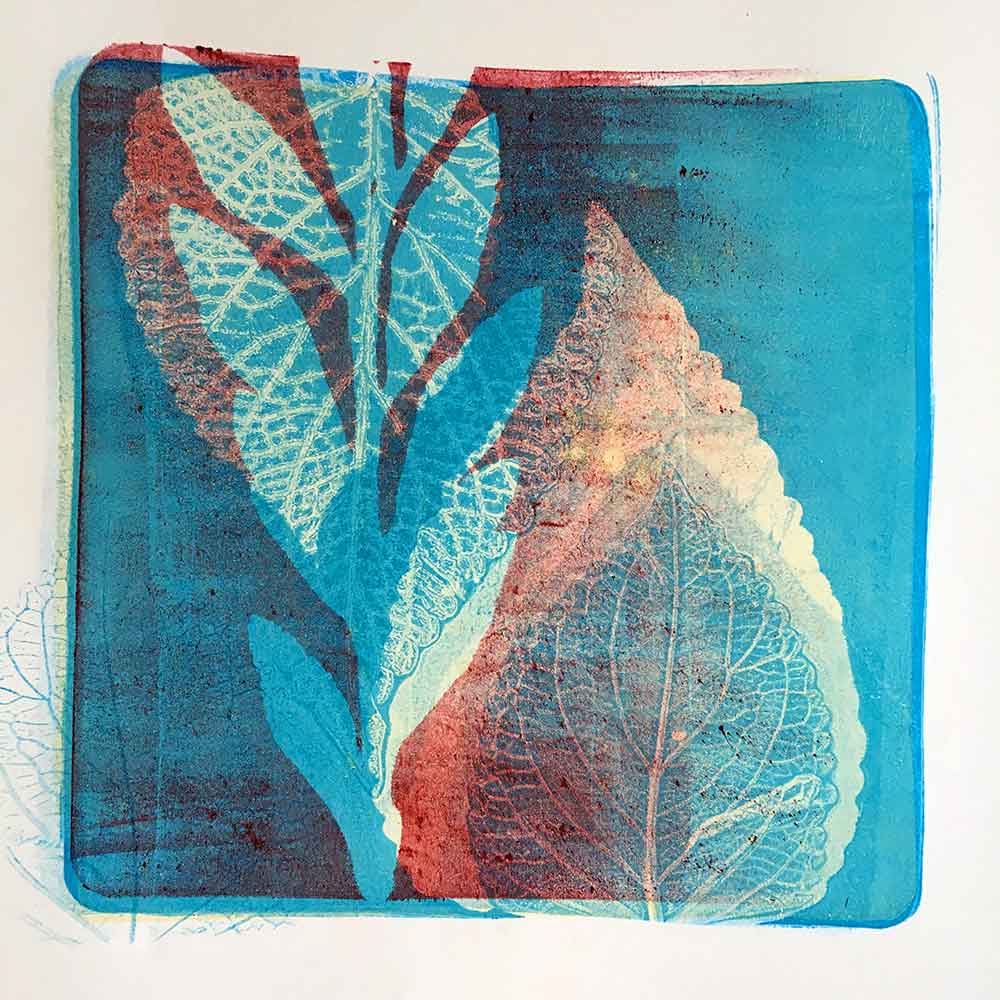
Below are two examples of prints created using my white silhouette intentional sequence. The contrast of the thin botanical elements against the larger, rounded shapes create interest. You’ll also see that the elements are placed ‘asymmetrically’ on the print. The spaces around the elements helps balance them. The contrast of shape and size in the 3rd image works to create interest. And there is a subtle repetition in the shapes that also works to appeal to our natural tendency to look for pattern in images.
Composition Tip 2 – Balance
I think that ‘balance’ is one of the most critical factors when it comes to an aesthetically pleasing composition. When a composition is ‘balanced’, it feels right … comfortable to look at.
Balance is achieved by the equal distribution of the ‘visual weight’ of elements or objects on your page – those elements being shape or marks or colour or tone. And to make that sound a little more confusing, balance can be symmetrical or asymmetrical.
I tend to work with asymmetrically balanced compositions. That means that the elements on the page vary or contrast with each other to create an overall even flow or feeling. For example, a large open space can balance a small area with tight details.
Symmetrical balance is achieved when elements are equally weighted on either side of an image. For example, an equally spaced pair, or a mirrored image.
There are other types of ‘balance’ to consider – radial, colour and tonal. Do some online searching if you’re interested in these definitions or explanations.
If you’re not sure ‘how’ to balance your objects on your gel plate – then simply place them on the plate and see how they ‘feel’ to you. Does it feel comfortable to look at the arrangement on the plate? If yes, move on! If no, fiddle and re-arrange a little more … but don’t stress about it. Remember to release the attachment to the outcome, allow yourself to enter a state of play, and see where your intuition guides you. Its meant to be fun – not hard work 🙂
Another balance tip is to work with odd numbers. Generally, placement of an odd number of items can feel better balanced that an even numbers (eg. 3 or 5 vs 4 items). Talking about pairs of items or elements is a bit different, but I generally like to work with an odd numbered collection of elements on my gel plate.
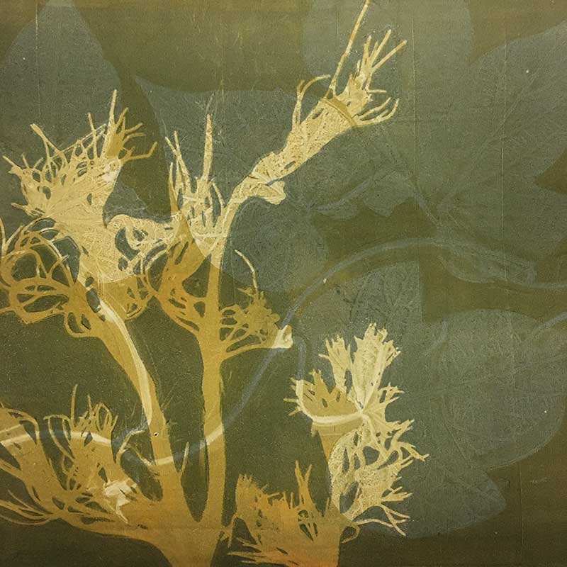
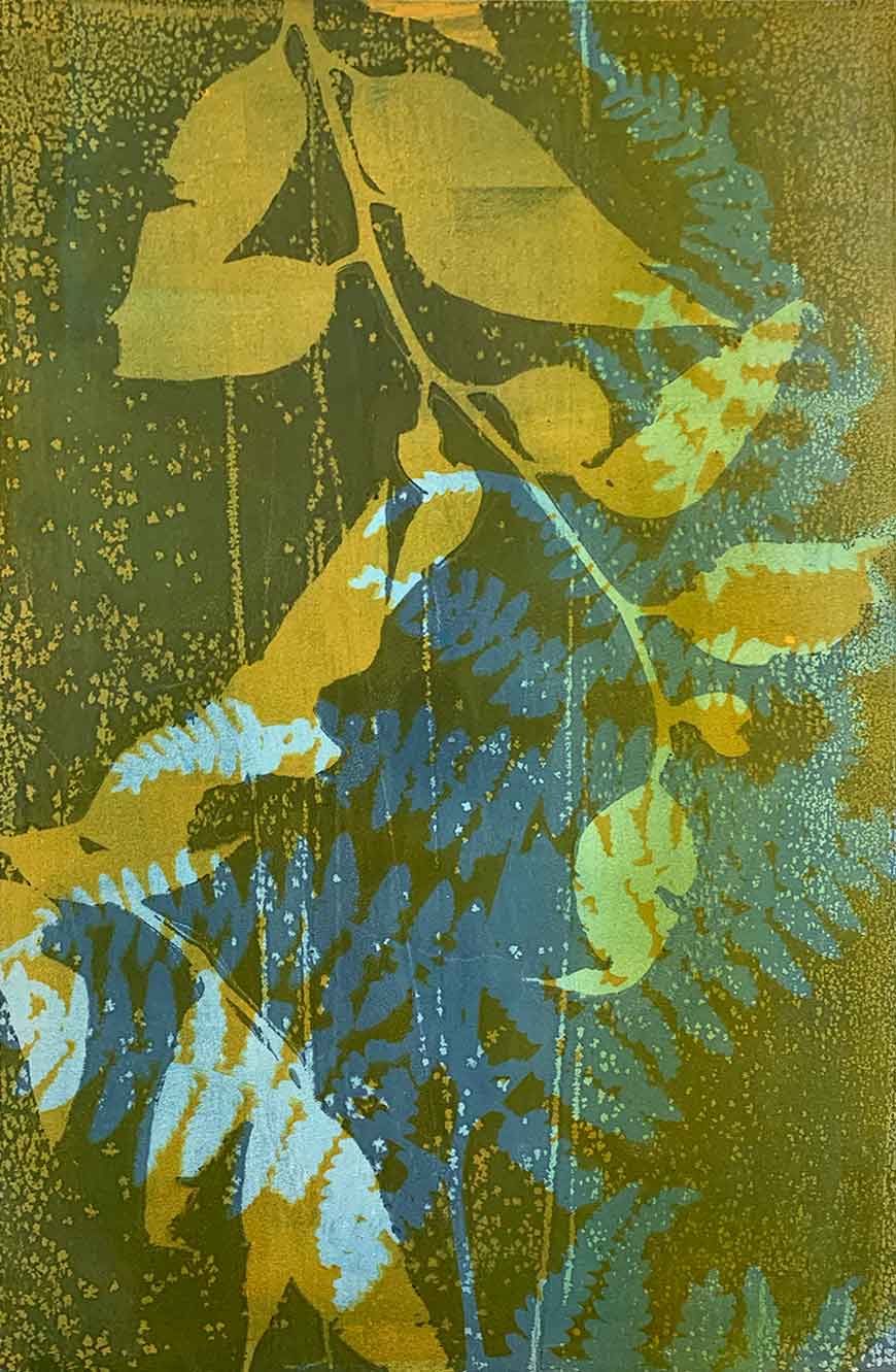
The images below are examples where I have intentionally placed botanical elements asymmetrically, or off-centre, on the plate. I have worked to create a flow for the eye to follow, also playing with colour to create harmony or drama in each print.


As kids, we’re taught (and praised) to stay within the lines. It feels that our education and social conditioning tries to keep us ‘within the lines’ well into grownuphood.
With this printmaking process, I love to break that rule and let elements run off the edge of the gelatin plate. I might keep some elements within the edges of the plate, but allowing some leaves or branches to extend off the edge can breathe a sense of space into a composition.
It can work to add interest. But be conscious of when an element just touches an edge, or sits just within or over an edge. Does it feel balanced? Does it feel comfortable or easy to look at? If not, push it out, or in, a little further to find a more (visually) comfortable placement.
This print, Wandering 3, is my current favourite example of working outside the lines.
Working with this approach, however, means that balance is an important element in the composition. You may need to create a focal point of sorts, something to lead or keep the eye on the page. That focal point can work to balance the composition.
For me, in Wandering 3, the lighter detail in the green leaves is working to keep my eye within the boundaries of the print. The printed bracken, emerging from the bottom of the print, tells the story of plants growing up from the ground; with the eucalyptus leaves telling the story of branches hanging from the trees overhead. I feel like the elements are working to keep my eye toward the centre of the image.
If you look back at the other images above you will see they all have had botanical elements extending off the gel plate when they were printed. Another way to approach this is to crop into a print after it has been printed
What do you think? I hope what I’ve written gives you some ideas to play and print with. Play around with them and see if it appeals to you as an approach to arranging your elements on your gel plate during your next printing session.
Remember – release the attachment to the outcome. There is no right or wrong way to print with gelatin plate printing. And … there is no such thing as a mistake 🙂 #nosuchthingasamistake
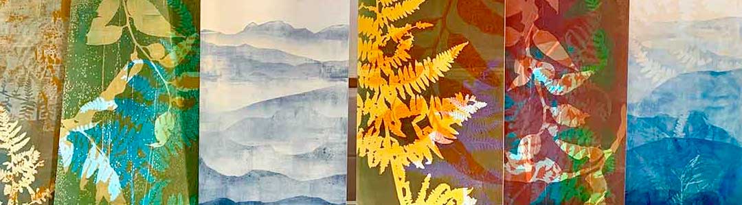
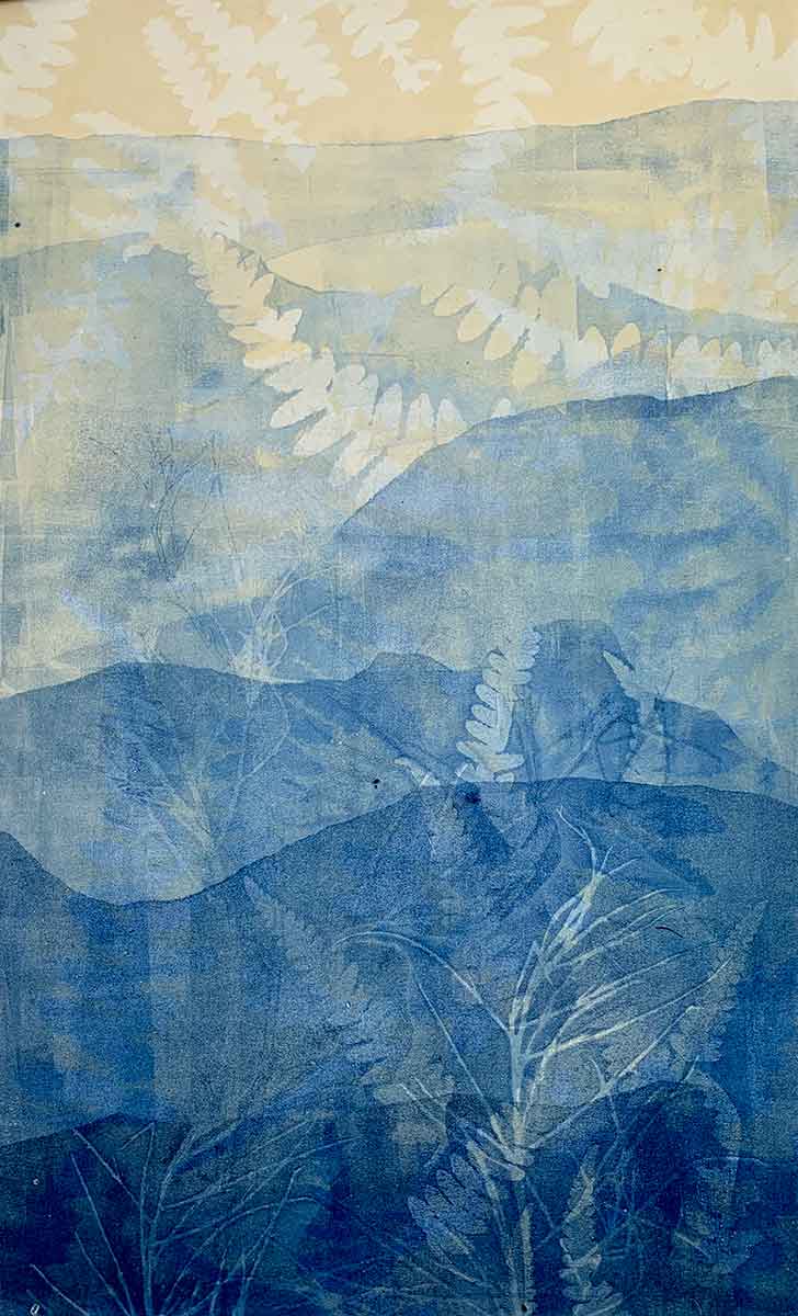
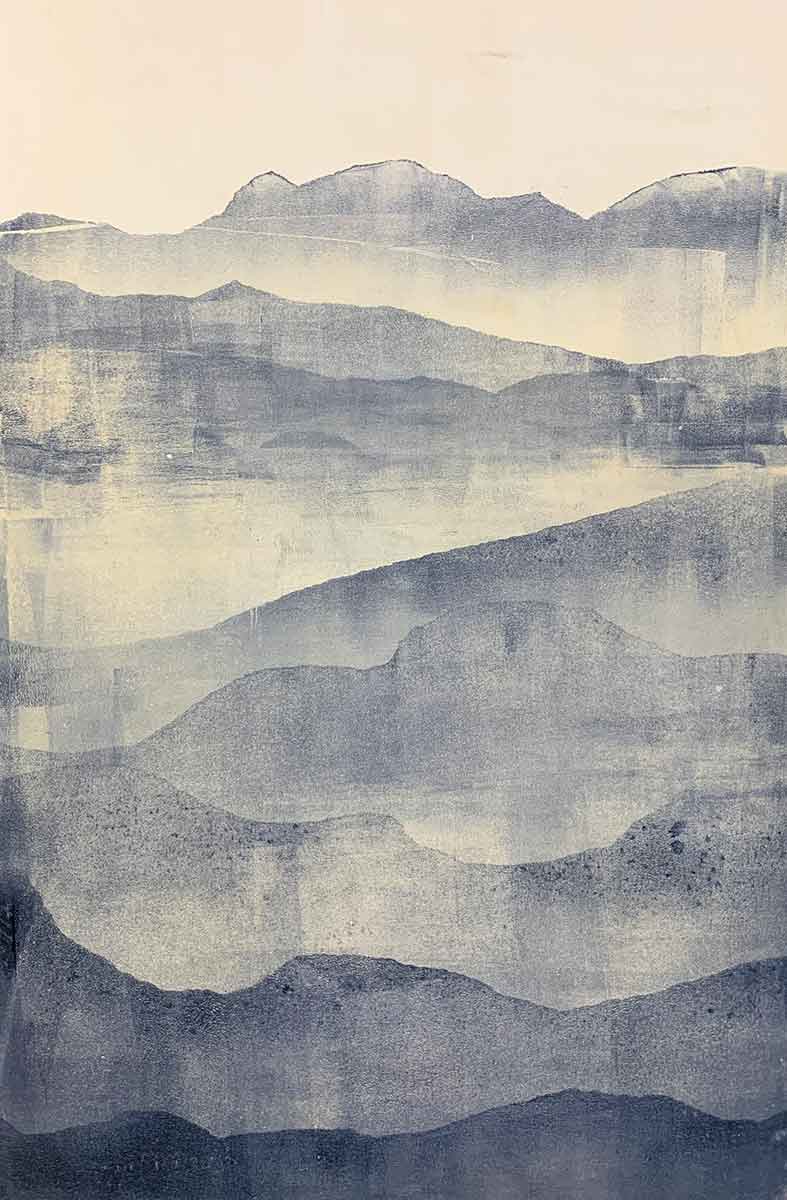
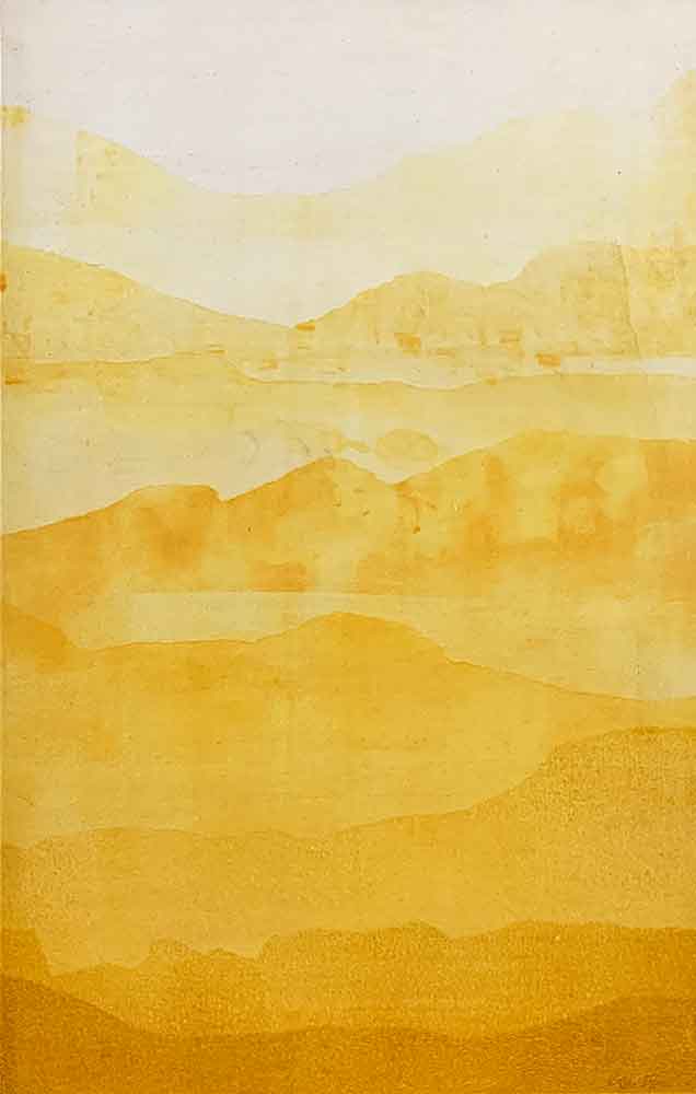
Another Gel Plate Printing Tip – mountain ranges
This is one of my favourite sequences to print with my gelatin plates. 2 (sometimes 3) paint colours, some torn paper and a brayer. Viola! I love sharing this process in my workshops … and then I love to see students make it their own with their own colour combinations and modify the sequence. Have a go yourself and follow the step-by-step instructions here.


Want more?
Printing with gelatin plates, home made or commercially bought, is fun and easy. There are many different approaches you can take, using different paints and inks. If you’re interested in learning my approach, I offer in-person workshops and have recently launched my online workshop.
In my workshops, both in-person and online, I demonstrate and share how I create my layered prints using botanical materials. And how I make my DIY gelatin plates. I’d love to share this all with you.


I just got my first gelli plate and have only gotten as far as tutorials. Yours are, by far, the best. Thank you so much for sharing your artist secrets. You do beautiful work and make it fun!
Hi Joanie, yay! I’m thrilled you found this helpful. Gel printing is fun! No ‘right way’ or ‘wrong way’, just glorious colourful printing fun! cheers, Kim 🙂
Many thanks for this article. I am hoping that making gelli prints will be my salvation, and get me started producing artwork again. Thanks for the inspiration; now I just need to start using my perspiration! 🙂
Hi Sherryl, you are so very welcome !! Gelli printing is my salvation … when I’m stuck or stressed or feeling creative or now! Release the attachment to the outcome and just play. There is no ‘right way’ or ‘wrong way’. No such thing as a mistake. Print and play with colour. Kim xxx
Thankyou for being so inspirational x
you are so very welcome 🙂 thank you so much for reading, Kim 😊🙏💙
As usual a great article Kim! You always inspire me – I want to go out in the ‘Van’ and play now!!!
Thank you 🙂 Get out in that van and print!! We all need to print more. it is too good for the soul not too 🙂 x