

The long way home – a new Reduction Linocut

Who else likes to take the long way home? Slowly meandering along back-roads, delaying the start of a working week or extending the delights of a lazy Sunday afternoon drive.
I have long-held memories of long weekend drives with my parents and brother. I was young, younger than 10. I’m not sure if I enjoyed the drives or not back then. The memories are fond, but time can skew reality. And I was under 10! It was something we did as a family.
I can remember on one of those drives I figured out that when it rained, it rained in one spot, and not all over the world all at once. Its funny the things we remember. I can remember silence in the car, as well as my parents chattering in the front about who-knows-what. And there was of course the odd fight for personal space in the back seat with my brother.
Now, I really do love my aimless wanderings. Driving with the radio on. Radio off. Windows down. Fresh scenery. Stolen moments before returning to whatever realities are waiting for me. I don’t take the long way home as often as I’d like to. I think maybe I need to do something about that.
My Inspiration
In case you’ve missed me saying it already, I love where I live. I live in a corner of Australia where people come to escape their daily lives in search of space and fresh air. Where I live is not my weekend getaway or a place I need to escape to reconnect to a freer self. Rather, the hinterland forests and farms are my own backyard. Every inch of its spaces, green rolling hills, dairy pastures and expansive views are mine to enjoy every single day.
In addition to looking out, beyond and down … I’ve learned to look up. And with that I have a growing fascination with cloud formations. Their drama. Their size. The shapes and formations. Their colours and play with light. Living in a hinterland area means I can enjoy bold displays of gorgeous cloud formations almost on a daily basis.
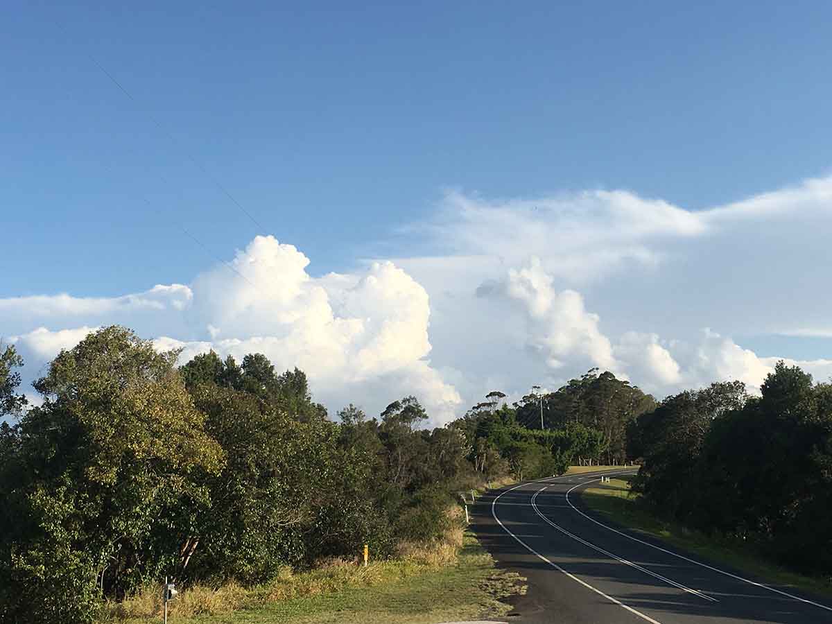
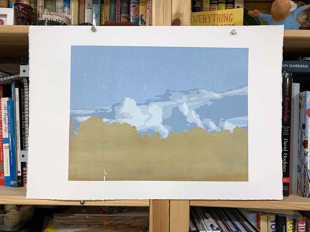
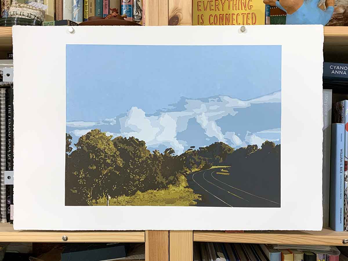
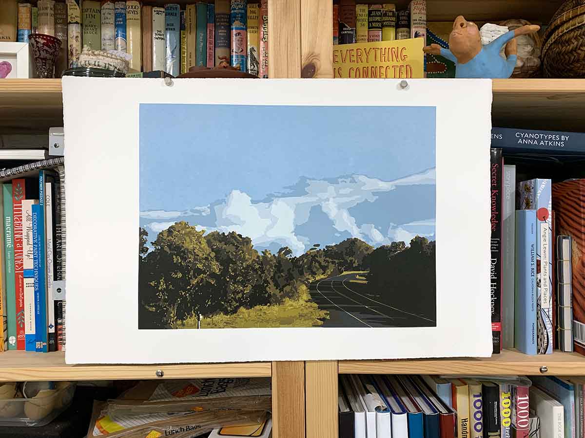
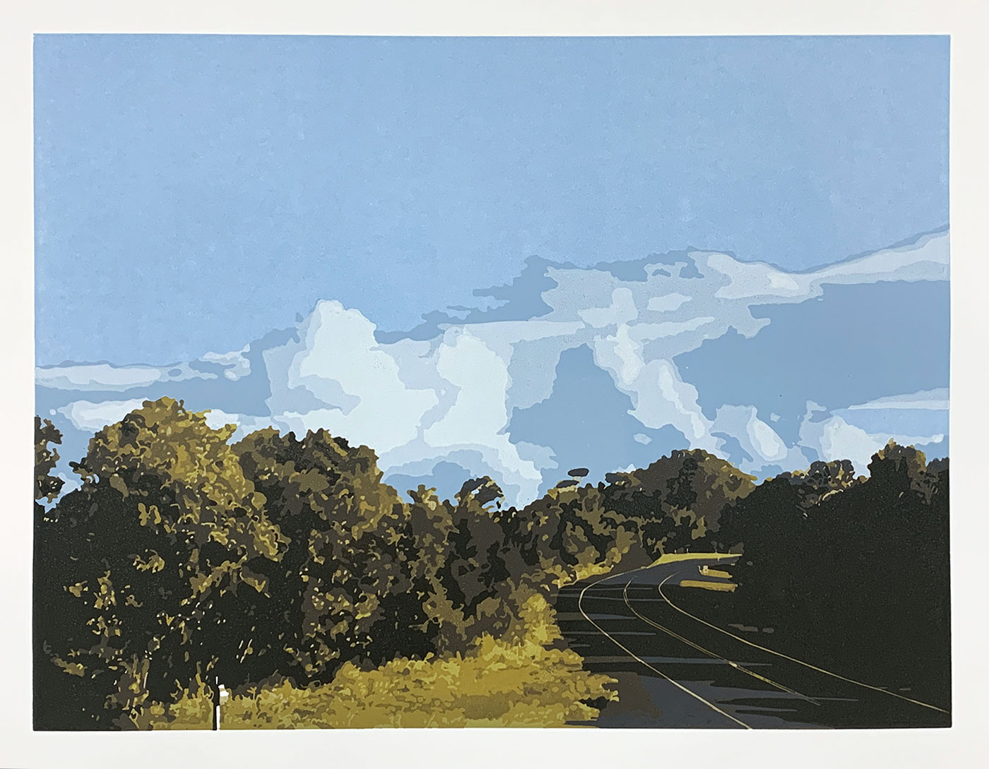
On one drive early-2020, heading home from somewhere late one afternoon, I was struck by this dramatic formation building off the ridgeline. Our ridge is high. The road we were driving felt about as we were level with the clouds. If it weren’t for the drop of the ridge, I could almost touch them.
As is my way, I had to capture this moment in a photograph, knowing it would find its way into a reduction linocut not too far into the future.

The Process and Layers
I decided to tackle this print a little different to my normal approach. Generally, I print my colours light-to-dark, meaning I start with the lightest colours and carve and print my layers to the darkest colour.
However, with this print I wanted as ‘pure’ a sky as possible, and figured the best way to do that was to print the sky first, printing each cloud layer on top, building up to the cloud’s highlights.
That meant I needed to work (sky) mid-tones to highlights, then back to (foliage) mid-tones, layering and printing up to the shadows.
This was the first print I approached this way. I admit I was nervous.
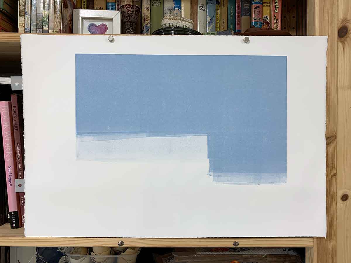
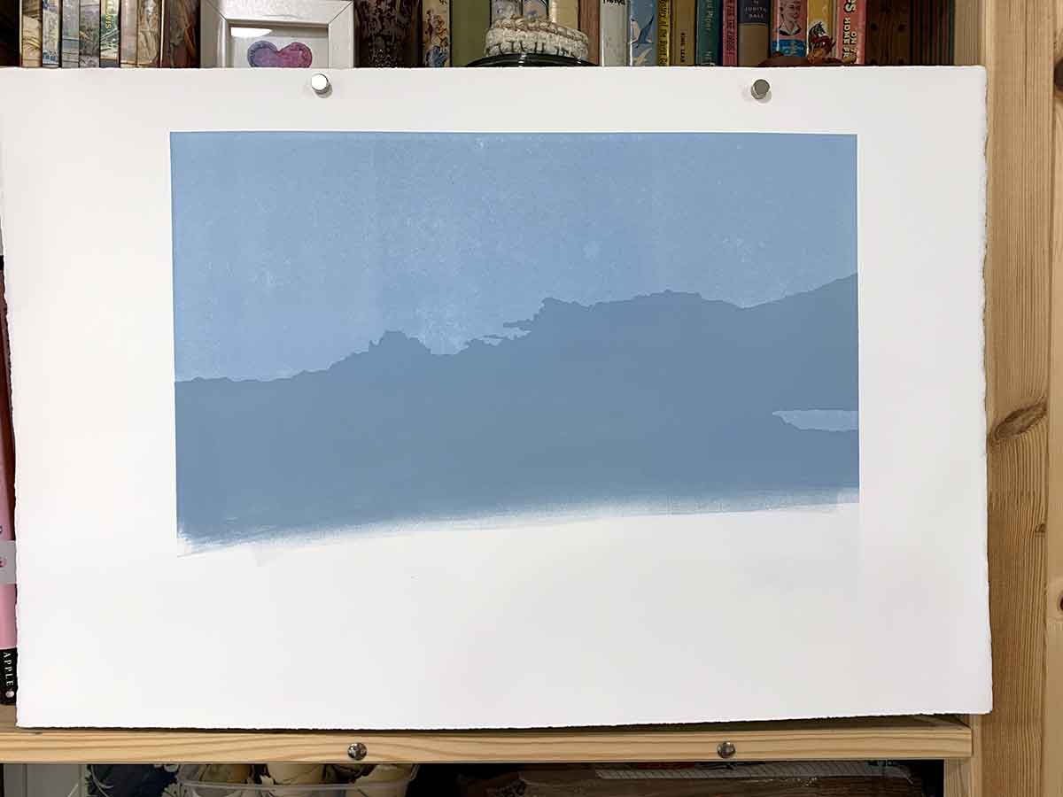
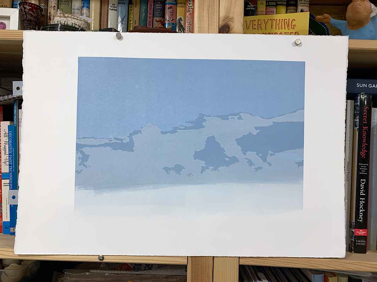
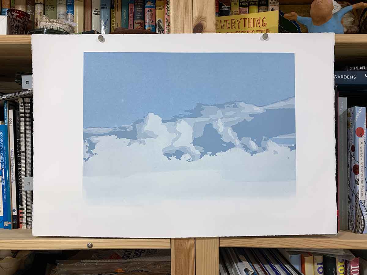
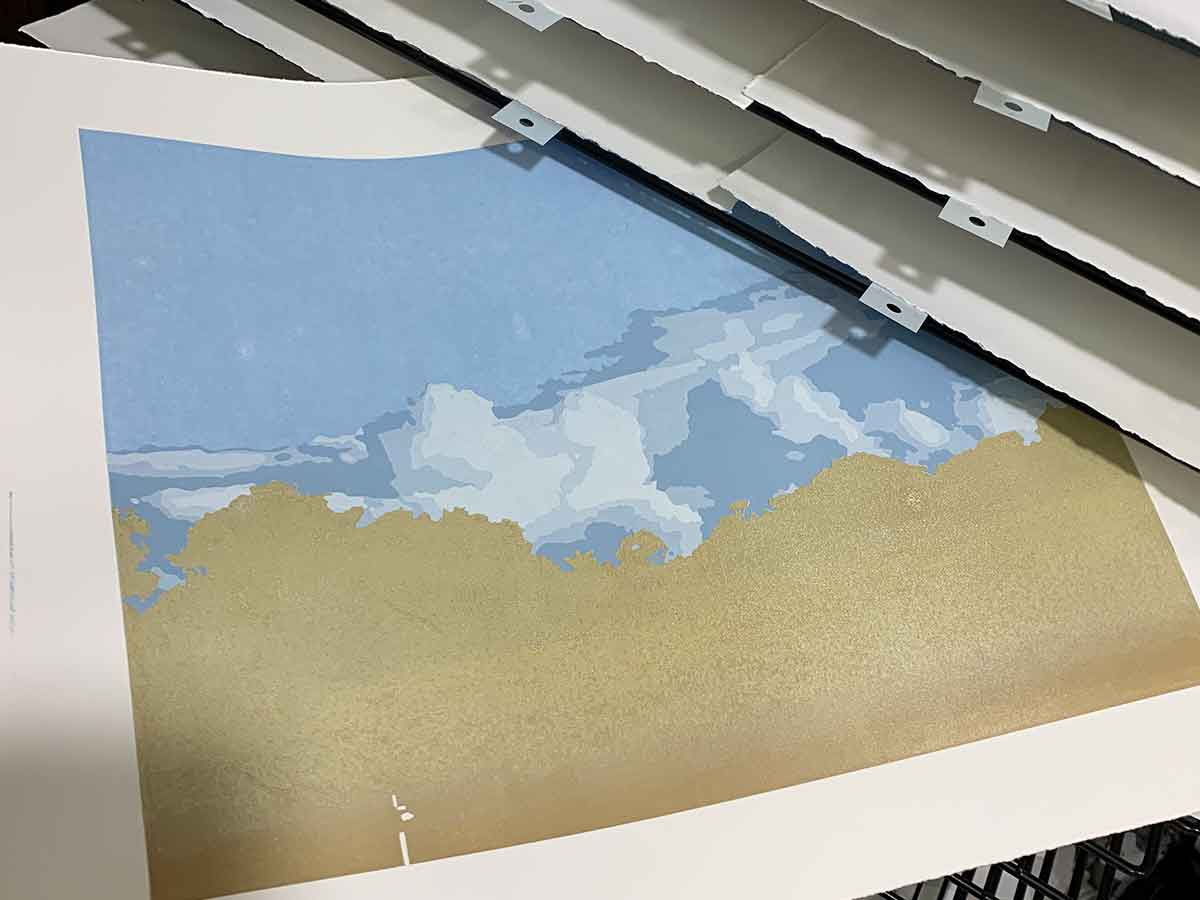
Layers 1–6, the sky and clouds
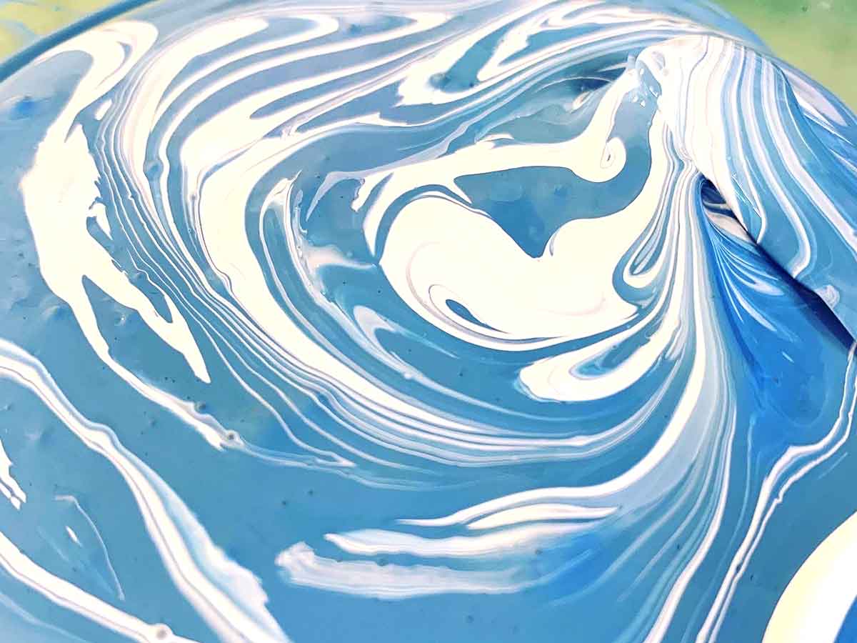
When mixing my colours, I work with a base set of yellow, red, blue, white and black in my ink selection – and from there I create my entire colour palette for every print. I like to mix my base colour, then build on that as I move from colour to colour through the edition. I generally work through a full tube of white ink for each print, with just small amounts of my primary colours.
I loved the ‘lollie lines’ of colour when I started to mix my prussian blue and white for this print. I played with it, watching the colours mix to the consistent tone I was aiming for. Adding in the smallest amounts of yellow and red helped my find the blue I wanted.
Layers 1 through 4 were pretty straight forward … the sky blue was a mid-ish tone; then I jumped back a few shades to build up the cloud shadows to highlights.
When I got to the 4th layer I wasn’t sure that the layer was light and dense enough. I printed that layer twice – to give it a double-hit of the 2nd lightest highlight-white. This helped pop that 4th/5th layer, giving an even denser white for the final cloud highlight on layer 6.
Layers 7, 8 and 9
When printing the first green foliage layer over the sky/clouds, it wasn’t as opaque as I wanted, so I printed that colour twice, as I had done for layers 4 and 5. I felt it needed a second hit to increase the opacity of that colour. I was hoping for a stark contrast of colour between the foreground foliage and distant (albeit feeling close enough to touch) cloud formation.
I’m using Sakura oil inks for this print. The Sakura white isn’t as opaque as the Gamblin Titanium white that I like to use, but I had none in the studio at the time. Printing that 7th layer twice made a big difference to the density of that colour. I didn’t take a photo of each of the those layers, so I can’t show you, but I think its a neat trick to have up your sleeve if you’re not sure about the opacity of a colour/layer.
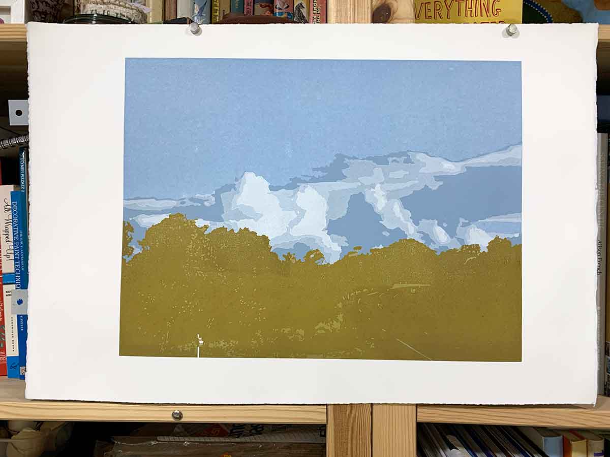
Layers 10, 11 and 12
I managed to print 2 colours in layer 10. The difference was subtle. But I thought it needed it. When planning this print I tried to see how and where I could print multiple colours in any one layer, but given the nature of the image and how I wanted it to print, I couldn’t work my way around it. So other than layer 10, each layer is a single colour.
By layers 11 and 12, I was seeing the foliage come into its own. The photos aren’t fabulous, given the reflection of my studio lights on the oil ink. But you can see the foliage detail coming to life. I love how simple carved marks come together to tell the story of an image. Just like drawing with graphite on paper, or painting … pencil lines and brush strokes create the marks to come together to tell the story of the image.
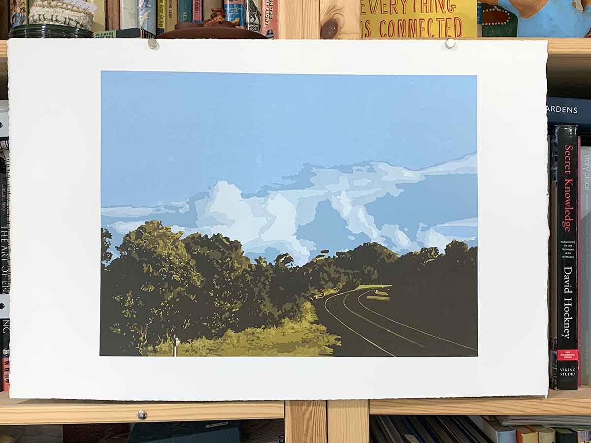
Layers 13, 14 and 15
I started this print end-May 2020. I finished it end-July.
When I started printing, I was enjoying the still of our COVID-19 imposed home-isolation. But within a week of starting, restrictions started to ease and life got busy again. I was able to get my printmaking workshops back up and running (albeit it at a reduced capacity), which was great, but I also started to experience a delayed reaction to the crazy events of the year so far.
I felt flat and found it hard to get back into the studio to print. The previous few month’s printing had been a great escape from the never-ending news cycle of that darn pesky virus, but that respite was waning.
But … I’m a determined and sometimes stubborn soul, so I got me back into the studio to get this print finished.
It was exciting to see the road start to come into its own. Layer 13 covered the road surface area with a shadow foliage colour. Adding the grey bitumen on layer 14 was exciting! I was loving the contrast of the distant dramatic clouds and the afternoon green-gold glow of the foliage against the flat man-made rigid road surface.
Then came the final layer … adding the shadows of layer 15 was, for me, the most exciting aspect for this print. The shadows added depth to the foliage, but most of all I loved the long afternoon shadows across the road surface. Its those shadows that tell the story of our afternoon drive. Our long way home. Taking the winding back roads between our point A and point B. Enjoying the scenery, and enjoying the fact that this is our (metaphoric) back yard, not somewhere I need to escape to to catch my breath.
I love simple pleasures.
And I hope you enjoy my print.

‘The long way home’ reduction linocut print technical Information
Print process – reduction linocut print
Edition Size – Limited Edition of 10 prints with 2 Artist Proofs and 1 Hors de Commerce
Layers – 15
Inks – Sakura oil based inks
Paper – 300gsm Arches 88
Image size – 40cm x 30cm
Tools – Pfeil carving tools
Printed – I printed this print with in combination with my press and trusty glass Print Frog barren, and on occasion my bamboo stirring spoon came in handy.
Are you interested in buying this print?
The print is for sale framed and unframed at the Montville Art Gallery.
I also have a few unframed prints available via my website shop.


Can I use acrylic paint and ‘system’3 for block painting?and which paper then? Watercolour paper?
Thank you
Regards,
Sarah Eksteen
South Africa
Hi Sarah, I’m not sure what “system 3” is, but if it acts to stiffen your acrylic paint, then definitely give it a go. Acrylic paint on its own isn’t viscous enough. As for paper – I use printmaking papers. Many many options to print with. I dont use watercolour paper – it is made a little differently. You can also print onto a range of Japanese papers. It really depends what what end-result you’re hoping for. Do you know the Linocut Friends Facebook group? You may find members in there in the South Africa who can recommend what they use and where they buy from locally. My personal favourite for linocut is Arches 88. I hope that helps!!! cheers, Kim 🙂