

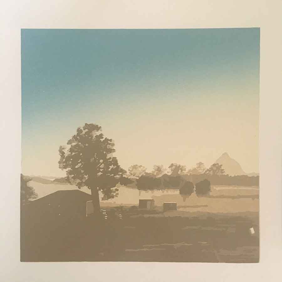
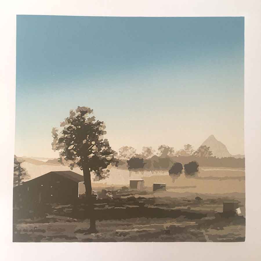
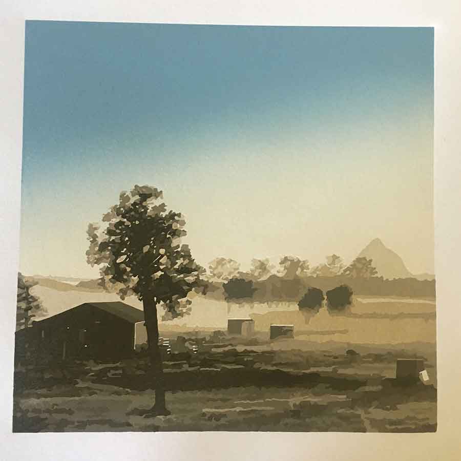
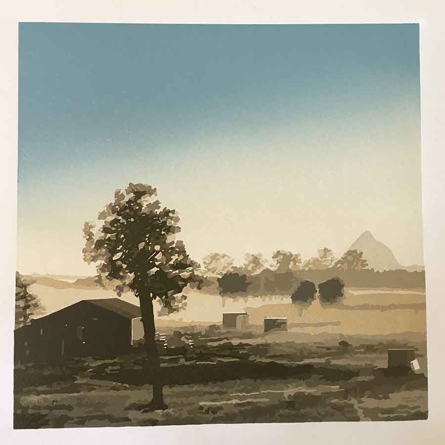
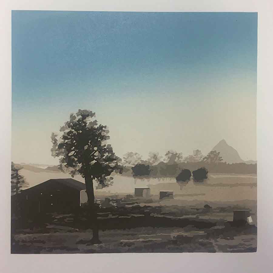
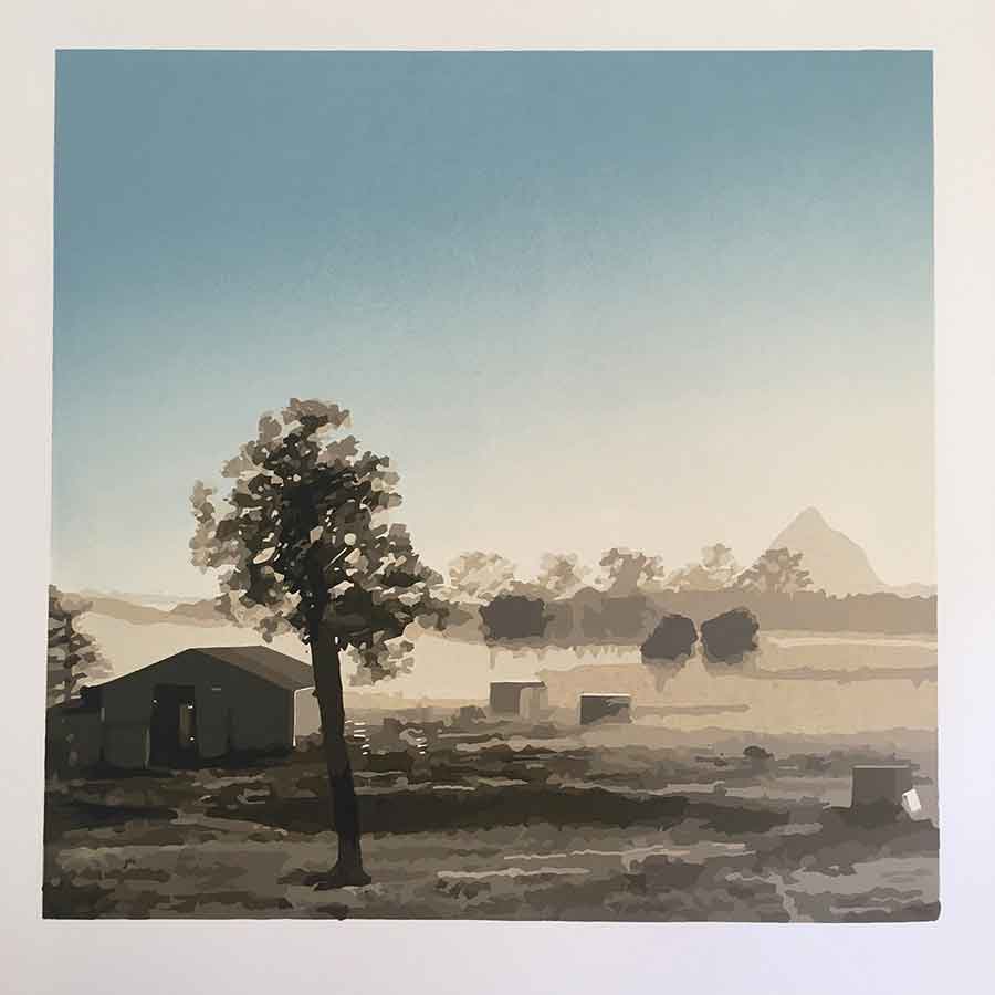
‘Beerwah Rising’ Reduction Linoprint
I finished my latest reduction linoprint two Sunday’s ago … 16 colours over 14 layers. This print was a visual collision of a few art loves of mine … the Glass House Mountains, reduction linoprinting and the square format. Above is a video showing the progression of each layer, and I have explained some of my process, with still photos of the each layer, below.
I learned many lessons from my previous two prints, Glass House and Safe Harbour. I learn lessons with every print I produce; but with ‘Beerwah Rising‘ I feel that I am now more in control of the process than the process being in control of me.
Preparing the colour separations for my prints comes easily and naturally to me. My career as a graphic designer taught me well on that technical front. But it is the skills I am continually learning as a printmaker that I find challenging and motivating:
- managing how much ink I roll on the plate for each layer
- maintaining accurate registration
- carving and mark making to maintain interest and add character to my print
- making sure I carve what needs to be carved, and leave what needs to print for the next layer/s
- maintaining focus for every print in each layer of the edition to avoid silly, careless and avoidable mistakes
- problem solving when those silly, careless and avoidable mistakes happen
As with every print there were a few mistakes with this one, but none that I think anyone will notice, or detract from the final image. I think it is a frustration of every printmaker, every artist, that the final image has blemishes or errors or marks that the artist did not want or plan for, but the viewer and admirer are none the wiser. In many cases the image may be better for those ‘mistakes’; and they add their own character to the final piece.
My inspiration
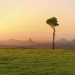
I am working through a series of reduction lino prints with the Glass House Mountains as my primary subject. By series I mean I have now bought to life 2 prints, and plan to do more, but nothing else is set in stone at this point. So perhaps ‘series’ isn’t quite the right word here?
I have admired these mountains from a distance ever since I was in primary school. I remember driving past them in a bus on a school excursion when I was about 9 or 10 years old. Now I live near the Glass House Mountains and I am drawn to them more and more. They are striking and unusual and sit proudly above the flat farmland landscape. And they hold great indigenous significance in this area.
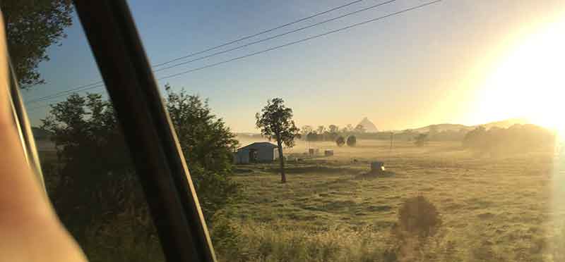
An early morning drive-by iPhoneography snap was my reference for this particular print. We were about 40minutes into our road trip headed from Maleny to Newcastle and it was about 5:30am. It was a bright and warm. A low summer fog was lifting from the surrounding farmland and Mt Beerwah was rising with the sun, proud in the distance.
My process
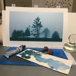
I play with my photographs in Photoshop and Illustrator to realise the final image that I want to print. I use these applications to work out and plan my colour palette, tweaking and adjusting the photo if I think it needs it. Once the colours are sorted I’m ready to prepare paper, create my registration jig and start to carve the lino. As I print I continue to adjust and tweak colours with each layer, always referencing back to my original image and colour palette.
I don’t think I’ll ever tire of how the final printed pieces presents itself, especially when compared to the photo. I’m not looking for a ‘photographic’ representation. Rather a ‘realistic’ representation; something with a photographic quality but obviously an artistic re-creation.
With this print I used Sakura oil based inks for the colours (yellow, red and prussian blue), mixed with Gamblin’s Titanium White. While I love the Gamblin white, I am loving the Sakura colours. Great pigment, easy to use, fluid and tacky at the same time – and they dry quickly. Plus the benefit of the ink in a tube versus a tin means they aren’t drying out before I can use them like my Gamblin inks do. I have written previously about my favourite lino printing tools, where I was using exclusively Gamblin inks … its safe to say that now I am migrating across to Sakura inks.
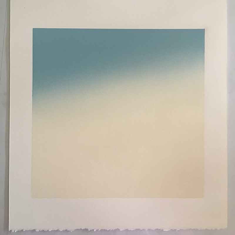
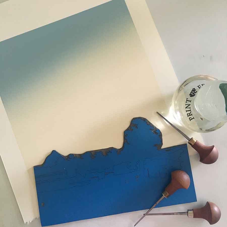
For this print I started with a blended roll as my first colour layer – light blue fading down to the colour of the rising mist. I didn’t want a horizontal line in the blend, so I rolled it on an angle. I wanted to keep some idea that the sun was rising in the east; and I also wanted to maintain the sense of fog or mist burning off as the sun rose. The blended roll allowed me to print the first 2 colours on the one layer.
Colours 1, 2, 3 and 4
Above you can see the first 4 colours printed over 3 layers.
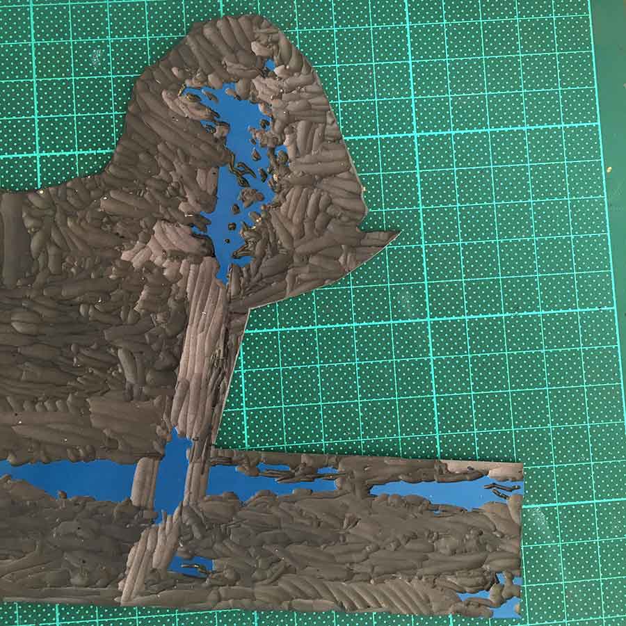
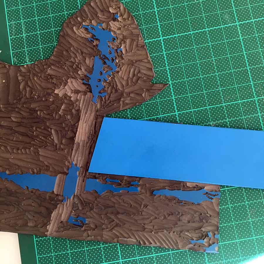
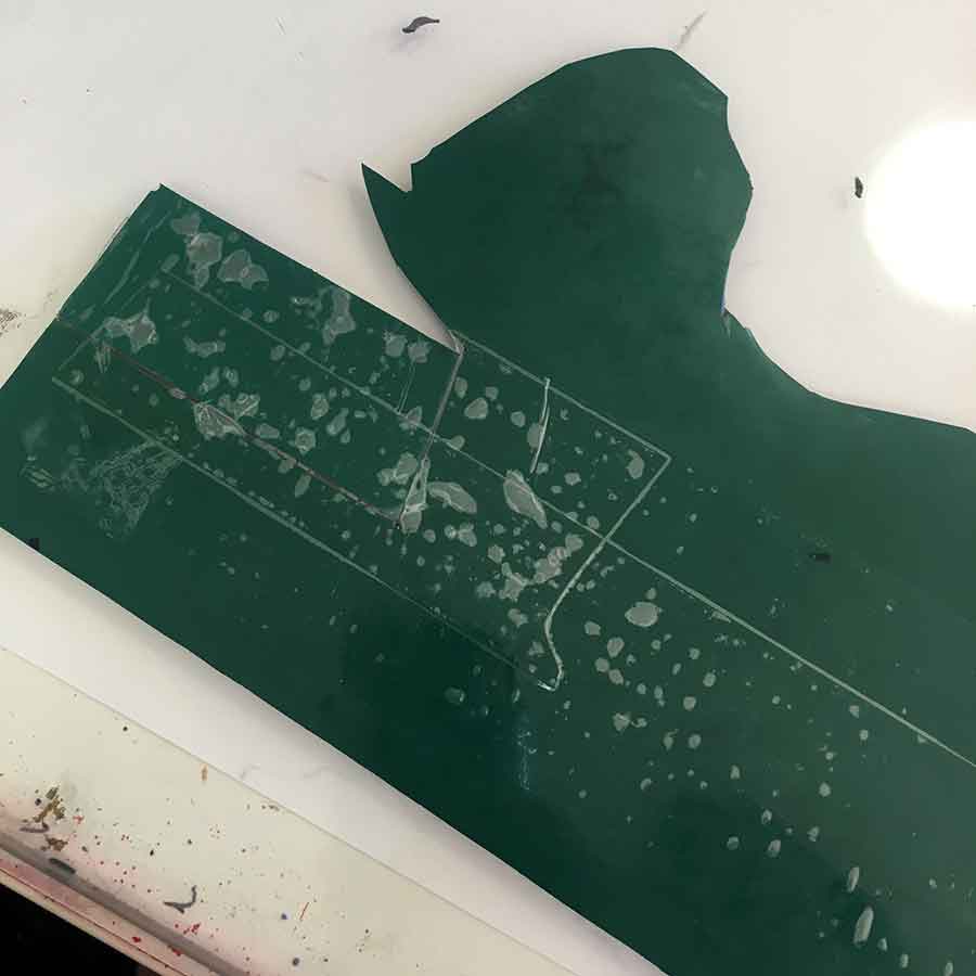
Once I had the blend for the first 2 colours printed I cut the block. I cut away the sky to remove the risk of embossing or unintentional print marks from carved-away areas of the block.
What I didn’t consider when doing that was how reducing the overall height of the block may impact the registration system I had set up for this print. Reducing the overall size of the printing plate directly affected how the block fit back into my registration jig. It meant that the plate shifted about 1mm, so I had to manually adjust every print for every layer a smidge to maintain the registration.
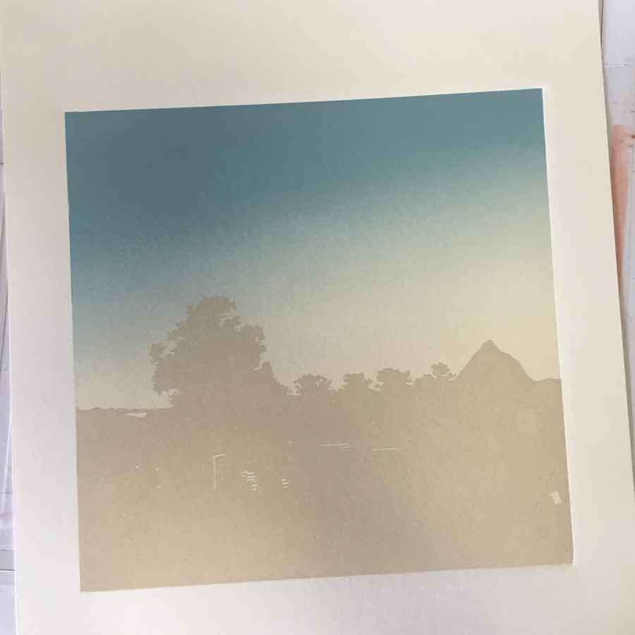
Below are the next 4 colours – colours 4-8. Given that there wasn’t too much carving for layers 1-6 I found them quick and easy to print.
I like to work with a monotone palette. That combined with the nature of the my final image, carving colour detail can get quite complicated and time consuming. Carving time increased at about colour 7, identifying and carving the textural detail for the final 8 or 9 colours.
Colours 5, 6, 7 and 8
I have a tendency to apply my ink quite thick. In some prints that works well for the image (like in ‘Persistance‘ where the thick ink added to the texture of the tree bark), while in others it creates real problems with additional link layers, like in ‘Glass House‘.
However, with this print, I was able to master layering several thin layers of ink onto the plate for each colour. Partly because the Sakura inks have a different viscosity to the Gamblin colours, making them easier to work with; and partly because I learned a little more patience. Plus, Mike Smith c/o the fabulous Facebook group Linocut Friends shared the tip about ‘blotting’ or ‘mopping’ each printed layer with newsprint…
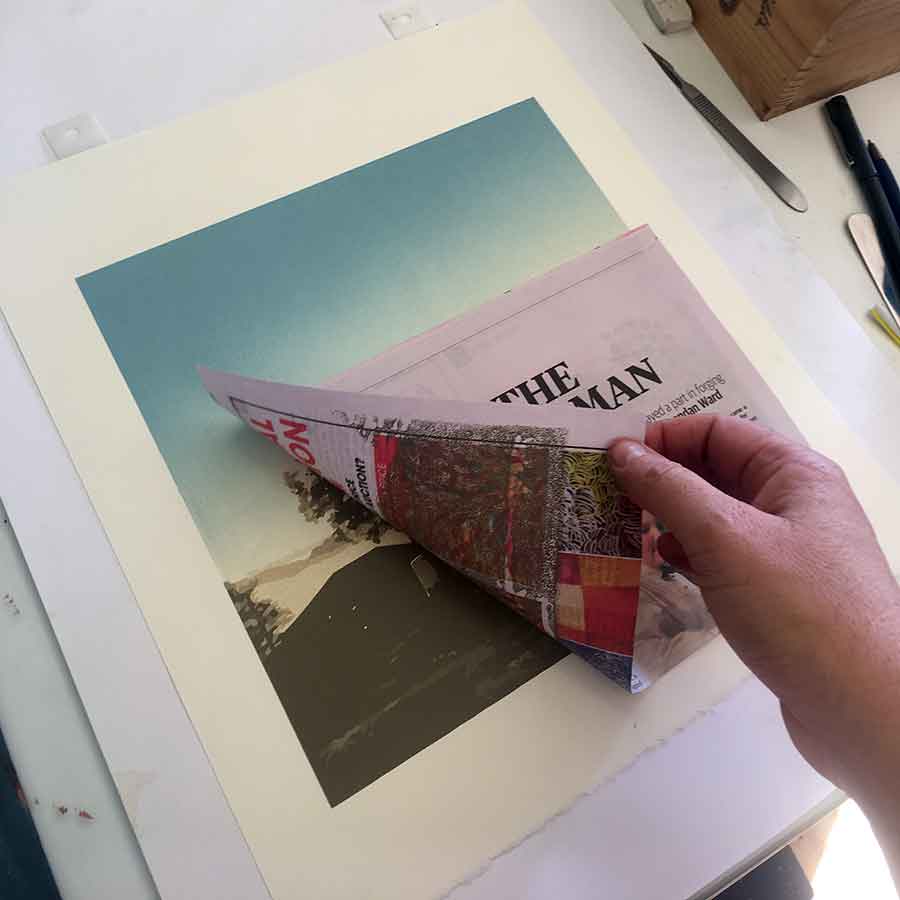
By carefully laying a strip of newsprint over a printed layer, it works to ‘mop up’ excess ink. This works to remove unnecessarily thick ink and help speed up drying time.
Note – make sure the paper you use isn’t creased or folded. This will have an impact on the printed layer you are blotting. I have also used fresh butchers paper for this purpose, but newsprint is readily available and work wells.I doesn’t leave behind print makes on the print paper. Just remember to wipe your hands once you have rubbed it on the newsprint to eliminate any newsprint-fingerprints on to your next print.
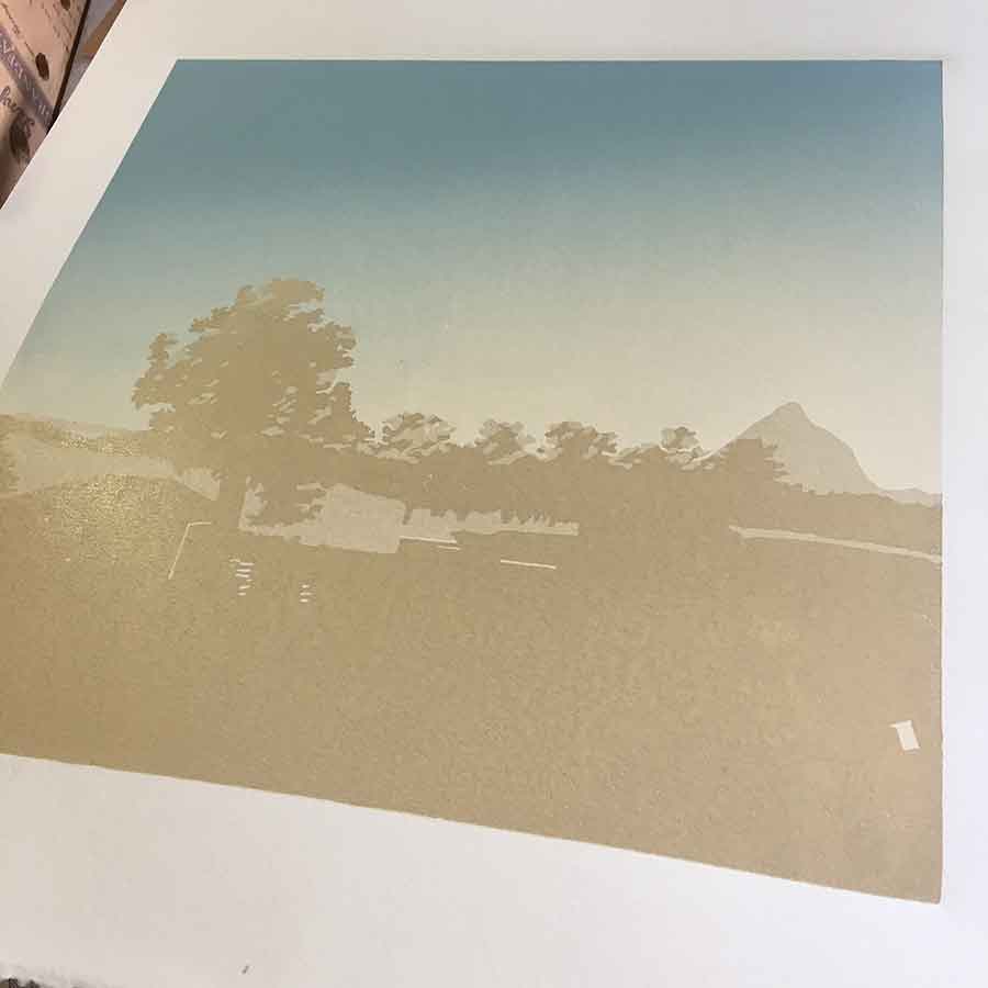
Colours 9 and 10, blotting each layer with newsprint
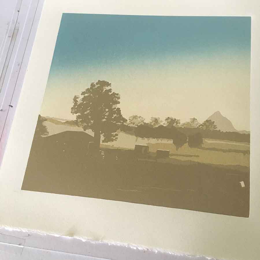
I was printing in a pretty good rhythm by this stage. The carving between layers was getting a little tedious, but I could really see the printing coming together. The light through the back of the shed. The contrast of the farm yard against to flat farmland behind. Mt Beerwah fading further into the back of the picture, while still remaining proud.
I was feeling pretty good about this print. I had managed to print one layer every morning, so I felt like I had made great progress. Printing is such a perfect way to start that day!
The Sakura inks made a big difference to how quickly I could move on to printing the next layer. In the past, using Gamblin inks, I was having to wait several days to print the next layer. I had to wait up to 6 weeks in one print for the final black to dry.
Colours 9 and 10, then 11, 12 and 13
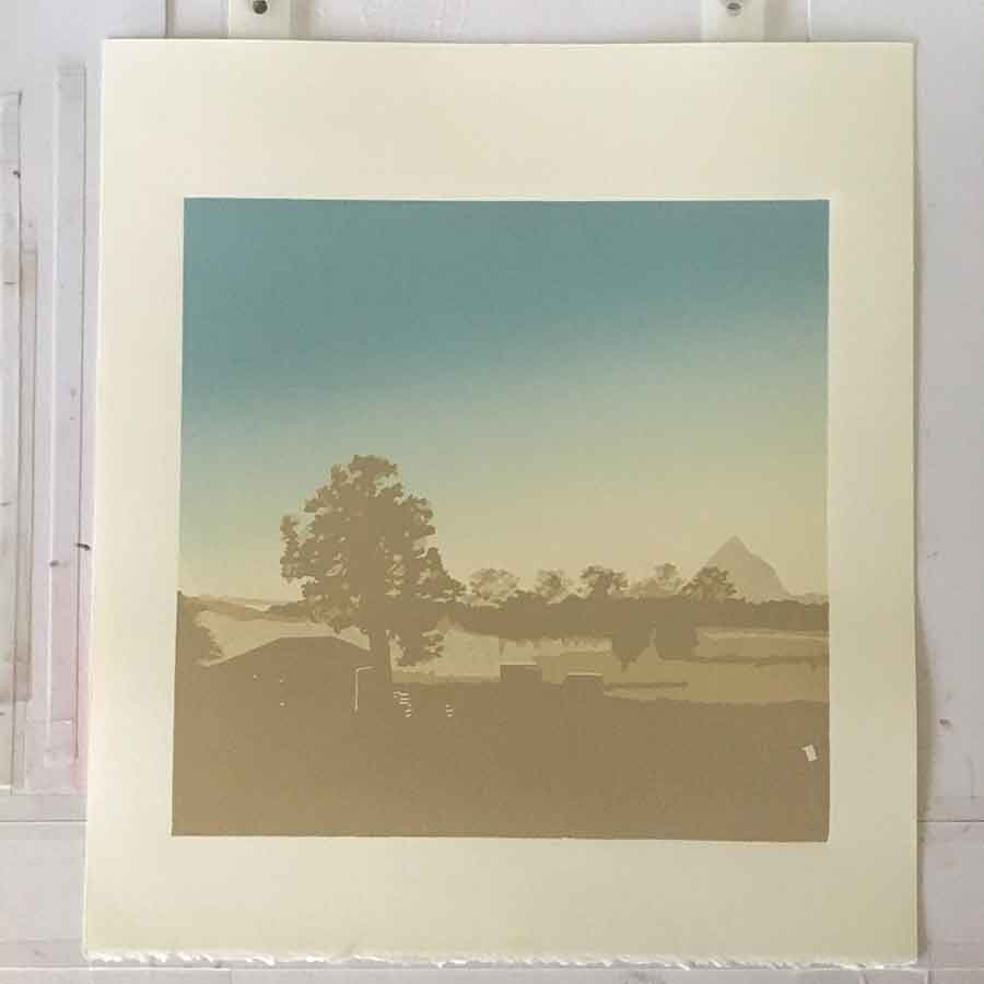
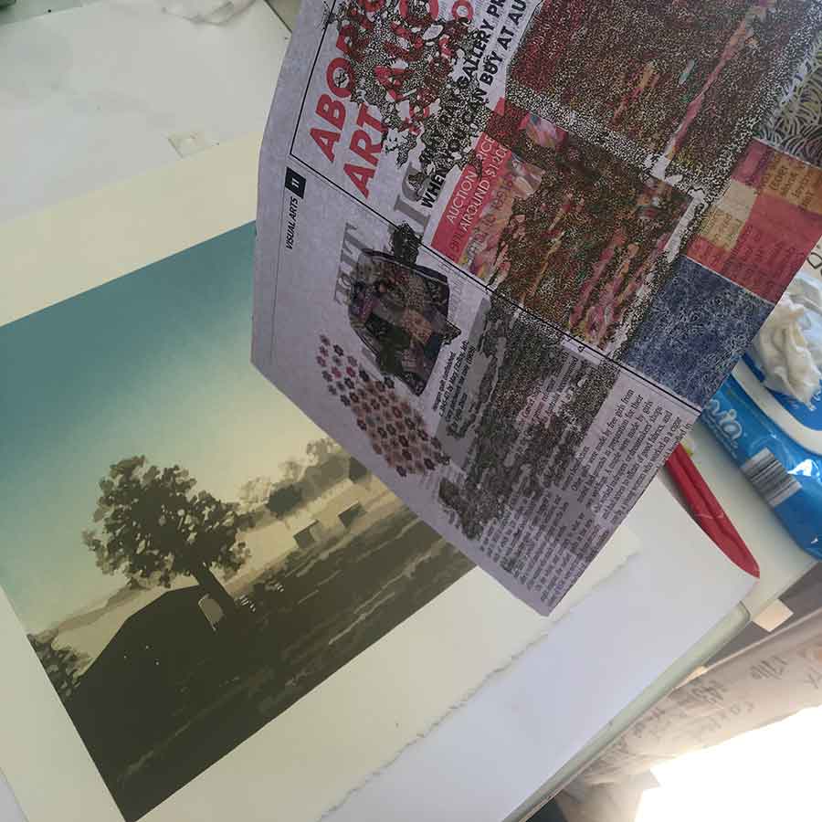
Then I hit a snag … I accidentally carved what I wanted to print for my final 16th colour. Poop!
There wasn’t much to print for the final colour, but it was important for bringing everything together. I didn’t use any black for this print. The whole way through, after the blue in the first layer, I used red, yellow and prussian blue mixed with white. I am using black less and less in my colour work, rather using colour to create the shadows. Black can work to give an image a good hit of contrast, but using it or not really depends on the drama you are wanting to create in the final image.
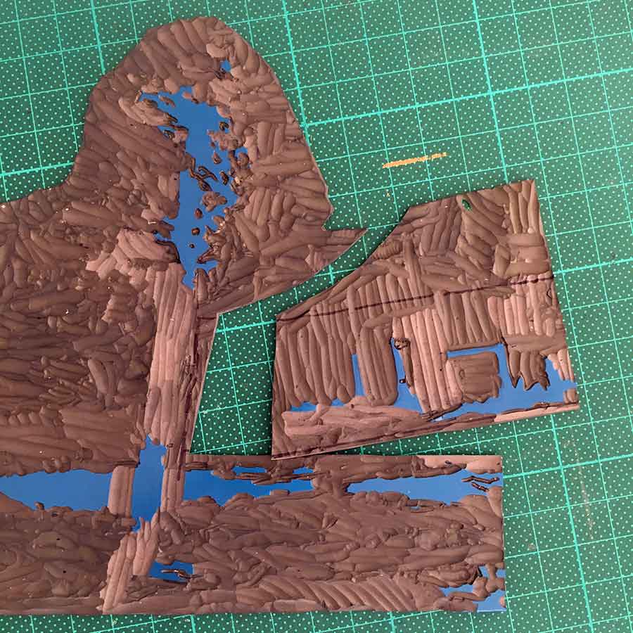
Then, with the final colour to carve then print, I made my next big mistake … I had managed to carve the darkest shadows of the shed away before I realised what I had done.
It was early morning, my favourite time for printing, and the time of day when I am most clear-headed … I was able to solve the problem by cutting away that section of the block, then cut, carve and insert a new piece of lino. It took a bit of jiggling, but once I sorted the registration, you could hardly tell the mistake I had made. Phew !!
Cutting then patching the plate for the final 16th colour
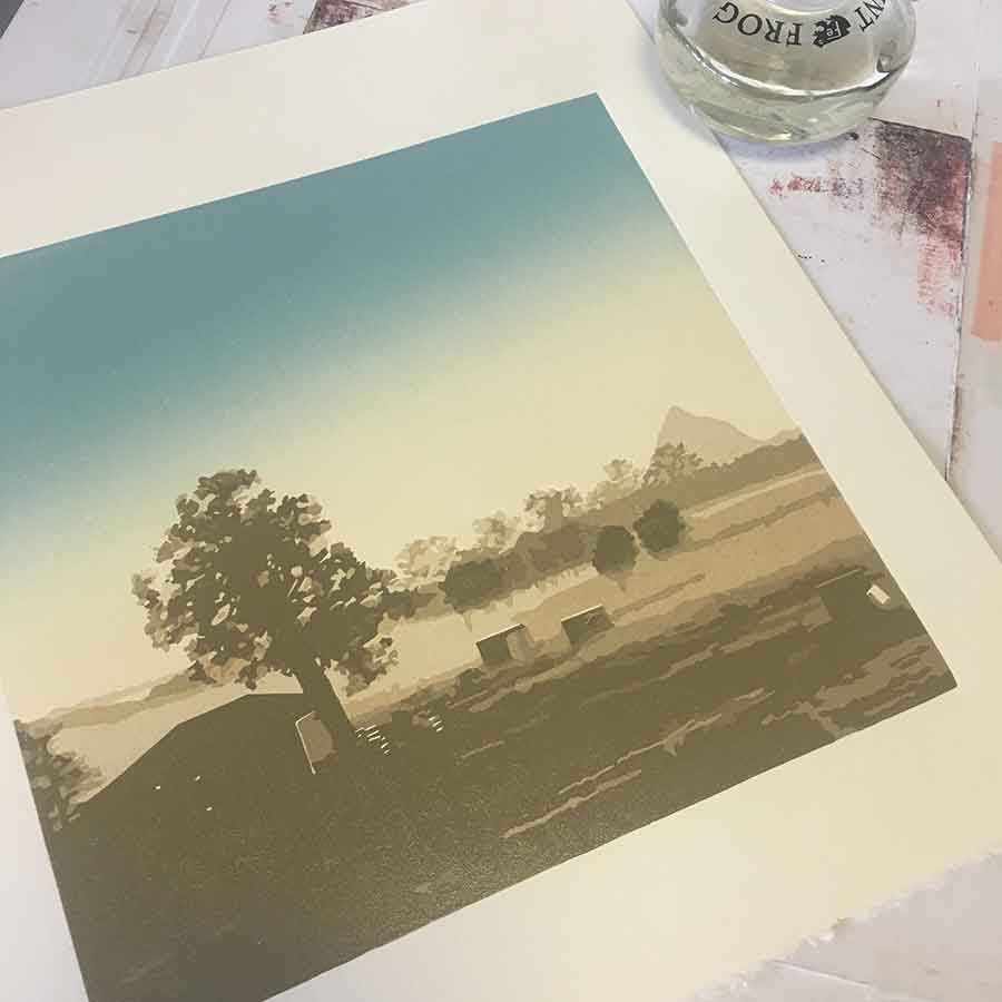
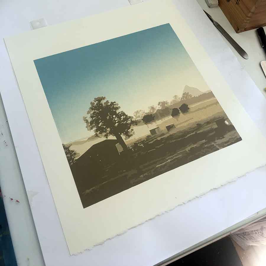
The final print
I really enjoyed this print. Yes I made mistakes but it didn’t feel like a struggle like other prints have felt. The registration issue way back between colours 2 and 3 could have sent me back to the beginning with new paper and lino. The mistake between colours 15 and 16 could have been disastrous, but I problem-solved it, and if hadn’t shared it here, no one would have known about it.
Overall, I am pretty happy. I pick it up from James Frames (previously Holdens Gallery) this week and will be delivering it to Montville Art Gallery, Montville, and Peace of Green Gallery, Maleny. If you are interested you can see the print with your very own eyes at either of these locations, framed and unframed, or you can view it online here.
The final 2 colours, 15 and 16
Post Update – 11 August 2018
I am excited to share that this print has been selected as a Finalist in the Local Artist Local Content 2018 Art Prize. It was announced yesterday, 10 August 2018. Winners are announced 16 October 2018. I am thrilled just to have been selected as a Finalist. I am in the company of some fabulous artists form the Sunshine Coast.


Beautiful Kim, i am just beginning to play with reduction printing so i will be following you eagerly
Oh how excitement! reduction linoprinting is so much fun!! process, thinking, creating. Getting lost in the process. A perfect combination. 🙂