

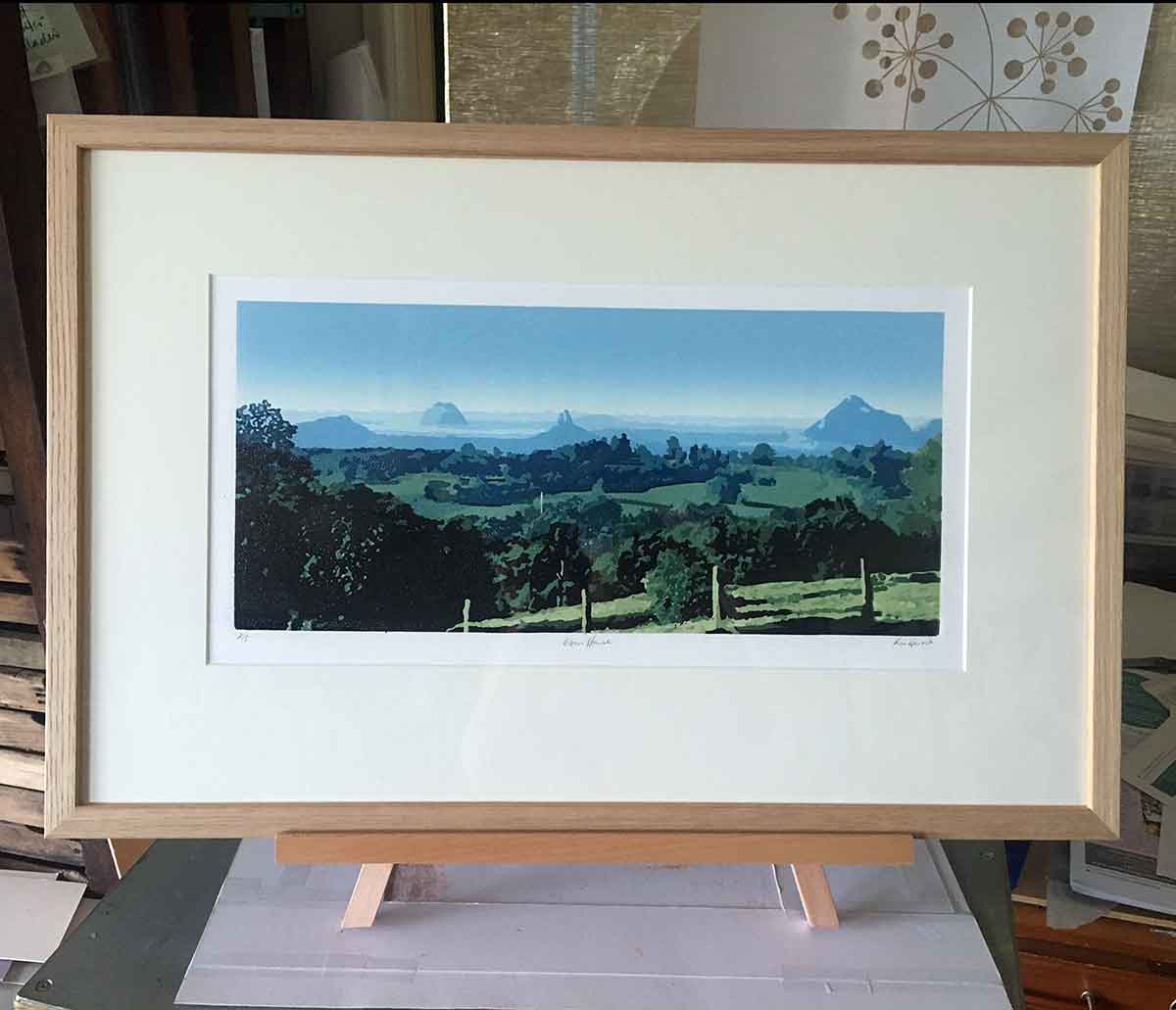
‘Glass House’ Reductive Linoprint
Wow … “Glass House” is finished, editioned and framed. This labour of love reduction linoprint has taught me lessons in both printmaking and patience, and has already made its way into several homes around Australia – from Maleny on the east coast to Perth on the west coast.
In this post I have finally collected my thoughts, fallen back in love with the print, and shared more about the process…
In my previous post “The Trials and Tribulations of reduction linoprinting” I shared some of the problems I was having with this print. That post took me to layer 6. The print has finished with 18 colours over 16 layers. It was hard work. I enjoyed it, but I also struggled with it. I made careless errors, rookie errors and learned a lot along the way. In a display of ‘artistic vulnerability’ I’ll share with you the problems I experienced and the lessons I learned through the process…
The video above shows each layer of the print. It runs for about 2:40 minutes, and unfortunately has no audio, but does show some up-close-and-personal views of each layer – and some of the problems!
A quick recap…
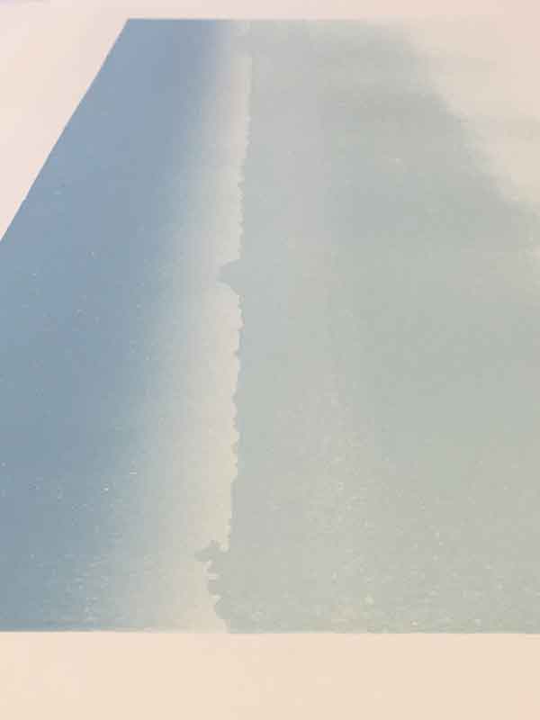
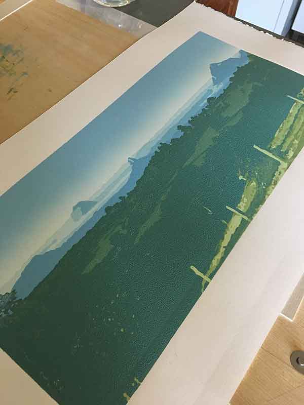
THE SUBJECT MATTER – I referenced a photo I took from one of my favourite vantage points of the Glass House Mountains, Howells Knob Lookout at Reeseville (about 10 minutes drive out from Maleny). I love this view. I love this photo (below). It screamed REDUCTION LINOPRINT at me. And it presented a unique challenge – how to create the depth of distance in a reductive linoprint, retaining detail without overdoing it.
As a side note … I took this photo in May, coming into winter. At that time of year there is a lovely fog that rolls around the base of the mountains, encasing them in a floating sea. It is a beautiful sight to behold when the conditions are right and you catch a glimpse of the sight from the hinterland ridges. I missed capturing the full drama of the scene with this photo, but worked to add some of the drama back in the linoprint.
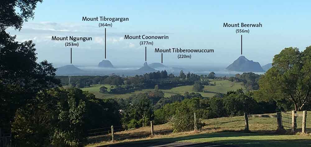
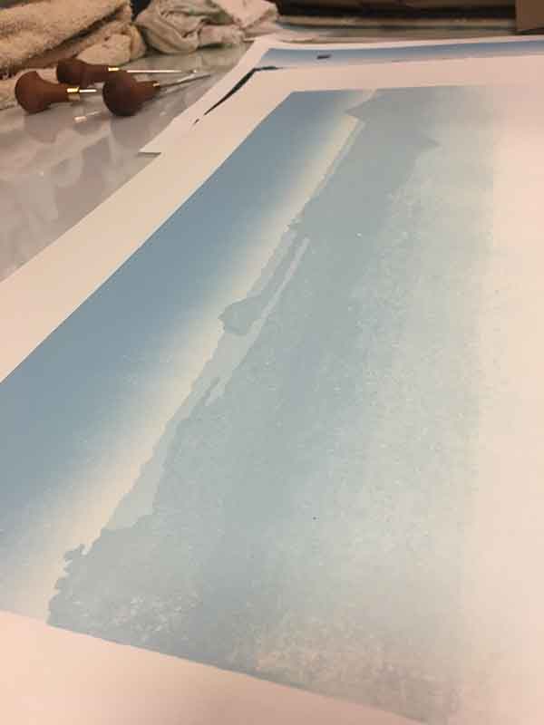
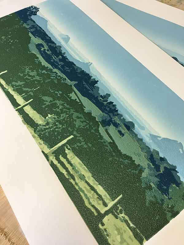
The images is divided into 3 distinct ‘visual’ layers. Each visual layer will let me play with colour to create the feeling of distance.
- the Background – the sky and Glass House Mountains on the Sunshine Coast
- the Foreground – the paddocks surrounding the lookout
- the Middleground – the dairy cow grazing paddocks
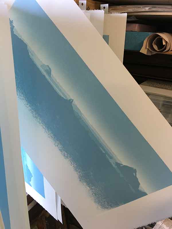
The Background
The sky and Glass House Mountains on the Sunshine Coast
This area consisted of 4 layers and 5 colours, a few mishaps and several monolithic structures deeply rooted in Aboriginal dreamtime legend.
I wrote about this area of the print in a previous post. I had some hiccups that I was worried would become bigger problems as I worked through the print. I was right! Below is a quick recap of where I had got to…
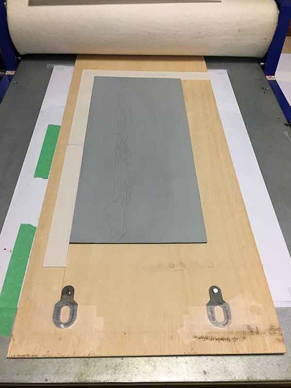
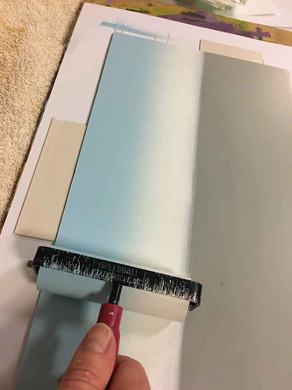
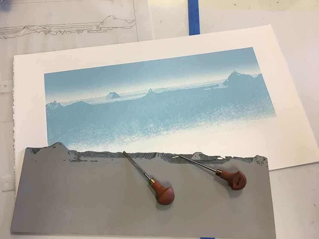
Measure twice, cut once! I didn’t think through my registration system properly when I first prepared the board and trimmed my paper. As a result I had to add to the registration board, then make a minute manual adjustment for each print. It sounds simple enough now and something that should have been avoided, but I was careless and it cost me at least 4 prints due to misregistration. Ahh the trials and tribulations of printmaking!
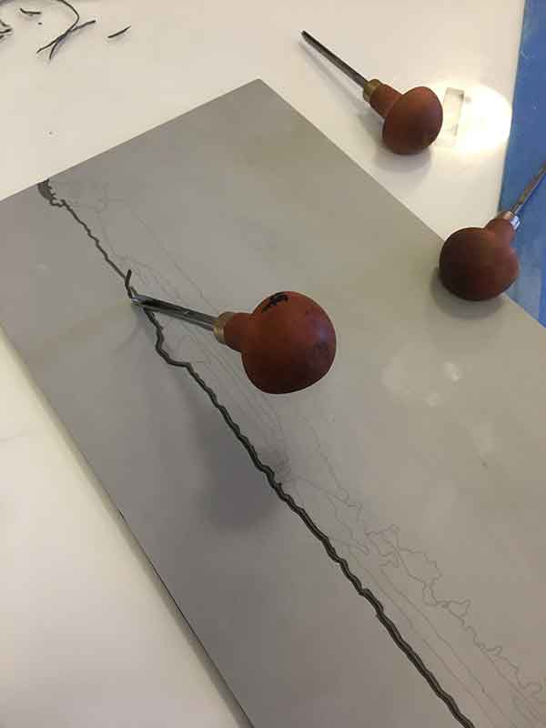
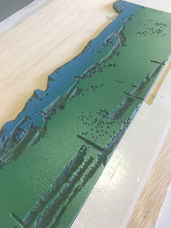
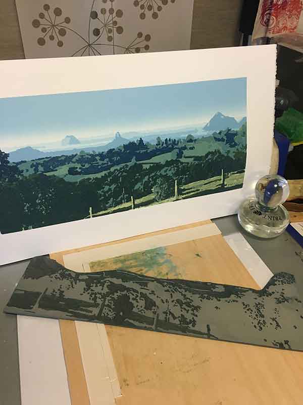
I had also decided that, I worked through the background layers, that I would cut them from the block completely. I wanted to keep the sky as clean as possible. So, to minimise the risk of ink marks from carved areas, I cut away the sky area once printed, then cut the Glass House Mountains and surrounding land area away once I have reduced the block through those layers.
Once the sky was down and I was set to carve the distant Glass House Mountains, again I got a little ahead of myself an accidentally carved colours 2 and 3 together. I had to rethink the colour approach there, and also missed 2x prints in the (potential) edition with one layer. Another 2 prints lost. The viewer will never know the ‘mistake’. And now that the print is complete, I can see that everything worked, but these sorts of errors add frustration and tension to the printmaking process. I guess, to be honest, that in itself is a natural aspect of printmaking.
Also, in an effort to keep the layers of ink on the paper as light as possible, I inked only the area of the plate that needed the colour, as opposed to the whole plate. For this background area, it meant keeping the ink rolled across the top of the plate only. The problem for me here was that I was quite heavy-handed with the ink as I rolled it on the block. I liked how it was looking as it was printed, but it created a texture problem when I approached the middle- and foreground areas of the print that I didn’t think through.
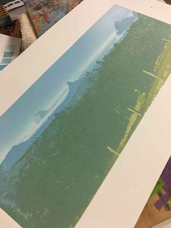
The Foreground
The paddocks surrounding the (Howells Knob aka Reeseville) Lookout
Convention might have it that this area should be printed after the middleground area, and therefore the last area to be printed. As the foreground greens were the lightest, I started with these, and printed some middleground colours with this section of the print.
I have counted the fore- and middleground colours here as I did print them interchangeably, making it hard to distinguish the exact colour and layer count for these 2 areas of the print. So the foreground and middleground areas combined consisted of 12 layers and 13 colours; along with more mishaps and some triumphant wins when I realised how much I have learned to love working with colour.
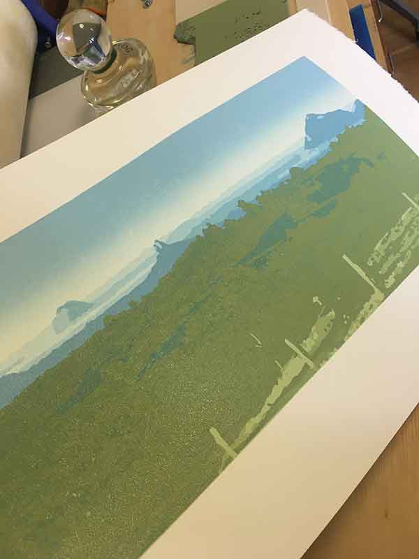
For many years I was terrified of colour. I think simply because I didn’t understand it. I liked it, as most of us do, but hadn’t worked with it enough to ‘use’ colour to convey the story. With this print I really began to understand how I was intuitively using colour to convey depth. To tell the story of this iconic view, looking to the distance, helping the viewer of the work navigate the distance in the print.
I think it was when I had carved the fenceposts on the foreground, then the different greens around them, that I started to see the depth in the image.
I also continued with my selective inking in this area. And it was here that I became acutely aware of how heavy handed I was with the ink, and therefore the problem with ‘deep layers’ of ink building on the paper. This has a positive and negative impact for me…
The negative – it was getting very hard to print each layer. I used my Glass Frog baren to handprint every layer of this print. It was now taking me over 2-3 hours to print each layer. That makes for a very sore wrist as I was having to apply a fair amount of pressure for the ink to transfer from the block to the paper, and I printed some layers twice to ensure enough, and an even consistency, of ink.
The positive – I loved the texture emerging in the print, and in a strange way, I think it adds to the overall depth of the image.
The Middleground
The dairy cow grazing paddocks
It is difficult to distinguish the number of layers and colours specific to the middleground area, so I included them above, in the foreground section of this article.
I printed 2 layers here with green blends … blended foreground greens with middleground greens. I used the same prussian blue and yellow for all greens, but different mixes with white and intensity of the prussian blue is what worked for me here. I added a little red to the middleground greens to darken them a little. I love to not use black when mixing colours. I feel I am being true to the colour then – like I am in a relationship with the colour and need to respect its true nature. These were such odd thoughts to become aware of when printing this print – but I do enjoy the inner dialogue I have with myself when I am engrossed in the process of printing.
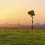
This was also the first time I blended colour for different areas of the print. Previously I have printed blends for background sky (light- to dark-blue, as in this picture), or an orange blend for a sunset-on-the-lake scene in “At the end of the day“.
The Final Word
After a month or two in the thinking and planning and nearly 3 months to print (factoring carving, printing, drying and frustrated-procrastination), Glass House was completed. It was hard work with many mishaps but more learnings. Often when I finish a print I need to not look at it for several weeks. I dislike a print once completed, and all I can see are the flaws and the areas I wish I had done different or better. I guess that is what most artists do with their own work. I sat this print aside for about 2 weeks before I fell in love with it. Of all my reductive linoprints, I think that I am most proud of this one. I hope you like it too. At the time of publishing this post there are 2 unframed prints from the edition still for sale, at Montville Art Gallery. If you are interested in purchasing, please contact me or the Gallery directly. Or click here for more information regarding buying this print.
Final layer count = 16
Final colour count = 18
Mistakes – too many to count!
Triumphs – more than the number of mistakes!!
Paper and prints – 12 sheets of Stonehenge 245gsm white printmakers paper giving me 24 prints (I was aiming for an edition size of 20)
Ink – a lot! with white being the most used ink in the edition. I used prussian blue, yellow, red and white. I added a little black to the final layer, but let the other colours do most of the work to convey the shadows.
The final limited edition – 8 prints, plus 2 artist proofs and 2 hors de commerce prints.
Sacrifices – I never throw away my failed prints. I plan to use the non-editionable prints in some paper sculpture work I have in mind. Watch this space!
A confession – of the prints that didn’t make the edition, one I have kept and framed for myself. I dropped in toward the end of the print run, around colour 13 or 14. As a result there are clusters of ink spots in the sky area and floating above the paddocks of the middleground area. They look a little like flocks of birds, so I have editioned is as a unique state (US), and it sits in my own private collection.


I also have been doing some very complex prints with many layers. I’ve learned to be super meticulous!
Question for you: it looks like you rolled some of your colors very lightly to achieve a mottled effect in areas like the greens of the trees. Do I have that right?
It seems a lot better than trying to carve out lots of small regions to capture things like leaves.
Pete
Hi Pete, thank you for reading :-). I carved the colours for this print. You absolutely play with different inking consistencies to achieve different textures in the trees, but I like to carve mine. In this particular print I inked very heavily – too heavy. And that caused a whole lot of problems. But regardless, I am (now) happy with the result.I love carving – its my most favourite part of the linocut process. And when carving the colour/texture in the trees, I’m not aiming to carve ‘leaves’ but rather shapes of colour that read as texture in the foliage. I’m not sure if that makes sense?? cheers, kim
Beautiful work Kim. Thanks for sharing your process and thoughts.
Thank you Joanne. Thank you so much for reading. I really appreciate your time to do that, and I hope it helps with your own lino printing 🙂