

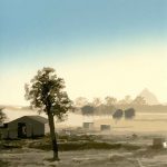
After the Rain – a new Reductive Linoprint

It’s late on a Sunday afternoon. It has been a warm and humid day. The summer rain has come and gone. The clouds hang low over the ridge and there is a feeling of cool respite from the heat of the day. After the rain. And that was the beginning of my latest reductive linoprint!
This 14 colour reductive linoprint spanned several months from start to finish. I had planned to have it printed within a few weeks. I had also planned two other reductive linoprints to print concurrently. I wanted to immerse my fingers in ink. Images prepared and colours planned out. Blocks were ready. Paper cut to size. Registration jigs created for each sized print. Ink and brayers ready.
I made a solid start over a few days on ‘After the Rain’, but then the best-laid plans of mice and men often go awry. At about the 5th colour I was hit by a mosquito ninja with a dose of Ross River Virus. I was knocked for six. I had heard of Ross River Fever, but not known of its symptoms. The virus attacked my joints, and my carving and printing days were put on hold for just over 2 months.
It was driving me nuts watching the prints hang on their drying rack, desperately waiting for me to get back to them.
I finished the print about 2 weeks ago. It has gone off to the framers. I’m looking forward to picking her up and seeing her framed and ready to present to the world.
How the layers unfolded
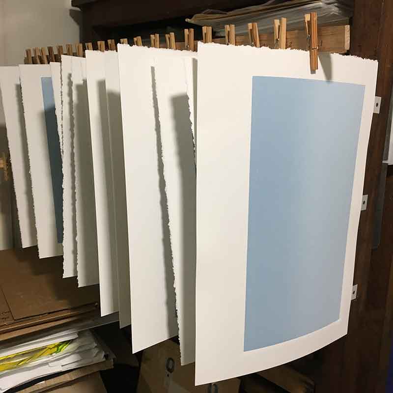
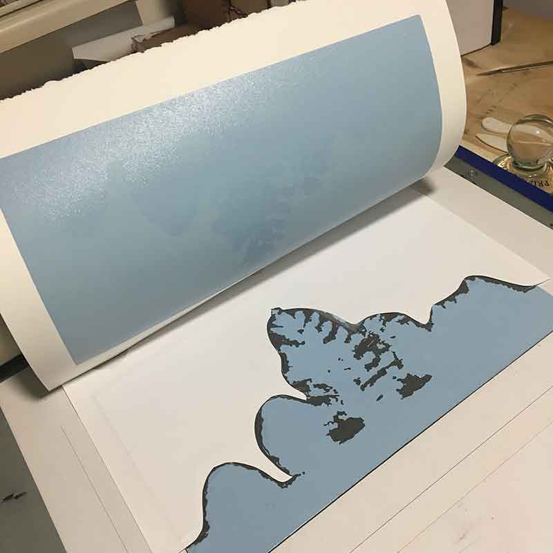
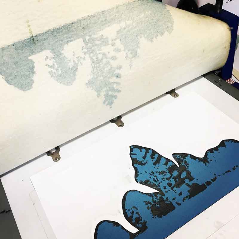
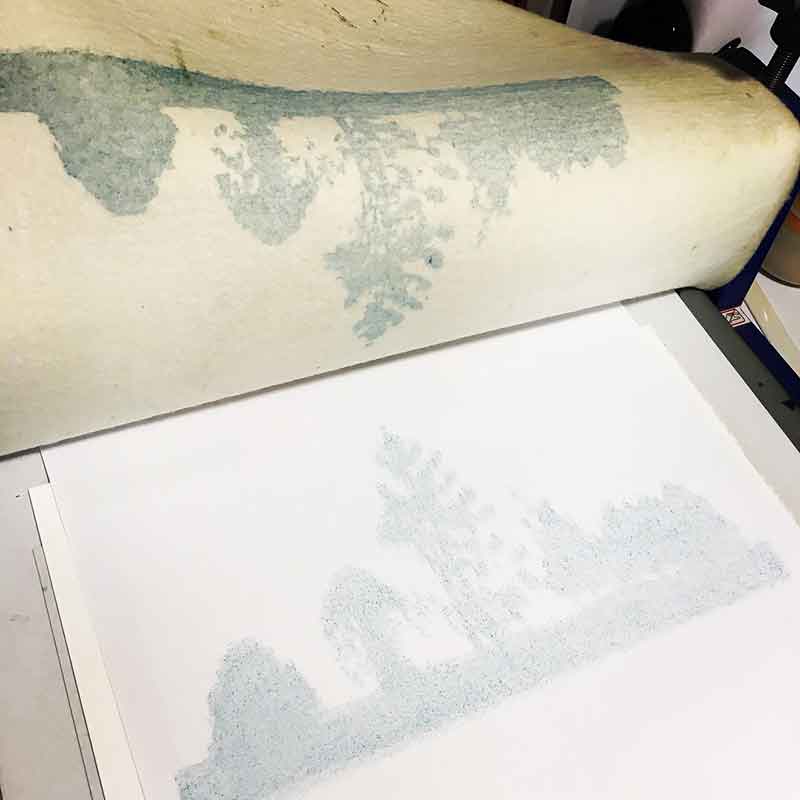
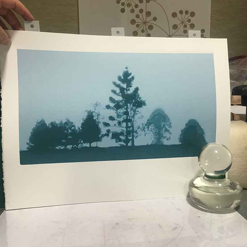
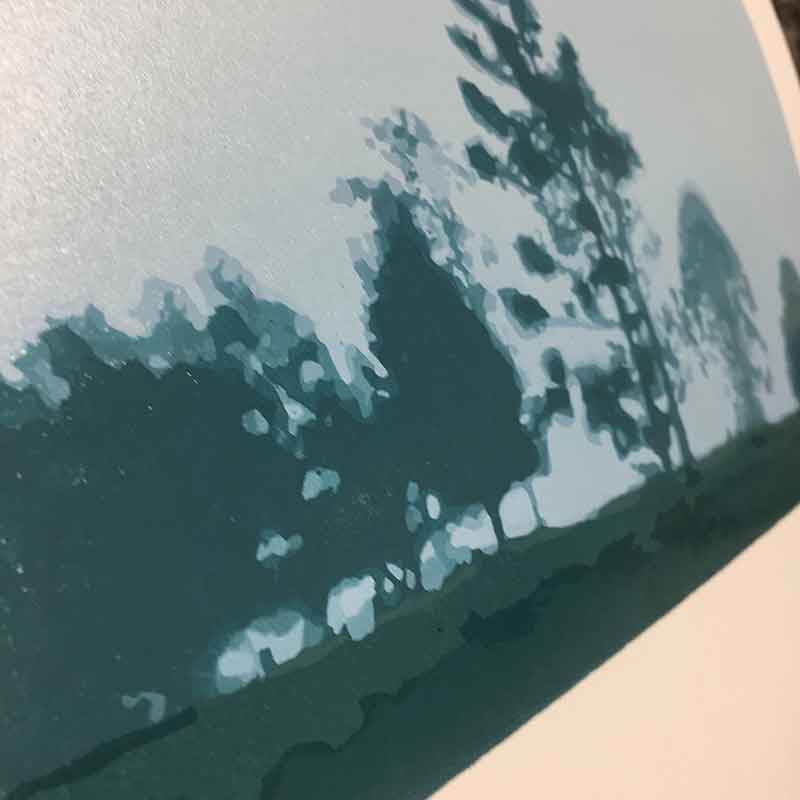
There was no ‘white’ on this print, so no carving as the first colour and layer went down. I printed a blended roll across the background of the print area, blending a light to not-quite-so-light blue. I was looking for subtle tonal variations with each colour of this print. It felt delicious to roll the ink and run the lino block and paper through the press.

I love to work with an almost monochrome colour palette.
I love to print subtle shifts in colour and tone.
I realised with this print that I am telling the story of the image with the colour and subtle shifts in tone.
Before I start my reductive prints I have worked out the colour palette and number of colours I plan to print. The colours may stray in a slightly different direction to my original plan once I actually start to mix the inks, but I have a pretty clear idea about where I’m heading.
That, however, doesn’t take away from how nerve wracking it can be as I lay down the colours. The 2nd layer for this print was no exception. Getting the tone of the first blue to print over the blended background was tricky. It took a few proof prints before I was happy with it, but now I am on my way.
For this print I used both my press and glass baren (my Print Frog). I ran each colour through the press, but I wasn’t getting the solid ink coverage I wanted, so I hand-burnish each layer before lifting the paper.
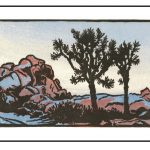
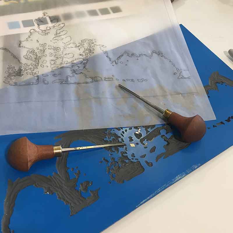
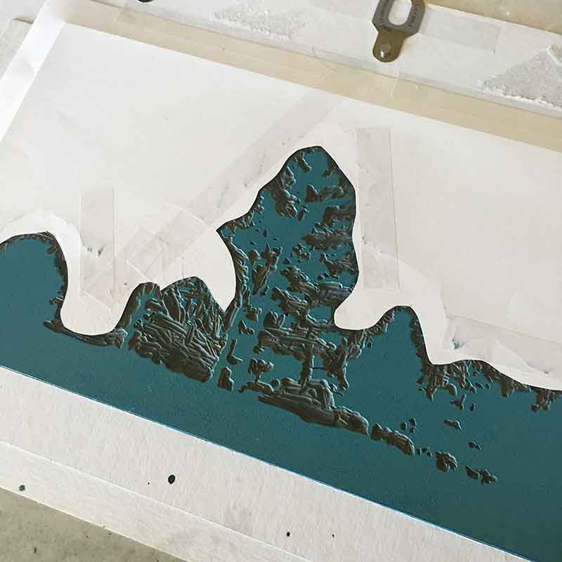
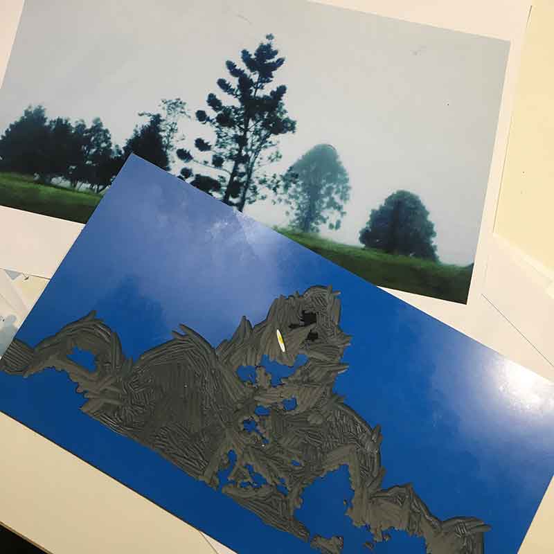
When it came to carving and printing the layers for the trees, I opted NOT to carve or cut away the excess lino block. I have done this before, after printing a solid full-plate background colour, only to experience problems with registration.
So for this print, I carved a wide channel around the trees and used paper masks to protect the printed background from stray print marks from the block.
On one hand, using a mask made handling the block easy and ensured I maintained good registration with subsequent layers. BUT I did manage to ‘print’ plate emboss lines on the print. By the end of the print most of the embossed lines have been smoothed out, and when you look at the print front-on you can’t see the lines.
When I create my masks, I print the layer onto thick cartridge paper, then cut away the area that I want to print. I kept these cut-away bits and plan to make a collage out of them.
I managed to print myself a ‘bonus print’ with this edition too. I printed my blanket! For the layer above I eagerly inked the block, carefully placed it in the registration jig, then mindlessly flipped the blankets over, ran it through the press and ‘revealed’ a lovely blue ink impress on the blanket! It took me a few moments to work out what was wrong with this picture. Poop! Total brain fart. I was a little too lost in the process and not paying proper attention.
Oh well. I can’t undo it, so a few runs back through the press with cartridge paper and I blotted most of the ink off the blanket.
And it was at this time that my Ross River Virus kicked in! Ouch. I knew that fatigue was a major symptom of the virus, but I had no idea that joint pain was a symptom. I went to bed a little achy one night, then awoke the next morning barely able to walk. I had never experienced pain like it. Needless to say I wasn’t able to carve or print until the pain eased up. My carving arm and neck may have thanked me, but it was killing me to see half-finished prints hanging in the drying rack, begging me to get back to them.
My enforced print break last 2 months. 2 very long months. But I was able to keep running my workshops, so the second best thing to actually printing is teaching others how to print; and watching the joy on student’s faces as they learn and understand new art processes.
When I did finally get back to printing, it was with mixed feelings. It felt so good to be back carving and getting my fingers inky again … but I felt disconnected from the print. However, a few layers printed and I was back into the feel of the image. It was a lovely reminder of how much better I feel when I am printing something I want to print, printing an image that resonates with me.
My husband knew how happy I was to be back printing and snuck into the studio to snap the above photo of me. Golly gee whizz it was good to be back.
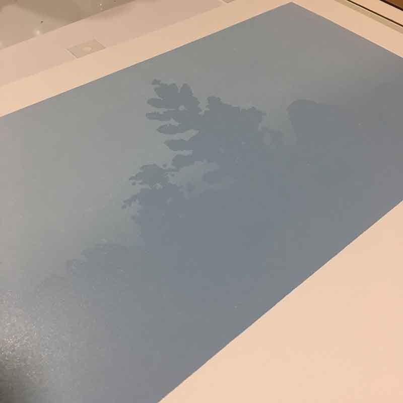
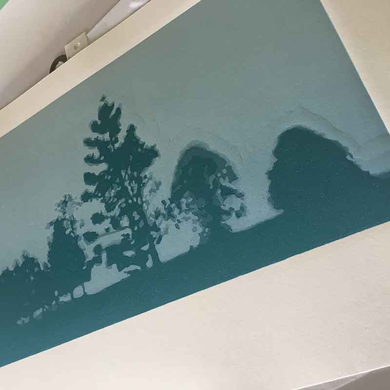
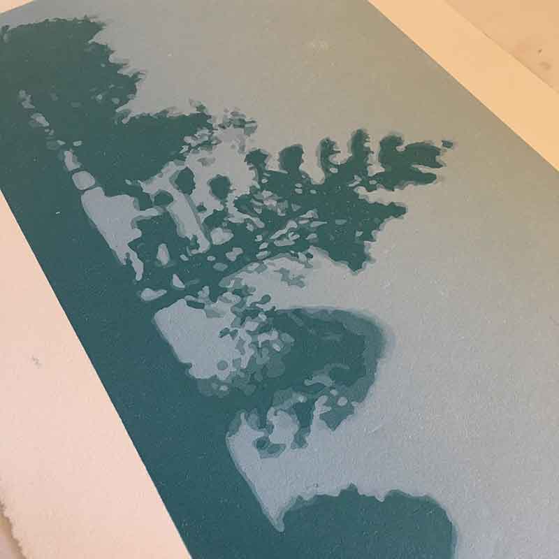
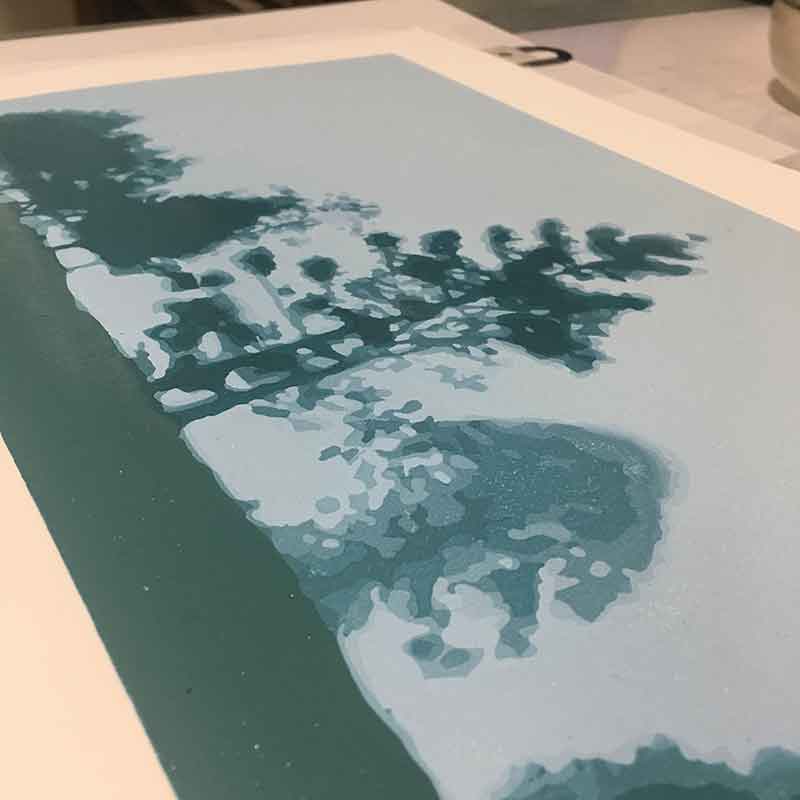
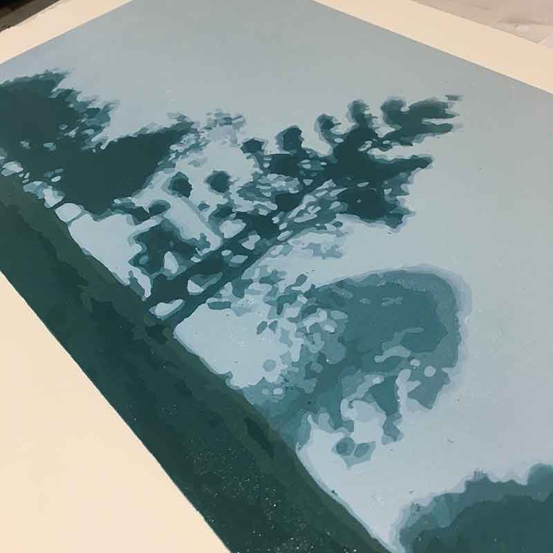
With the above two layers I finished the trees. The subtle colour shifts felt a little laborious at times, but I’m happy with the result.
People are often stunned at the layers I put into my prints. Sometimes asking “Why?”. Fair question, comment and observation.
Why? Because I love the process. It takes a fair amount of patience. Not to mention persistence. And a hellovalot of “trust the process”.
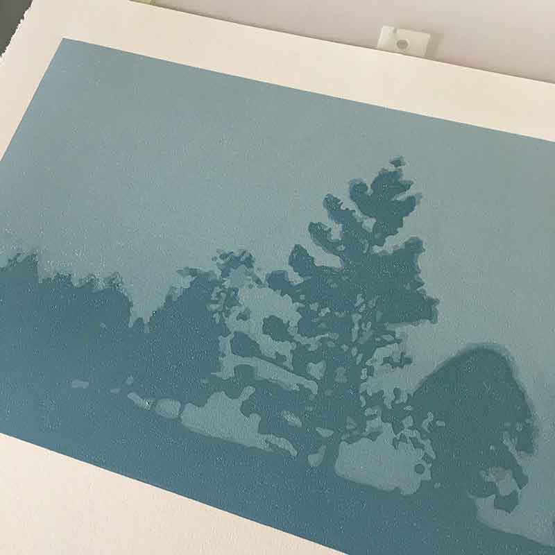
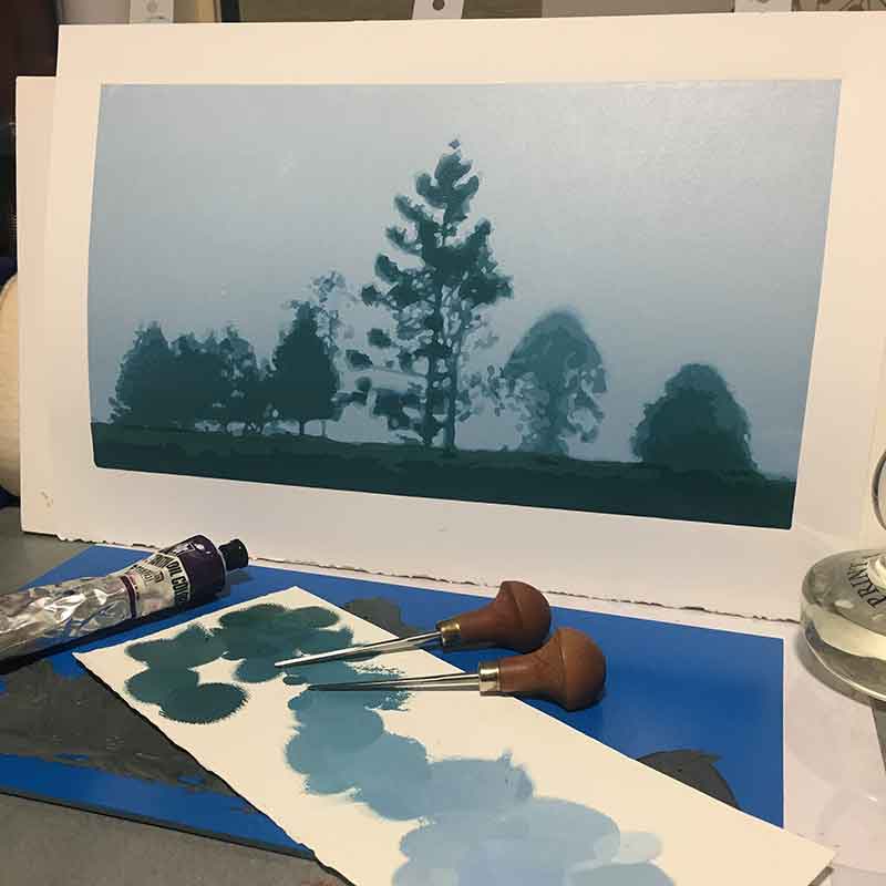
Now, moving on to the foreground paddock area was tricky. I was at a bit of loss for a little while. Do I leave it as it is? Do I print lighter or darker? Do I stay with my blues or bring in a touch more yellow and head toward green?
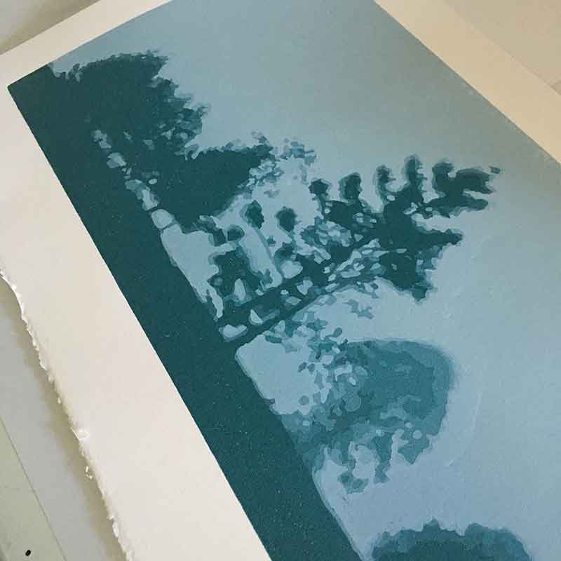
Green it is then!
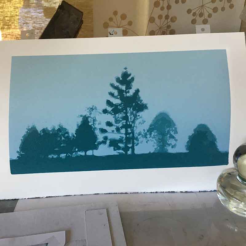
Three layers in the foreground greens and the print is finished.
Now it was time to step away from the completed print for a while … to come back with fresh eyes to see it for what it has come to.
I pick her up from the framers next week. I’m looking forward to seeing her then. Prints look so different when they’re framed.
I’m curious. Does this print resonate with you?

The technical Information
Print process – reductive linoprint
Edition Size – a Limited Edition of 8, plus 1 Artist Proof and 1 Hors de Commerce.
Colours and layers – 14
Inks – Sakura oil based inks. Yummy!
Paper – Stonehenge White. Still my favourite for reductive linoprints.
Size – 38cm x 21cm
Tools – Pfeil carving tools, glass Print Frig barren and my very special ‘The Big Press’ printing press
Interested in buying one? Unframed prints are available on my website. The original print will also be available framed from Montville Art Gallery and Peace of Green Gallery.
Reproduction prints – maybe? I may opt to print a limited edition of archival giclee reproduction prints of this image. I’ll keep you posted.


Beautiful print and great to read about the process. Thanks for sharing the technical details. Just wondering: in the first photo showing the process above it looks as if the under-layer of ink is a strong, royal blue colour. Is this correct? BTW the website link below doesn’t work. Here’s my blog: jennykyngartthoughts . wordpress.com
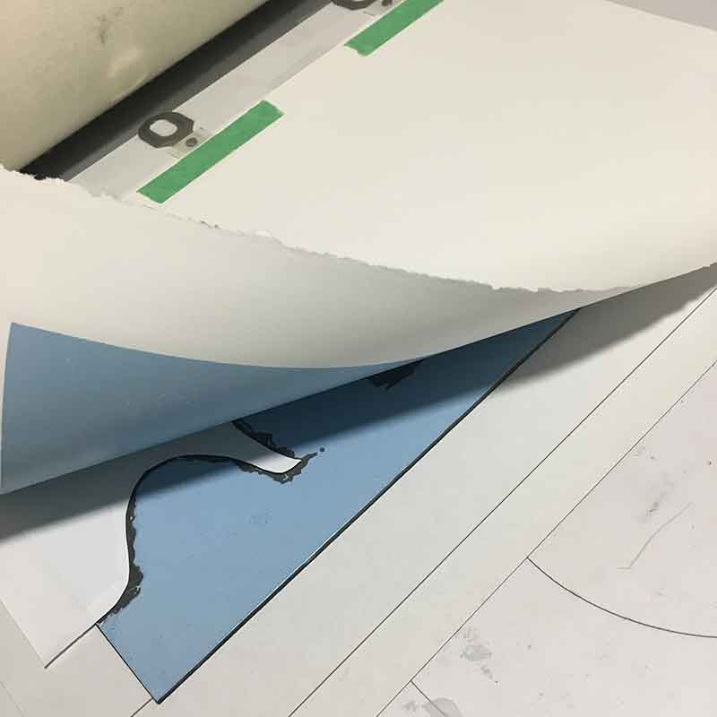
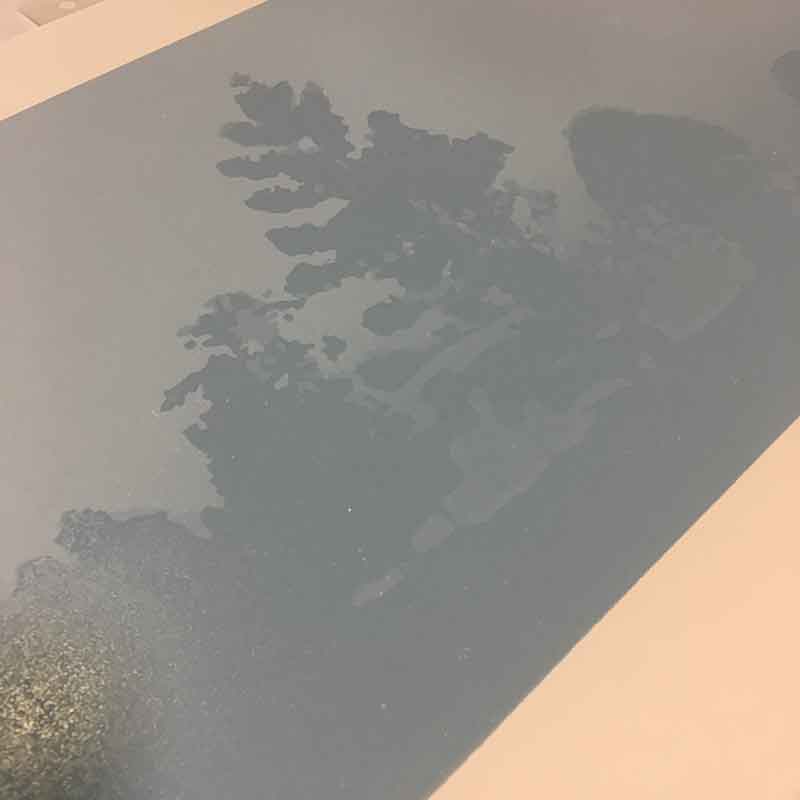
Hi Jenny, thank you 🙂 that first photo is the ‘lino’ block itself – I printed the first layer with no carving on the block. I use the blue/green vinyl as my lino, hence that colour. I miss this print. The edition has sold out, and I’d love to see it again 🙂
I love this piece and I love that you have shown the process. Thank you. It’s so helpful as an emerging printmaker to see a direction you would love to follow!
Thank you Caroline. I love sharing and teaching the craft as much as I love to do it. I’m happy that you found the story useful! Go forth and print!!
Wonderful work and explanations! thank you for sharing on FB. I’ve shared you on my printmaking FB page. You are welcome to check out my website (www.printznetworkaustralia.com)
Hi Cynthia, THANK YOU! I just had a look at your website – some great content in there! I’ve just subscribed to your newsletter and send you a message re joining via your website.
A wonderfully written blog. Extremely descriptive with fine attention to detail.
Thanks Nick (in the interest of full disclosure, Nick is my darling husband). xx
Fabulous print – thanks for sharing!
Thanks Ann!