

Equanimity – PCA Print Exchange 2022
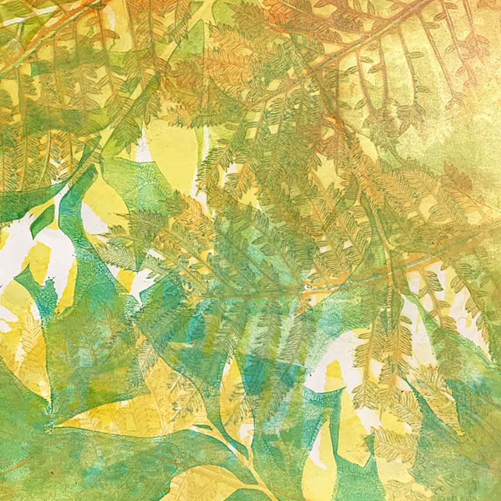
I’m continuing to explore a theme and working with my boat and waves, but with different compositions and layouts. I’m loving de/embossing with layers. The ins and outs, ups and downs. All for the love of print and paper.
I created a series of 3 embossed prints for the Vessel exhibition this month, there is still more for me express on that subject, and I’m loving exploring new process.
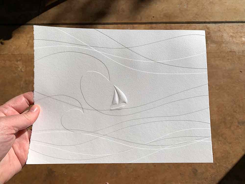
I have created this print, Equanimity, for the Print Council of Australia‘s Print Exchange 2022.
- TITLE – Equanimity
- MEDIUM – Blind embossing
- ARTIST STATEMENT – I’m learning that the safest passage through a storm is to sail with it, remaining calm and composed. The wind will calm and waves will eventually settle. The storm will pass.
Equanimity
Sometimes the title of an artwork is easy, other times not. For some pieces, I know the title while I’m working on it; for others, I know the feelings and sentiment around a piece, but assigning a title is a bit tricky. I especially love one- or two-word titles.
For this piece, I know the emotion and sentiment while I was creating it. The title took some research and thinking, to find the one word that best encapsulated what I was feeling.
That word was “equanimity”.
I specifically like this definition – “calmness and composure, especially in a difficult situation“. You can google the word yourself to see definition variations; but that definition pretty much sums up where I am at with regard to this piece.
Life throws up challenges, and life teaches us how to deal with them. Life experience teaches us lessons, and we (hopefully) gain wisdom from those experiences – I’m learning to use every life experience and lesson I have learned to date to navigate a difficult period of my life. And I am appreciating the opportunity to use my arts practice as a platform to analyse and process thoughts and emotions.
About the Print Exchange
I love this print exchange! It is a biennial event, starting in 2016. I have been contributing since 2018. Participating Print Council of Australia (PCA) members print an edition of 12 prints, and in exchange every participating member receives a random selection of 10 prints. One print from each edition is added to the PCA Archive as a snapshot of contemporary printmaking in 2022, while one other is shown in an online exhibition and fundraising auction for the PCA.
There is something so very exciting about receiving your collection of 10 prints in the mail. Who printed them? What did they print? How? What paper did they use? The processes?
And I love to share the prints with students at my workshops. I have participated in a few print exchanges – all of them exciting and challenging, and a privilege to be a part of. I have also taken part in the Queenscliff Gallery & Workshop print exchanges in the past – they are exciting programs to be involved in. Covid put a halt on their program, so I’m hoping it comes back into play again soon.
Below are the prints I created for the previous PCA print exchanges I participated in …

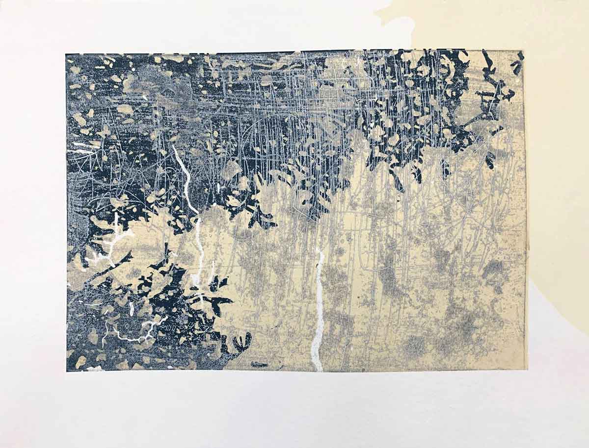
PCA Print Exchange 2020 – In between
- TITLE – In between
- MEDIUM – Linocut chine collé with metal plate etching.
- ARTIST STATEMENT – There is a lot left unsaid in between the lines and the layers.
This was an interesting piece to create. It was me exploring the notion of being in between printing process, looking to combine processes, explore new territory, but without completely walking away from the reduction linocut that I love so much.
I was also when I realised that a print exchange is the perfect platform to explore ideas, process and subject matter.
For this edition I used paper that had been set aside after the first layer was printed from a reduction print edition, but I wasn’t happy with the result. It was paper I started my ‘Come on … come with me’ print for the Kyoto Hanga International Print Exhibition in 2019. The paper was luscious, but too textured for what I wanted for that printed edition. So the sheets sat in a draw waiting for a purpose – and they found it with this ‘In between’ edition. I tore the large sheets to the correct size, then set about printing with them.
The chine collé component is a linocut print on antique Japanese ledger paper. I keep ALL of my reduction linocut blocks (I’m so emotionally attached to them after the work that goes into them); and I like to use components of them in other prints. I use the block that was left from my ‘Out for the day‘ reduction linocut print, printing it onto the Japanese paper. You can see worm-eaten holes in the paper. It is wafer thin but as strong as chain metal. Beautiful to feel and fabulous to print on.
I then etched a metal plate and inked white, printing over the Japanese paper and applying to the printing paper in the one pass through my press. The image on the metal plate is an abstract representation of what was going on in my mind at the time – all the conflict, confusion, questioning, frustration and experimentation that comes when you feel the in between space.

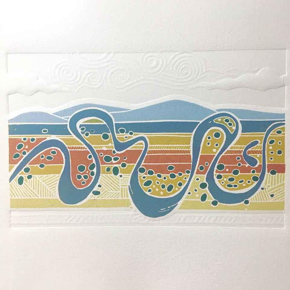
PCA Print Exchange 2018 – Dreaming of days to come
TITLE – Dreaming of days to come
MEDIUM – Reduction linocut with blind embossing. 6 colours printed over 5 layers, with blind embossing, with a total of 3 lino plates
ARTIST STATEMENT – Meandering liquid relief saturates a parched landscape and brings to life the land and love of a beloved ‘sunburnt country’.
With the rains on the east coast over the past few years, its almost impossible to remember the years of dry and drought that preceded the wet and floods of now. But this piece does remind me of how dry it got, how the farmers were desperate for rain, how the coastal towns were drying, and how the rainforests around where I live were drying to the point of fire a year later.
This artwork was the memory, fantasy almost, of abundant water and healthy fresh growth. Printing it created an opportunity for me to explore a love of aerial viewpoints, a river ‘scribble’ I love to draw, and some new ideas around my reduction linocut process and combining embossing with the print. Reflecting back on this piece now, I think I need to spend more time with it. I had forgotten how much I love this image. I can feel some new work coming on ?

