

The Trials and Tribulations of reduction linoprinting
Lino printing is, in its own right, a relatively simple form of relief printmaking. Reduction linoprinting is a little more complex, but can also be quite simple once you understand the basics.
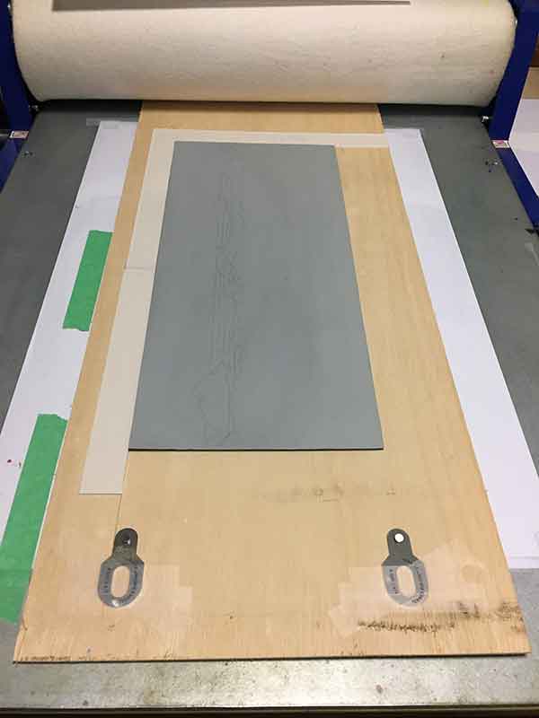
I however, have a tendency to make this simple process complicated with a lot of detail and many layers. I started work on a new reduction linoprint several weeks ago. 6 colours have been printed and it looks like there will be 16 +/- layers by the time the edition is printed.
Given the number of layers, and the fact that I am filling the image whole area with ink (as opposed to leaving a lot of white space), I have tried to reduce the layers of ink in any one area of the image. And now I feel stuck!
The subject
My backyard! I live in Maleny, a small town situated in the Sunshine Coast Hinterland, overlooking the iconic Glass House Mountains. I have lived here for a little while now, and hope I never grow tired of the view. This winter we had several weeks of low fog that sat around the base of the mountains. The fog hung low like a rolling sea, covering farmland and pine forests. It was lovely site each morning. I snapped a photo from one of my favourite vantage points, Howells Knob Lookout at Reeseville.
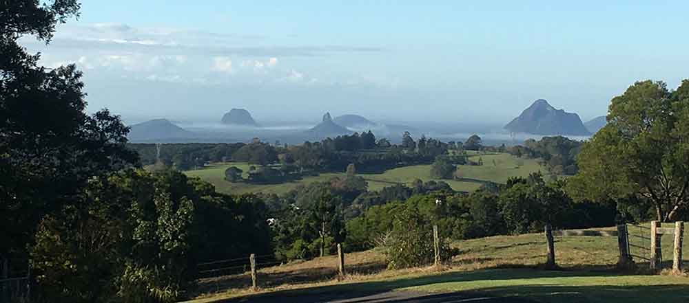
I love this view. I love this photo. It screamed REDUCTION LINOPRINT at me. And it presented a unique challenge – how to create the depth of distance in a reductive linoprint, retaining detail without overdoing it.
While I haven’t settled on the final colour count, I have decide there are 3 distinct ‘visual’ layers in this image. Each visual layer will let me play with colour to create the feeling of distance.
- the Background – the sky and Glass House Mountains on the Sunshine Coast
- the Middleground – the dairy cow grazing paddocks
- the Foreground – the paddocks surrounding the lookout
I’m not yet half way, and I’ve hit a few hurdles, but here is where I am at …
First Visual Layer – the Background
With each new print I set myself the challenge of extending myself and trying new techniques or approaches to my work. These challenges may not be great, but by extending myself even a little, I’m improving my skill set and, hopefully, my work.
So I started out easy enough. The carving was easy, but I had real issues with the ink. I struggled to get a thin layer. The ink was thick and tacky. I had bought a bottle of Burnt Plate Oil months ago, but been a too nervous to use it. Burnt Plate Oils are used to lower the viscosity of ink. I decided to give a go on this print and who would have thunk it … it worked! It thinned the ink to a delicious consistency. Not too thick, not too thin.
My 1st hurdle…
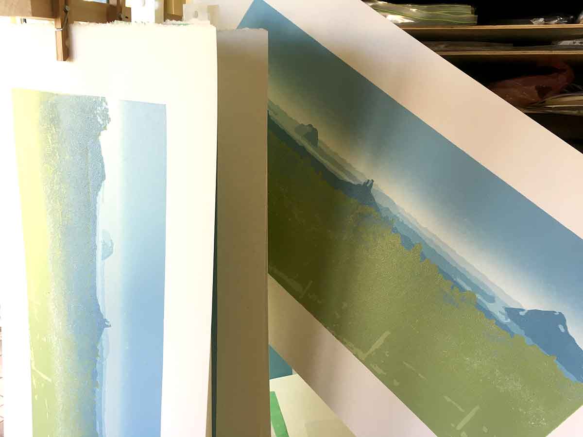
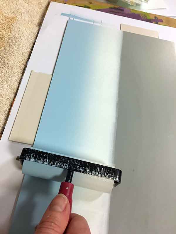
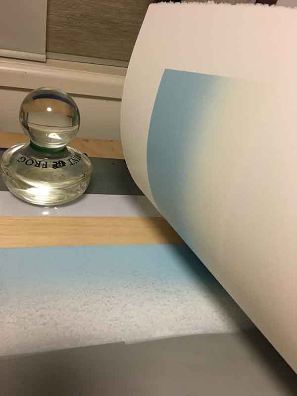
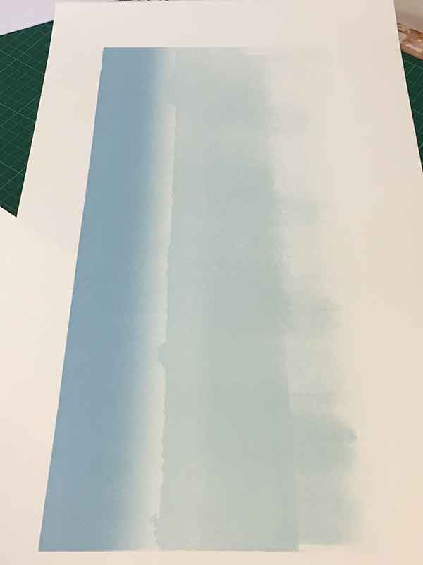
First I tackled the morning sky. I started with a graduation of white to a light blue across the top of the image for the distant horizon and sky. Easy enough. I still get a kick out of the graduated blends. They add a lovely dimension to a potentially flat image. My colouring is a little more dramatic than my photo reference, so fingers crossed it looks ok when the print is complete. I’m still learning with these blends. It took me a few prints to work out exactly where on the plate I needed to start to roll the ink to get the blend in the right spot. It sounds s0 easy, but not so easy when actually printing!
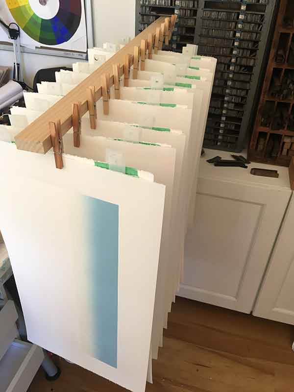
I was aiming for an edition of 20 prints, so I prepared paper for 24. I’ve lost maybe 4-6 sheets already. Oh well, I must go on …
My 2nd hurdle …
On ALL prints, I started the sky-horizon blend too low on the block, so I had to increase the height of my print area to give me enough room for the foreground and middle-ground. As a result there is now a crease in the paper that sits about 1cm up from the base of the (adjusted) image area. Hmm. I wonder how that is going to handle itself as I print more layers? Fingers crossed the crease will disappear under the ink as the print evolves.

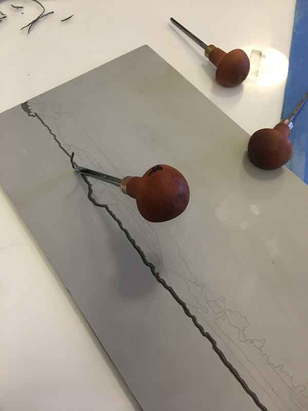
Once the sky was down I was ready to carve and ink the mountains and farmlands. I cut the sky area away from the block as didn’t need it for registration. Removing it completely will ensure that I keep that area of the print clean. I decided to print mountain background with a monochrome blue palette, using the same prussian blue and white as the sky, just adjusting the colour mix.
My 3rd hurdle …
While craving and printing the Glass House Mountains, I accidentally carved colours 2 and 3 together, so I had to rework my colours a little to keep the depth as I wanted it. Us printmakers are a pretty resourceful bunch, and I think we’re pretty good at troubleshooting the technical issues that arise in printmaking, but it doesn’t necessarily make it any easier when we do discover a mistake.
Reduction linoprinting is appropriately nicknamed the “suicide method”, and for good reason. Are you carve layers on your block, permanently ‘reducing’ the block, it can be almost impossible to correct a mistake when you have carved away an area you’re weren’t supposed to. Same goes for when you forget to carve an area, and realise it only after you have printed. I have done both in nearly every print I have made. I am pretty annoyed with myself for carving colours 2 and 3 together, but I must still go on.
Once I finished these layers, I realised that I had forgotten to print one layer on 2x of the prints – so now I’ve lost 6-8 prints for this edition. Yikes its getting smaller!
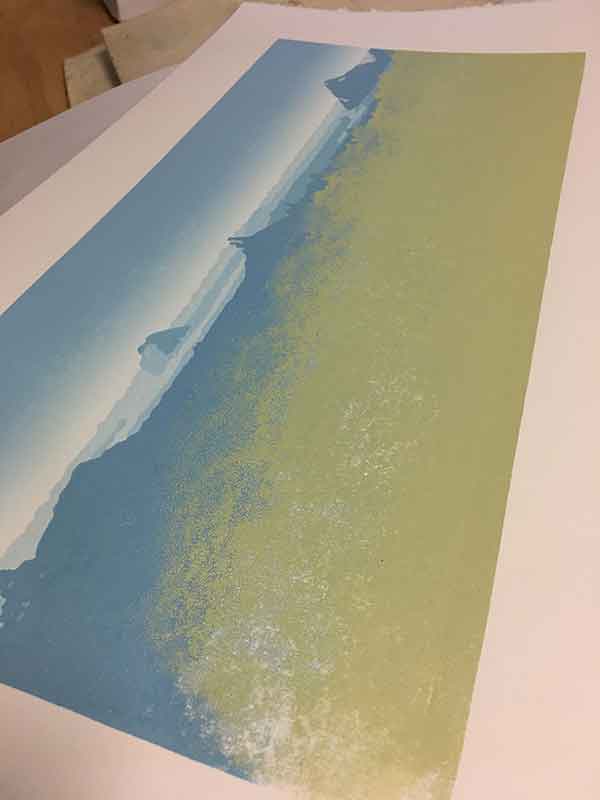
In an effort to keep the layers of ink on the paper as light as possible, I inked only the area of the plate that needed the colour, as opposed to the whole plate. For this background area, it meant keeping the ink rolled across the top of the plate only. I am realising through, that by doing this, I may have created another problem.
That was my 4th hurdle. I think I’ll stop counting the hurdles now!
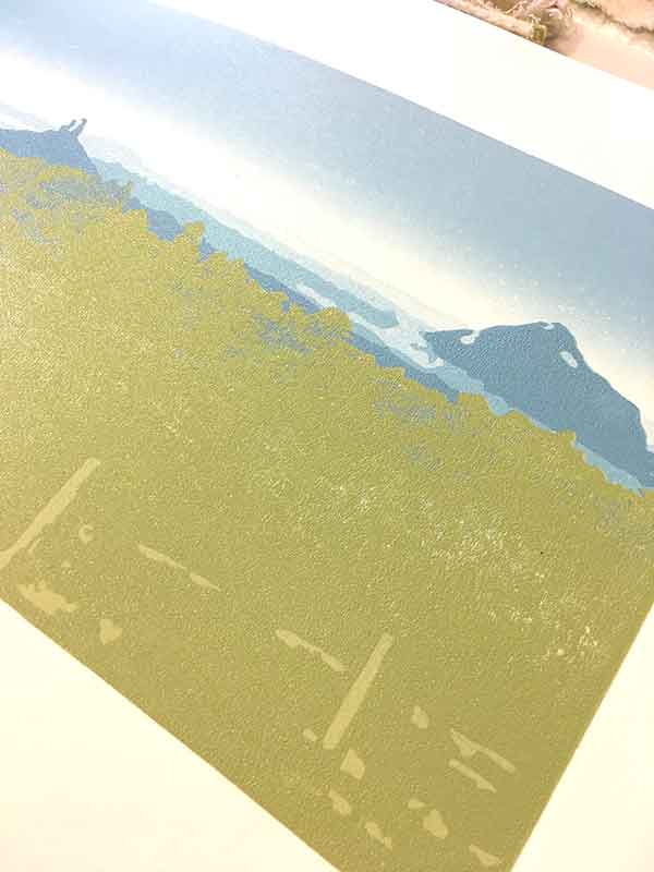
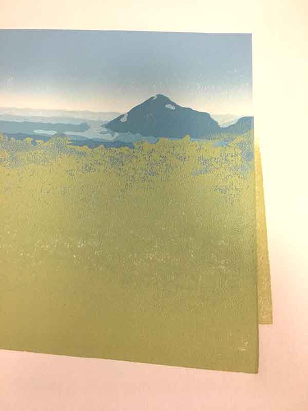
2nd Visual layer – the Middleground
This layer will come into its own after I tackle the highlight colours of the foreground. I try to work with my colour layers light to dark. The middle-ground colouring will be a duotone area with hazy blues and greens, but I don’t want these colours to muddy the brighter foreground colours. So we’ll jump to the Foreground layer, and I’ll come back to this layer when the print has finished, and in another post.
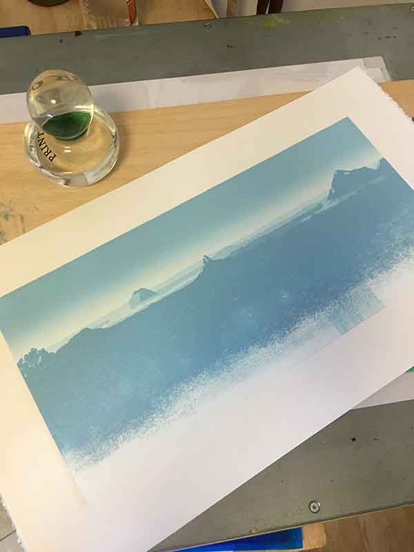
3rd Visual layer – the Foreground
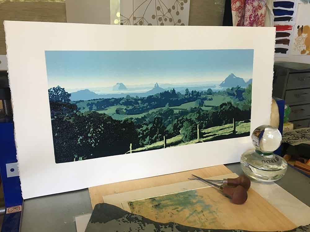
So this is where I am now. 2 greens down. Another 1 or 2 to go, then I’m up into the middleground. And it is here that I have encountered my issues with only inking part of the plate when I printed the blues for the mountains. I have inadvertently added too much ink to the paper in patches, so the ink in this layer isn’t transferring evenly on the paper. It makes sense now that this would happen, but I didn’t think that far ahead when I was printing the earlier colours. More learnings!
I’ve lost count, but maybe now I’m up to my 6th hurdle … I’m having trouble with registration. When I increased the depth of print image, I had to adjust the registration setup I created for this print. As a result of doing that, I created another problem where I am having to manually adjust the placement of my plate, by eye, to compensate for movement within the registration setup.
For registration I use the Ternes-Burton registration pins, specifically the Round 1/4″ pins. They are a great tool for reduction linoprinting registration. The work to ensure the paper places over the block in the same spot with each layer – assuming the block is in the exact same position after each inking. However, I am getting nearly 1mm shift on one side of the print. Argh! That isn’t the fault of the pins. Rather it is the fault of the printmaker and some fundamental errors made while in the early stages of this print.
But, the show must still go on and I will persevere.
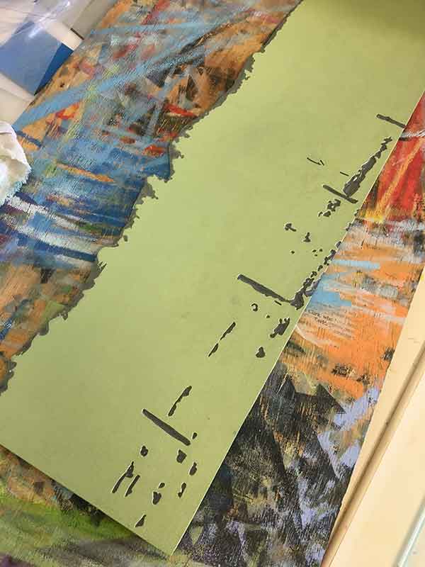
I have rolled two passes of the one ink layer for some prints as the different thickness of ink from previous layer is making it difficult for the ink to transfer nicely. That is another printing element fraught with risk and danger … and yes, I did drop one so have a very obvious misregistered green on 1 print, and some I’m not too sure about on a few other sheets. I’m thinking now that my edition size could be down to 12. Fingers crossed I don’t lose any more; but there are still quite a few colours to go.
Ah the trials and tribulations of reduction linoprinting! So this is where I am up to now. All things being equal I’ll get another layer carved and printed tomorrow. I’ll write another post when the print is done. I’m nervous about this one, but I won’t give up on it. With every print I learn more, only this one might teach me a little more than some of my other prints.
Happy printing!
UPDATE 7 OCTOBER…
FINISHED! I finished this print 3 days ago. The ink has dried and I have editioned the print. There were more lessons to learn, more careless errors and some triumphant accomplishments. I have compiled the print’s progression in images too. Click here to see the final stages.
And below is the finished print….


Great article! as a tip I found this Convert image to duotone tool very useful https://mate.tools/convert-image-to-duotone 🙂
Hi Nicole, great tip, thanks. I’ll check it out. cheers, Kim
Your work is very impressive. Thank you for sharing details on your process. I’m new to relief printing and am eager to attempt a complicated landscape myself. You’ve given me a head start.
I also use the Ternes-Burton stainless steel registration posts and mylar tabs! Solved my registration problems completely.
Would love to be in touch via email to share notes.
Cheers,
peter
Hi Peter, I’m glad you found my article useful. I love the process, but it definitely presents challenges! Did you see the article I wrote where I talked through the final stages of the print ‘Glass House’ Reductive Linoprint. I’m not sure if you have seen them, but I have a few other articles of landscape linocut prints done this year that you may also find interested – After the Rain – a new Reductive Linoprint and ‘Beerwah Rising’ Reduction Linoprint. In there I talk about some of my work-arounds for problems – including a solution that came from the problems I had with this print.