

Ruffled Feathers … A new reduction linoprint
Finished … my latest piece is an 11 colour reduction linoprint, referenced from a photo I took years ago.
This sulphur crested cockatoo was hanging about in the Sydney Botanical Gardens with his flock over 10 years ago. Watching them play and interact with each other was a joy and pleasure. They ooze character. This fella was sitting high up on a palm tree frond and caught in the wind. For a moment I think we caught each others eye.
I thoroughly enjoyed printing my cockatoo. With each print my confidence improves, as do my printmaking skills.
With this reduction linoprint, I remembered to document each colour layer as I printed. Below is a short video showing the progression of layers, revealing the final image. My photography skills a little more practise, to get a consistent ‘paper white’ between layers, but you’ll get the idea of each colour and layer in the video.
Trust The Process
For me the printmaking journey is one of trust. Working on this reduction linoprint was no different. This was especially evident for me when it came to mixing colours. Trusting that each colour would work with the other was nerve wracking. Trusting that the carved areas would match and register as anticipated was testing. I tend to start quite confidently, then as the final layers emerge, the nerves kick in. The mantra “Trust The Process” was on repeat in my head.
Using my Ternes Burton registration pins for this print ended up making for simple and near-perfect registration. I did have trouble on the final black, but all other colours registered perfectly. With the black, I think the ink was too slippery. It is only noticeable in the palm fronds, so I can live with it.
Managing colour
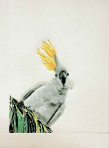 I wanted a very clean and bright yellow for his crowning crest feathers, so I masked off the crest feathers until I was ready to print the yellow in the 8th pass. By using thin but sturdy plastic for the mask, I was able to tape it to my registration sheet, therefore making it easy to maintain a consistent mask through the whole edition. The plastic I used was cut from a plastic sleeve used in ring binders. Thin enough not to impact my print, yet thin enough to survive the rigors of the printed edition.
I wanted yellow in the palm fronds, and this was my first attempt at printing light over dark colours. By mixing a fair bit of titanium white into the yellow, I was able to produce a pretty opaque yellow. However, I did still print a 2nd pass of the yellow in the palm frond area.
For the darker yellow in crest feathers, I printed that in the same pass as the green.
With the yellow and green – he really came to life.
Printing the black pulled the whole print together, giving depth to the eyes and beak.
Fixing a carving error
At the very beginning of the carving I accidentally carved a small area the I shouldn’t have. It was a small patch of feathers that showed as paper, but should have printed as a shadow-white. Oops! Printmakers are a resourceful lot, so with the black pass I created a small block to fill the unwanted white with left over darker feather colour. Phew! I could call this a ‘multi-block reduction linoprint’, but I’ll stick with a simple ‘reduction linoprint’.
My problem now is with the black. I am still waiting for it to dry after 4 days, even though it is only in a small area. I’m very keen to get him framed and on the wall. Now to patiently wait another few days!
Post addition April 2017…
Once signed, editioned and framed, I was very happy with how this print came up. So much so that I even printed him up in a greeting card. Printing my own greeting cards is something I have wanted to do since I was a child.
If you are interested in purchasing this print click here. As a greetings cards, you can purchase them either individually or in packs of 5 or 10.


