

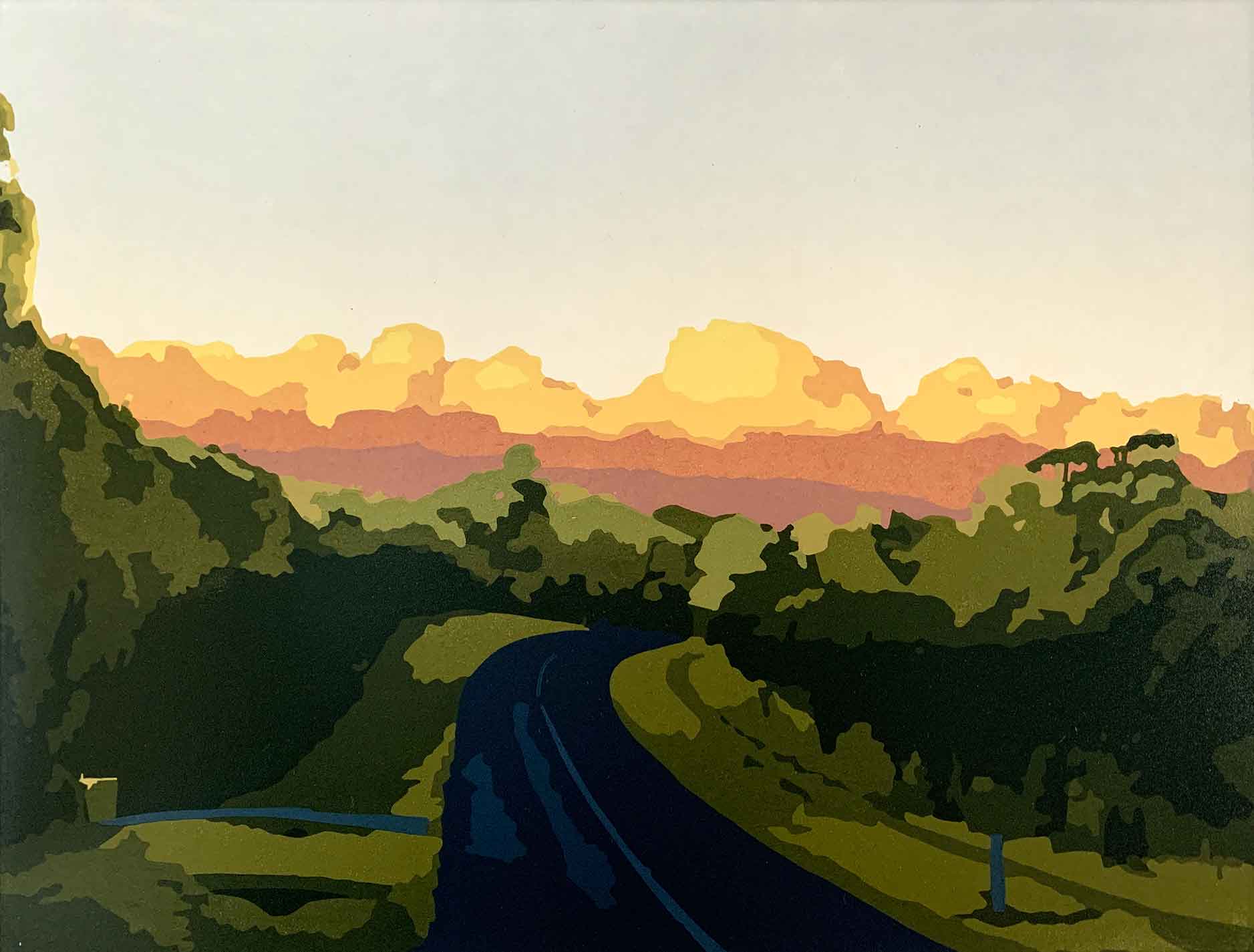
Kavieng – a new Reduction Linocut

In the grand scheme of time, our international COVID travel shutdown has been very short. But the memories seem so far away. I was mad-keen to escape the unpleasant news cycle of now, so I dove into my travel photos. I needed to escape to moments and memories of the distant beautiful places I have had the privilege to visit.
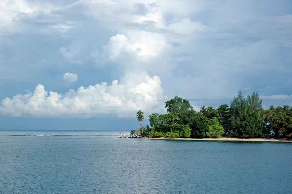
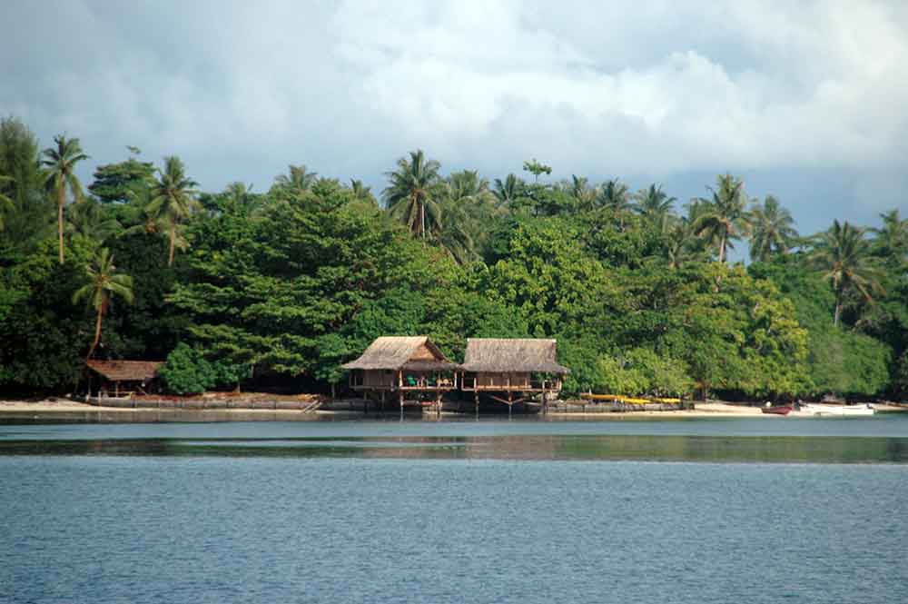
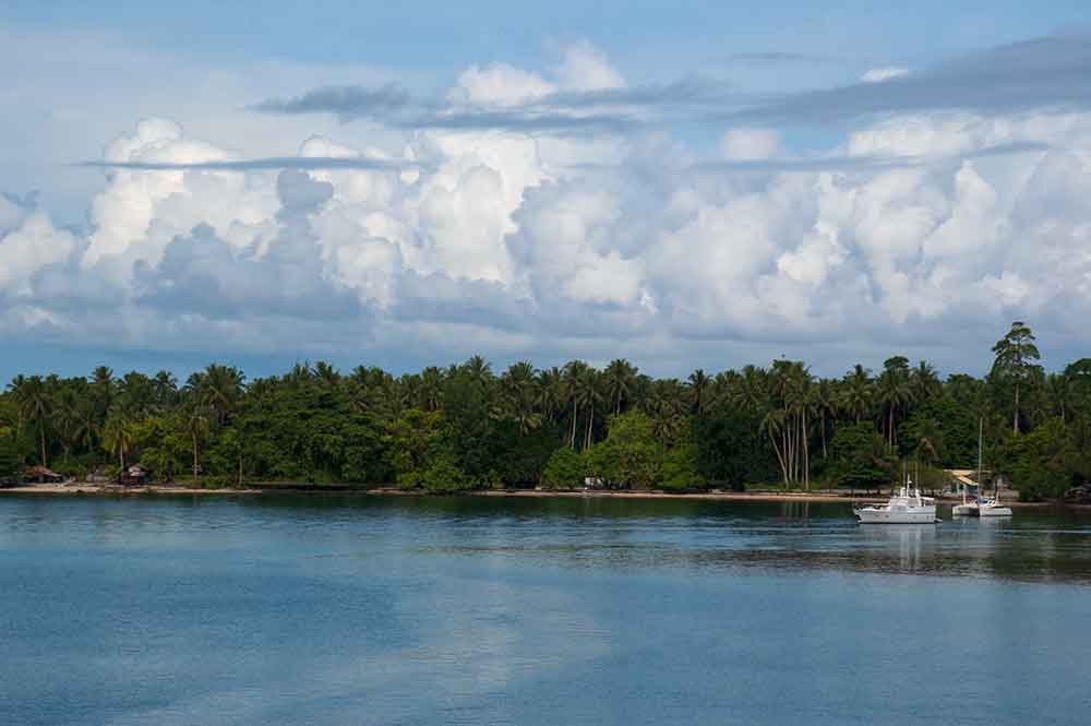
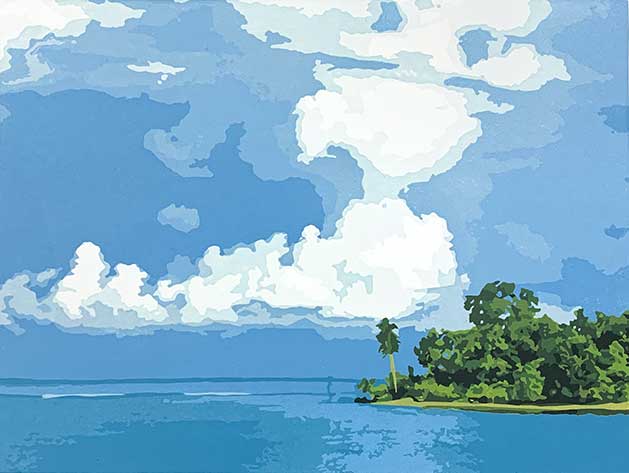
I found myself for a few lingering moments back in 2006 in Kavieng, approximately 2700km directly north of my home. Kavieng is the capital of the Papua New Guinean island province of New Ireland, up on the northern tip of the island. New Ireland sits just above the island province of New Britain. And both islands sit just east of mainland Papua New Guinea. Kavieng is beautiful. It was everything I fantasized a remote tropical island would look like. Smell like. Feel like. The air was salty. The water was warm. The people were beautiful and welcoming. And the humidity was almost intolerable – but I suffered through it.
When disappearing into my PNG photos I found one special image I had flagged to use as reference for a linocut print – so that is what I did!

The Process and Layers
My The long way home reduction linocut was my first print exploring a fascination with clouds. I have soooo many reference photos of clouds. Big fluffy cumulus clouds. So dense that look like you could walk and bounce along over them.
I was looking forward to tackling the fluffy clouds of this image … that warm tropical storm starting to bubble and brew in the sky.
When working on my prints I waver from deep thoughts of the moments and time attached to the photographed image and tackling the technical process and production of the printed image. Just one of the many aspects of this process that I love – and this print was no exception.
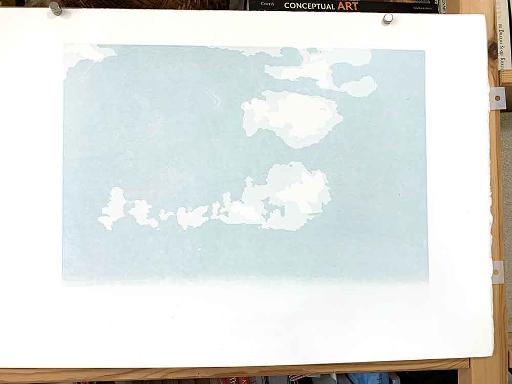
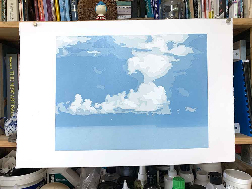
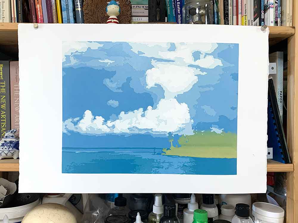
Layers 1–6 – the sky and clouds

The first layer down was an all-over flat just-off-white highlight for the clouds. The lightest colour in the clouds is a printed colour, not carved white to reveal the paper colour. On reflection, I think that would have been an easier way to go as there is very little difference between the paper and that first colour.
The first few colours are very subtle. It is hard to see the difference between the first two colours and layers in my photos. Much easier to see with real eyes.
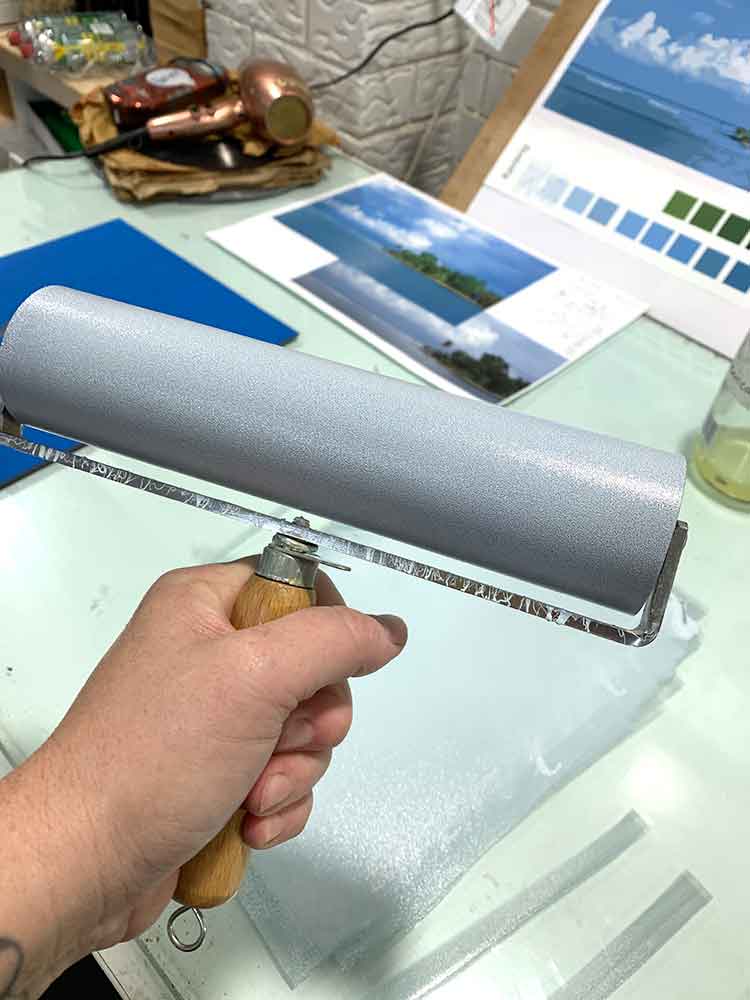
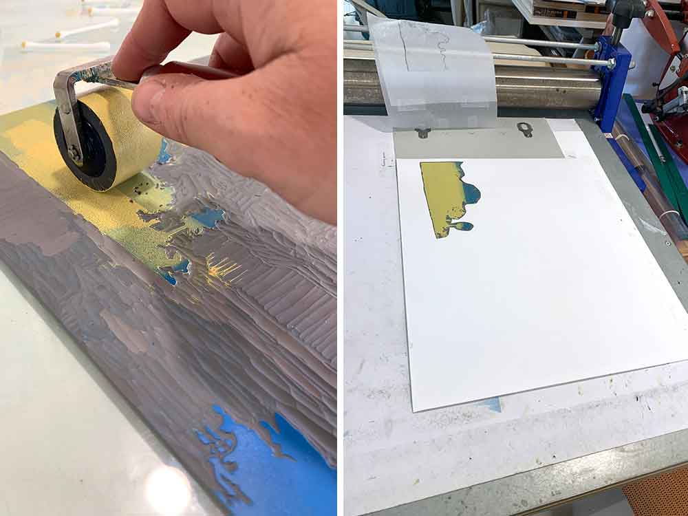
The second layer was printed to frame the cloud’s highlight as I cut away the first layer’s critical shapes from the linocut block. Given that I was inking most of the block, the big brayer came out to play! I don’t use this gal very often. I find her hard work on my wrist,. But I did find my mojo with some creative holding of the handle to manage its weight and the repetitive motion of rolling the ink.
And then on the second layer I encountered my first big problem. There is always something in a reduction print!
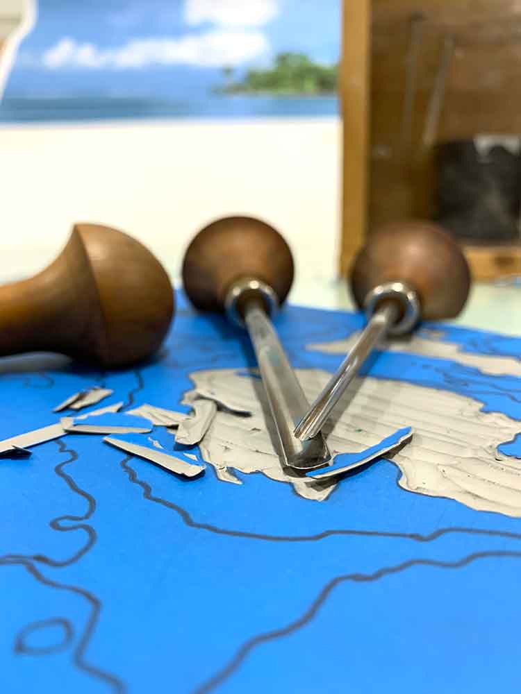
There were two spots on the lino block with imperfections that were translating to the printed result. I use the Japanese vinyl for my ‘lino’. There is a thin layer of vinyl over (what I think is) a recycled core. On this block there was something stuck between the thin vinyl outer layer and inner core in two places. Being the tenacious yet stubborn printmaker I am, I kept going – determined that it wasn’t going to cause problems.
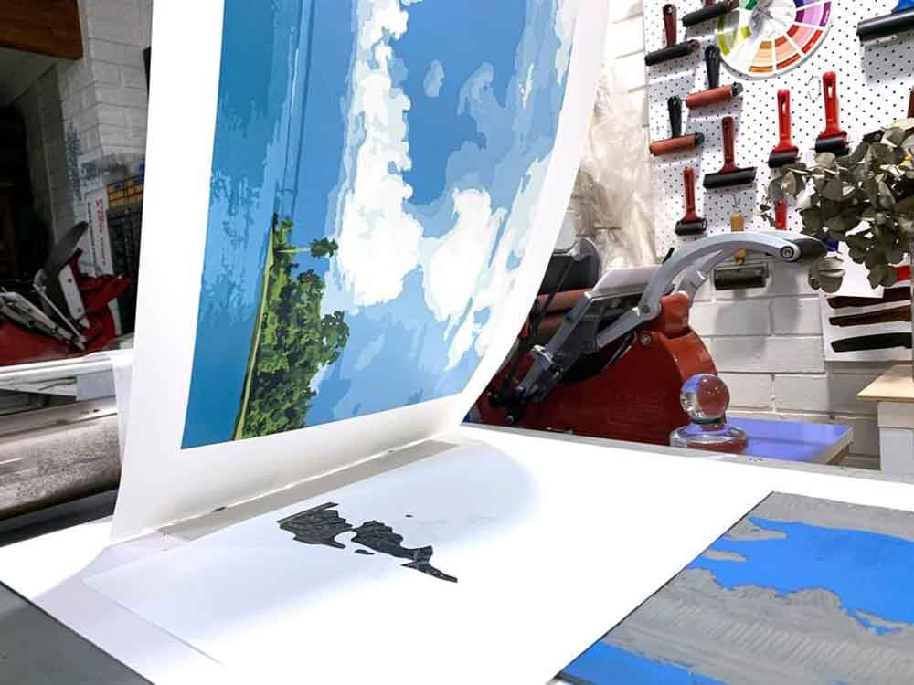
However … if you look at the picture for layer 3 below, you will see that it was causing problems.
Hmmm! It took a few layers before I could carve it out. I have mixed feelings about it being there. I’m yet to edition the print so yet to see how many prints I don’t mind seeing it in. If nothing else, it is the mark of a hand printed reduction linocut print 🙂

Layers 4, 5 and 6 progressed smoothly enough. I say “smoothy enough” because there are always challenges along the way.
After I printed layer 5 I noticed one small teeny-weeny hiccup … I forgot to carve something back in layer 3. Poop! I had forgotten to carve the white highlights of the shallow waves over the reef, just to the left of the island’s point.
Problem solved – I printed two colours for layer 6, with one of those colours being a white for the waves and the other the blue for the clouds.
Layers 1 through 6 were all about the sky and clouds – and those waves I almost-but-not-quite forgot! Now I was ready to move on to the water.
I swam in that water – it was beautiful. The ocean needs to be close to bath water for me to swim in it – and up there it is! Maybe edging a little too warm, but I wasn’t complaining. It was cooler than the outside air and made the humidity tolerable.
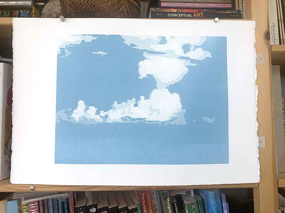
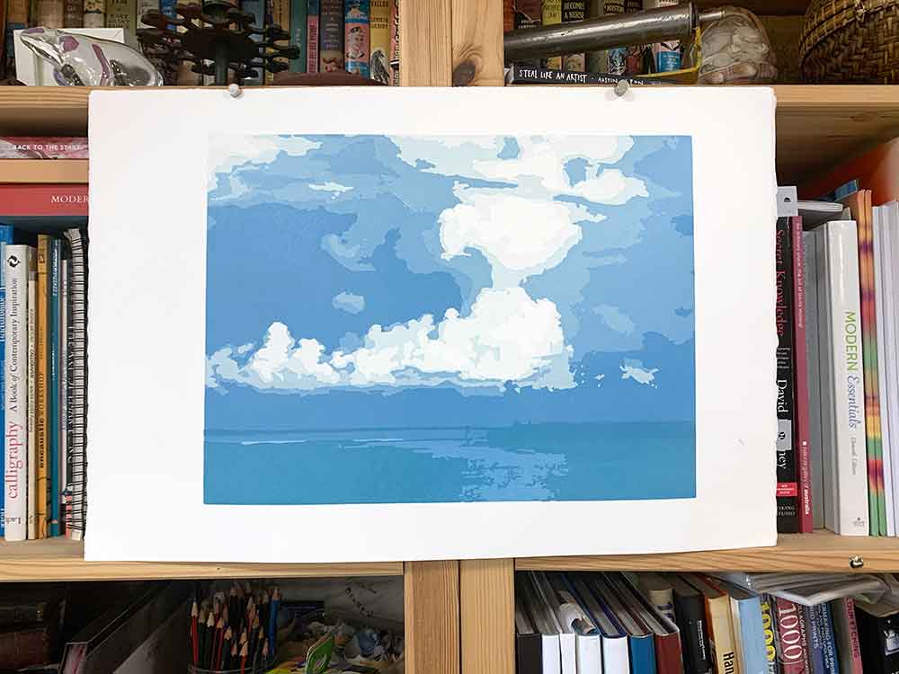
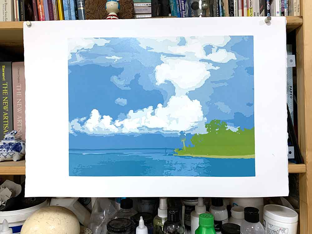
Layers 7-9 – the water
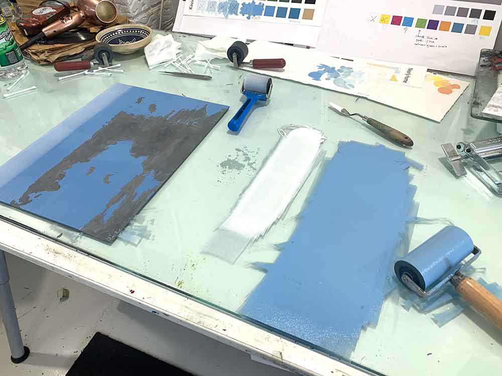
Layer 7 was the final layer for the sky and the beginning of separating the foreground water. I was enjoying mixing my blues. I do love blue.
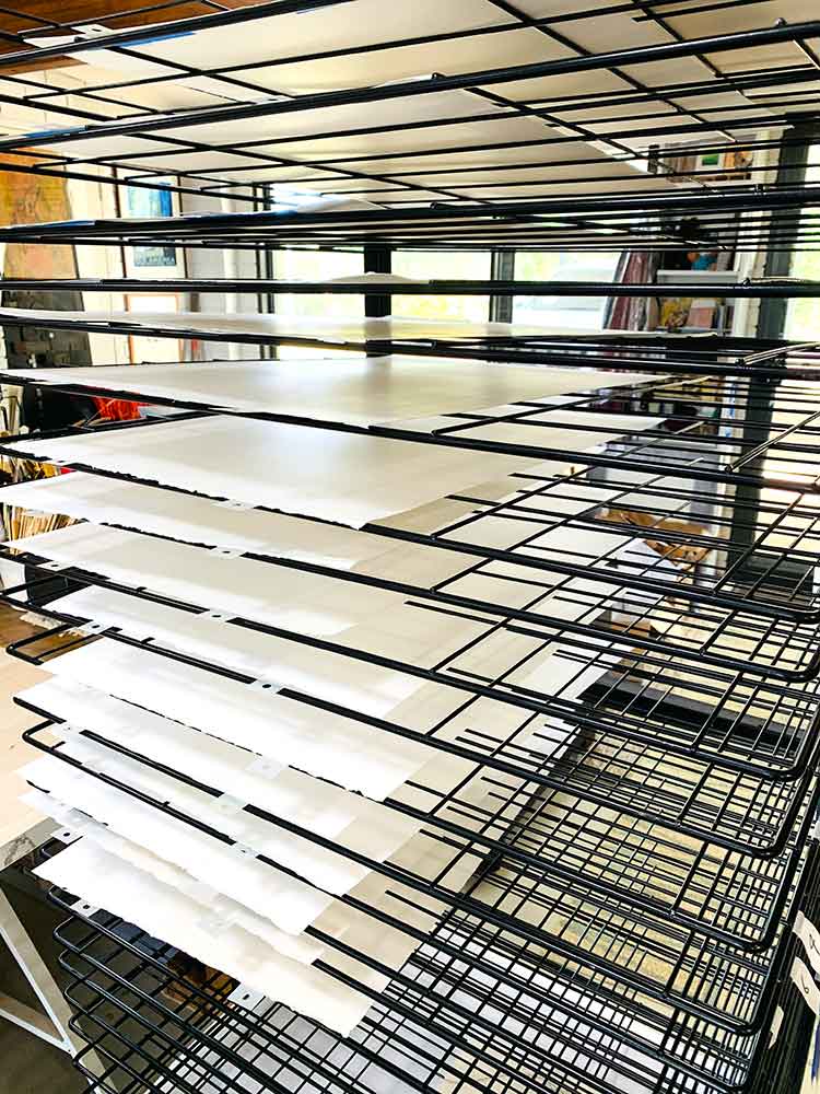
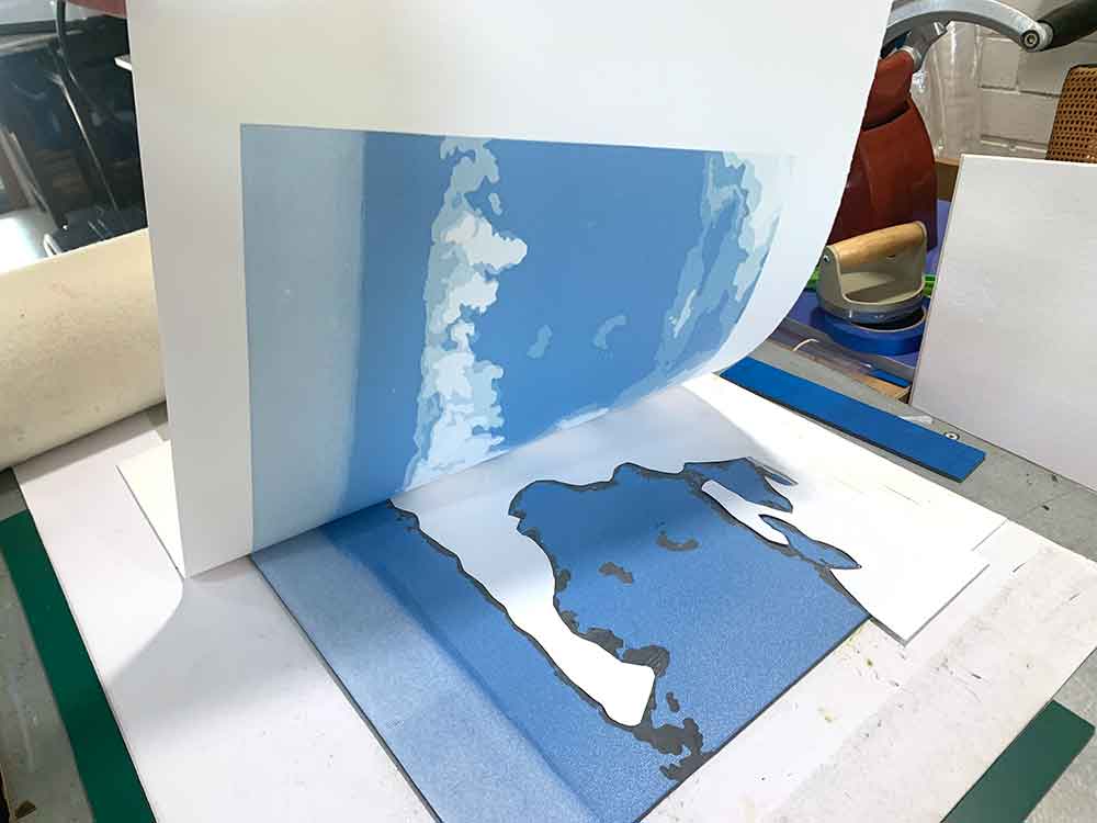
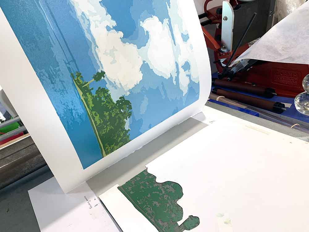
I was using paper masks on the lino block for most layers of this print. The masks worked to stop unwanted ink transferring to the paper – but also reducing the risk of emboss marks on the print itself if I burnish a little too hard off the raised relief areas of the lino block.
I had managed to run the first 6/7 layers through my press, but I hand burnished with my trusty Print Frog baren for the the remaining 9/10 layers.
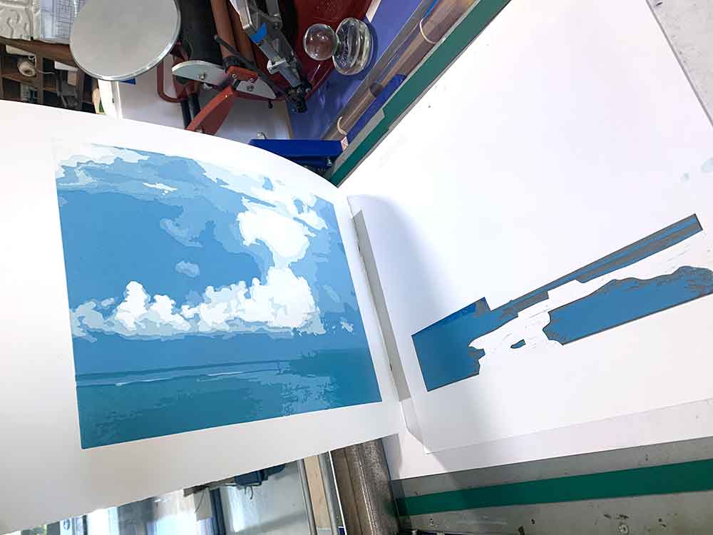
Layers 10-16 – the island
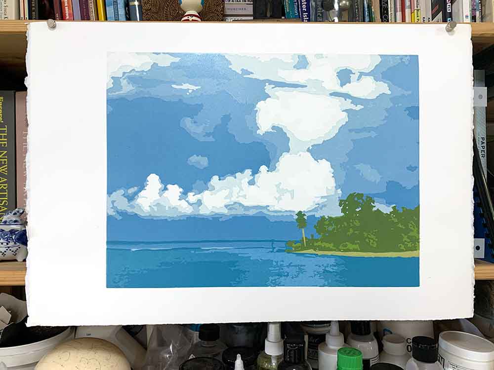
I am envious of linocut printmakers who are working with opaque inks. I have not found inks opaque enough to add a light colour over contrasting darker colour without the previous colour interfering with the next. My work-around is to print the one layer in question twice. I printed it first in a green/yellow. I admit that it printed up a little greener than I was expecting, but that’s what happens when you print yellow over blue!
So for layer 11 I printed the block again, no carving, with a brighter yellow for the sandy beach on the island.
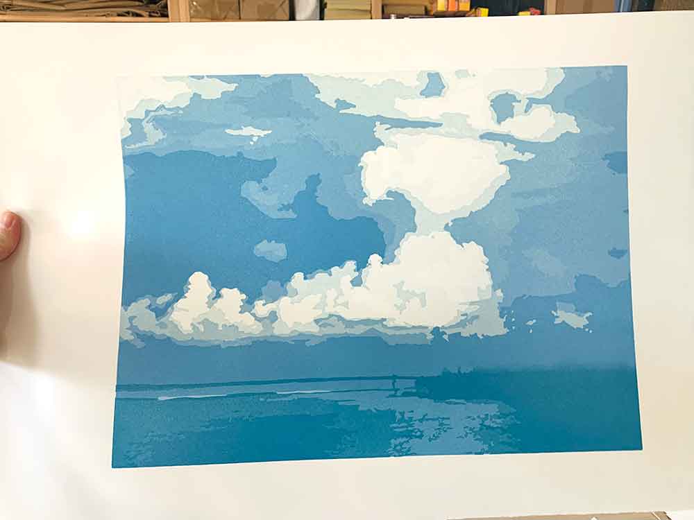
This is where I started getting excited … I knew that with each layer of the island, the print was finding its own voice. As I carved then printed each layer, adding shadow and depth into the island, I felt like I was escaping into her. A grand island adventure.
Printing the final two layers was fun, but also a mixed blessing. I admit I feel relief that the print is finished. But I then miss them when they are done.
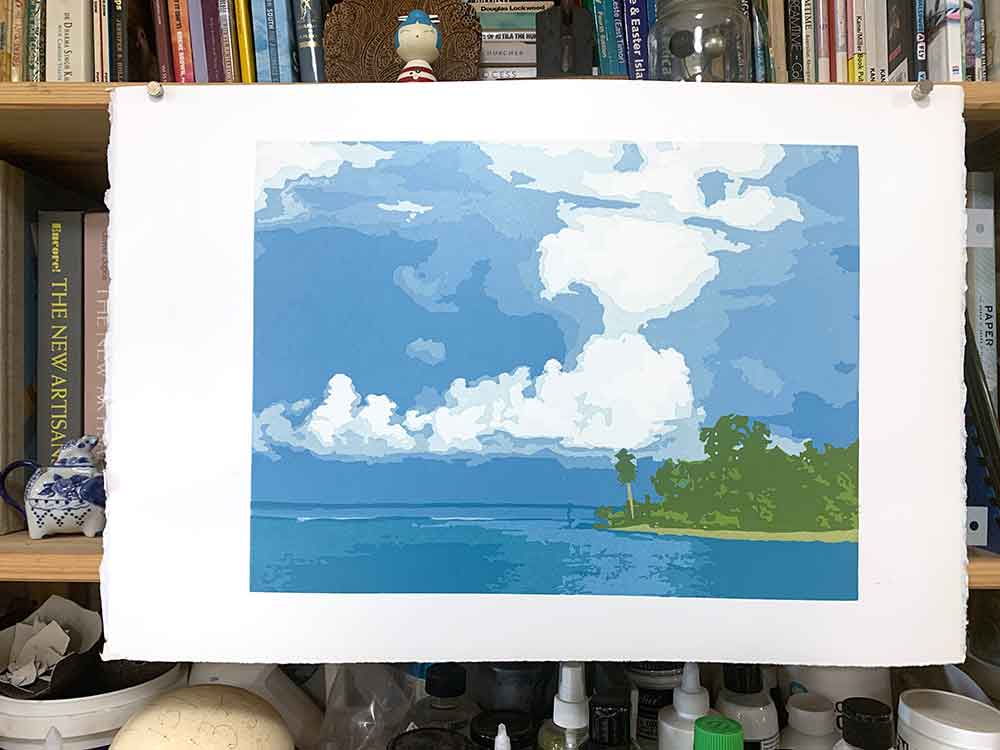
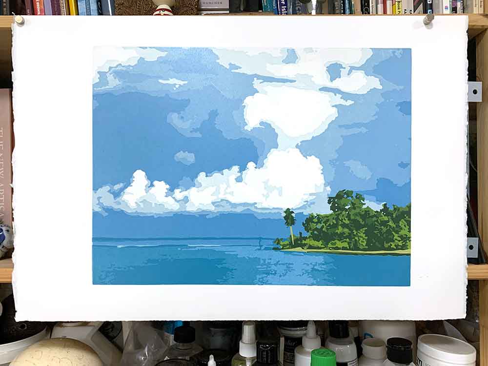
Normally, the final one or two layers will really bring the print together. And it really isn’t until you get to that last layer that you know if the print works.
I think this one does.
The final shadow layer printed felt like it was inviting me into her. I would love to walk along that sandy tropical beach and water into the bushes, forage and explore. I feel so very privileged to have been able to visit such a beautiful place. I wonder if and when travel will return the ease at which we could do it not long ago. But then I also wonder if we’re better for not making it so easy.

‘Kavieng’ reduction linocut print technical Information
Print process – reduction linocut print
Edition Size -a limited edition of 8 prints plus one (1) Artist Proof and one (1) Hors de Commerce
Layers – 16
Inks – Sakura oil based inks
Paper – 300gsm Arches 88
Image size – 40cm x 30cm
Tools – Pfeil carving tools
Printed – I printed this print with in combination with my press and trusty glass Print Frog barren, and new Speedball teflon baren
Are you interested in buying this print?
The print will be for sale framed and unframed at the Montville Art Gallery.
I will also have a few unframed prints available via my website shop – I need to edition them which will be done over the coming week.

