


Gel Plate Monoprinting BtB Resources
STUDENT RESOURCES
This page shares additional Resources relevant to your Gel Plate Monoprinting Beyond the Basics workshop.
I have included some of that information from the Resources pages for Gel plate Monoprinting, including providing a link to that page.
Bookmark this page in your browser so you can refer back to it in the future.
I’ve categorised the information below. Click through any links that interest you. Each link will open in a new window, so you won’t lose this page.
Bookmark this page in your browser so you can keep referring back to it.
And please let me know if you think I’ve left anything out! 🙂
The information below:
GEL PLATE PRINTING – THE BASICS – RESOURCES
This link will take you to the Resources page for the Gel Plate Monoprinting basics workshop 🙂
I have repeated some information from that page here, but visit that page to see more information about the process and what was covered in that workshop.
If you enrolled into the online workshop you may find some of the links and information on that page useful.
Plus, it is where you will find the videos on how to mount your printed paper to boards.
And if you’re not already a member, check out this Facebook group – everything about gel plate monoprinting – facebook.com/groups/gelatinprintingenthusiasts
COMPOSITION TIPS
Below are some links to sites for more composition and design tips. Some articles may resonate more than others, but they all offer several good tips for consideration:
- 9 Composition Tips for Artists
- Top 6 Photography Coposition Rules
- Design Principles: Compositional, Symmetrical And Asymmetrical Balance
- Some Ideas About Composition and Design Elements, Principles, and Visual Effects
- The Secret of Good Composition
- Create powerful artistic compositions: 21 pro tips
- 9 Steps to Creating Better Compositions
- A Comprehensive Guide To Composition For Artists
The Japanese are masters of balance and composition. I did an Ikebana (art of Japanese flower arrangement) workshop earlier this year. The The Art of Ikebana is a lovely resource to start to explore this beautiful art form. Ikebana considers size, shape and negative space to create beautiful balanced floral arrangements. I think it translates beautifully to gel plate monoprinting with botanical materials.
A sense of feeling overwhelmed or frustrated, when printing, can arise from having too many choices, be it colour or botanicals. Self-doubt or simply not knowing where to begin (or where to go next) can add to this. If you experience these feelings – you are not alone! In this lesson, we’ll explore some strategies to overcome these creative roadblocks.
I go through this myself at times, and these strategies are practical approaches I take myself to move through the feelings.
1. Limit Your Palette > Simplify Colour Choices
Begin by selecting a handful of colours:
- Choose up to 3-4 colours that resonate with your mood at that time; or
- Select your top 3-4 favourite colours; or
- Pick your 2 most favourite colours and add two less-used colours.
- Fewer colour choices in front of you removes that layer of decision making while printing.
Print a series of layered images. Change colour with each layer. Don’t overthink which order to layer the colours – just print.
Print again with the same colours, but in a different layering order.
If you are feeling overwhelmed just by colour selection alone, decide on one of the colour harmonies covered in The Colour Workshop and explore that combination of colour in different printed layers.
2. Focus on One Botanical > Embrace Exploration
Concentrate on a single type of botanical or a specific shape that interests you.
Exploring its various possibilities in terms of shape, texture and placement can enhance your understanding of negative space. Consider combining this idea with intentional exploration of the Rule of Thirds.
If you decide to work with two different botanical shapes, intentionally alternate them between layers. The goal here isn’t to create a pretty picture but to focus on alternating colours and botanicals as you build up the layers. After a few layers, pause to review the results – you might discover unique colour combinations and composition ideas.
Again, restricting your choice of botanicals removes that aspect of decision making while printing.
Combine this with colour restriction and you can narrow your focus even further.
3. Embrace the Unexpected > No Mistakes, Only Outcomes
Shift your perspective from fear of making a mistake to embracing the unknown. The nature of this process is such that you won’t know what the print will look like until you lift the paper from the plate. And you won’t know that until you place the paper on the plate. Release your attachment to the outcome and print.
Unplanned outcomes often lead to unique and interesting prints. If you create a print you dislike, try something bold as a final layer to rescue the print, like a colour combination you’ve never used in combination before. You have nothing to lose but a piece of paper, and it might lead to an extraordinary discovery.
4. Time Challenge > Boost Focus
Set time limits for your printing sessions. This exercise encourages you to focus solely on the process. It’s an excellent technique to clear your mind when feeling anxious or busy. The next tip introduces strategies for printing within time constraints, promising a fun experience.
5. Collaborative Printing Sessions > Creative Support
Overcoming creative frustration and overwhelm is often easier with the support of your creative community. Consider organizing collaborative printing sessions with friends to share ideas, techniques and experiences. Discussing challenges and successes with others can provide valuable insights, making the creative process less daunting. You can also turn these sessions into friendly races, seeing who can print the most papers in an allocated timeframe, ultimately adding more joy to your creative journey.
The Time Challenge is an exercise designed to immerse you in the printing process and release the attachment to the outcome.
The Objective
The aim is simple: print as many layered botanical impressions as you can, within an allotted timeframe.
Don’t overthink it and don’t labour over any one printed paper.
If you create a print you like, set it aside, grab a fresh sheet of paper, and keep printing.
Why it Works
Imposing constraints on your creative process can engage you in the present moment. Your goal is to print, not to create perfect prints. The more you get into the challenge, the greater the state of flow and the greater the encouragement for spontaneity.
Let’s get started …
1. Determine Your Time > On Your Marks …
Select the duration for your printing session. It could be 10 minutes, an hour, or even a few hours. Whatever time you have is perfect.
2. Prepare Your Materials > Get Set …
Gather a substantial stack of blank paper, ranging from 20 to 100 sheets, or more, depending on your allotted time. Challenge yourself by adding more paper than you think you can print. This abundance keeps you focused on the act of printing and encourages you into a state of flow.
3. Select Your Palette > Nearly There …
Limit your colour choices and botanical options. Pre-select a few favourite colours or mix favourite shades with some unfamiliar ones. Do the same with botanicals. The key is to keep your selections simple, so you can concentrate on printing during the challenge.
4. Begin Printing > GO!
Start the timer and dive into the Circuit Sequence. Your objective is to print as many sheets as possible within the set timeframe. Avoid lingering on a single print; your task is to work through your stack of blank canvases. When you create a print you like, set it aside, grab a fresh sheet of paper, and keep the creative momentum flowing.
The Time Challenge isn’t just about creating art – it’s about embracing the creative process and letting go of perfection … releasing the attachment to the outcome.
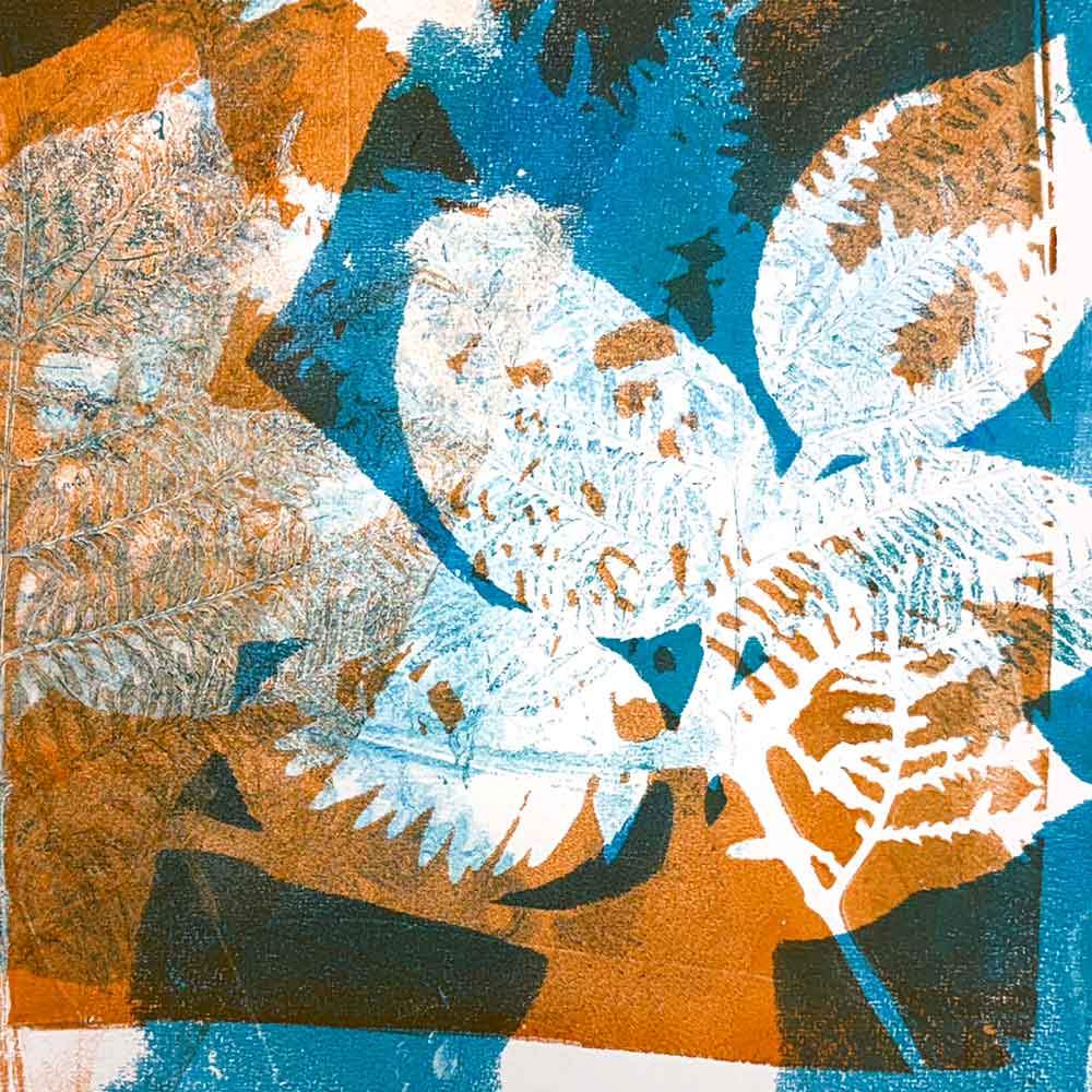
I love observing negative space – the space between and around the objects placed on the plate. Sometimes the shapes made in and around that space can be more interesting than the object itself.
In this lesson, we’ll explore the creative potential hidden in the spaces between. Learn how these empty spaces can define, balance and build depth into your prints, guiding your viewer’s eye with subtlety and storytelling.
1. Embracing Simplicity > Less is Often More
When I started gel plate monoprinting, I found that I was losing the focal point in my prints. They were nice prints, but worked as background images more than resolved artworks in their own right. I realised this was because I was covering my plate with objects for most layers, visually filling my paper and not leaving any space for the eye to rest or define as a focal point.
Keeping each layer simple can take restraint, but it opens your print up to future layered possibilities.
Start with a simple composition:
- Ink up your plate, then place just 1 or 2 botanical elements on the plate. That could be 2 individual leaves or a few leaves attached to a stem. The objective is to not crowd the plate with objects and leave space to consider for future layers.
- Consider using the Rule of Thirds as a guide to determine where you want to place your botanical element.
- Print a series of impressions from the plate.
- Notice the empty space around the botanical element. Does it complement and enhances the subject, or drown it out?
- Repeat the process – placing the leaves in a different position on the plate. Use the same botanical elements, or new ones, but ensure you don’t crowd the plate.
- Notice how the added layer changes the print:
- Notice the colour interaction and how the colour forms around the botanical elements. Does it add depth? Is it a distraction? Does it guide the eye around the printed paper?
- Does the different placement in the second layer add balance, create or change the focal point of the print?
2. Playing with Scale > Explore Size Dynamics
If you feel uncomfortable leaving open spaces on your gel plate, explore some intentional placement of different sized objects, then observe the printed results.
- Ink your plate and place a large object on the left side, leaving empty space on the right side of the plate; then
- Place a small object inside that space on the right side of the plate; then
- Print several impressions from that layer of colour.
- What do you notice about the printed result? Does it feel balanced? Does the size contrast detract the eyes from, or focus the eyes on, the subject of your print? Does it feel more or less balanced between the different printed impressions? How can you print another layer to add interest or create a focal point?
Repeat the steps above, placing the same large object on your plate in the centre of your plate, leaving smaller open spaces. Place a small botanical element in that empty space. What do you notice when it is printed? And how does it differ to what you printed above?
3. Achieving Balance > Establishing Harmony
You can use negative space strategically to balance a composition. If you have already printed one or a couple of layers on paper but feel that the balance is not right, you can intentionally create negative space on the gel plate to complement or block out what is already printed. I use this method when printing to rescue a print.
- Consider placing a botanical element on your gel plate with negative space around it that, in mirror image placement, overprints an area with too much detail already printed. This can also help create a focal point in the artwork and reduce visual distraction; or
- If you feel there is an area on your printed paper that appears uninteresting, position a botanical element to print in that space to add interest.
4. Restraint and Impact > (repeating) Less is Often More
You don’t need to fill every inch of the gel plate, or the printed paper with botanical objects.
Never be afraid of ‘space’.
If you feel that you have a tendency to print too many layers or too much detail on your prints, try these tips:
- If you tend to print 4 or more layers on a print:
- Print with the consideration covered above, then STOP at 3 layers.
- Put the prints out of sight for a few days then come back to them with fresh eyes.
- How do you feel about them? Do you notice if they are any less visually cluttered than you have printed before.
- Using a view finder (or ‘magic window’ as I like to call it) can help resolve questions in your mind as to when to stop layering. Strategically looking at smaller or specific areas within your print can work to focus your view.
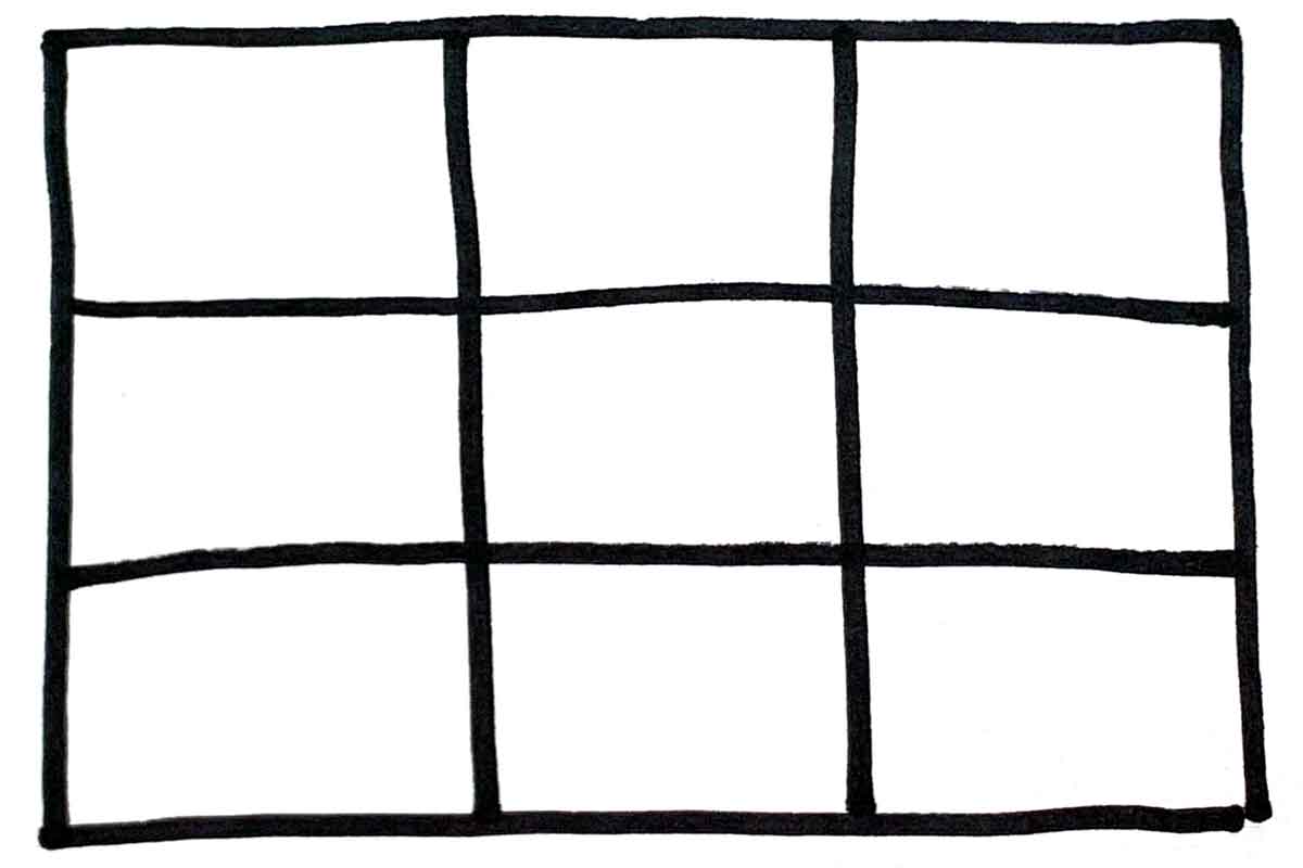
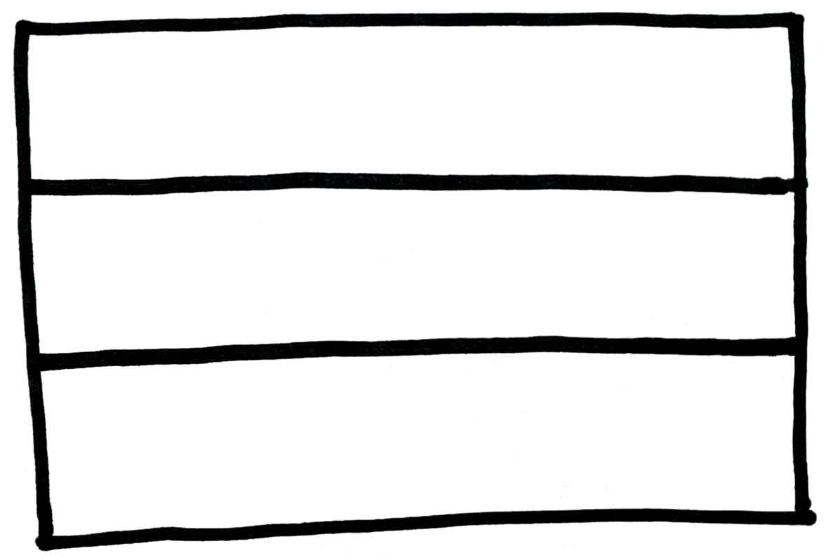
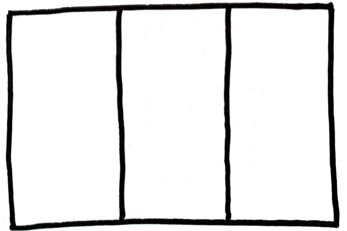
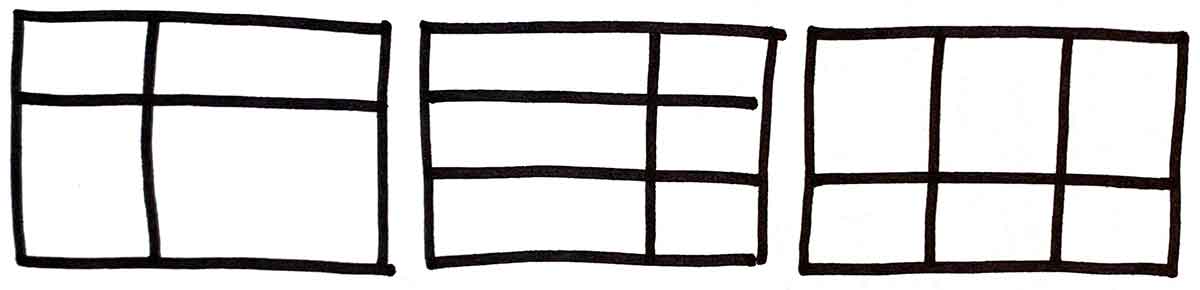
The Rule of Thirds creates balance and guides the viewer’s eye for a dynamic and engaging composition.
When looking at the screen, or through the viewfinder, of most cameras, you will see a grid in the frame view. This is often built into the frame as an aid to composing your photograph.
There are many grid combinations that you can create when intentionally using the Rule of Thirds to assist with your composition considerations. The 3 primary grid formats are shown below, and you can combine the centre and right grid to create different grid options that still comply with the Rule of Thirds.
1. Using the Grid > Understanding the Framework
To start:
- Create one grid with 3 horizontal and 3 vertical lines that is the same size as your gel plate.
- Create a second grid with 3 horizontal and 3 vertical lines that is the same size as your gel plate onto tracing paper or tissue paper. The idea is to make a grid on paper that you can see through, that is translucent.
Using the first grid:
- Place the grid under your gel plate to help guide you with the placement of objects on the plate.
- Systematically alternate the placement of objects as you print each layer:
- Print layer 1 – place an object on the left side of the plate, vertically, then print your impressions;
- Print layer 2 – place the same or a new object on the right vertical side of the plate and overprint onto the previously printed papers.
- What do you notice about the negative space around the objects and the relationship of shapes as the layers build up on the paper?
- Print a 3rd layer with an object placed in the central area of the plate and notice how it changes the print as you overprint onto your papers.
Using the second grid:
- Place the your translucent grid over your printed papers and notice if there is a natural division along the lines of the Rule of Thirds in your image.
- This second grid can be placed over a print in progress to help determine where to place the next object on your plate for the next printed layer. Remember to consider the mirror placement of the object.
2. Strategic Focal Points > Guiding the Viewer’s Eye
The four intersection points in your grid, where the lines cross, are often the key areas of interest in a composition. You can use these intersecting points to intentionally create the focal point of your print.
Use the grid above and experiment with intentionally placing different botanicals on different layers moving around the intersecting points. What do you notice?
Consider the negative space as you do this.
If you have a print with several printed layers, but no focal point, combine the print rescue technique with using the Rule of Thirds grid to intentionally create a focus at one of the intersecting points, or along one of the vertical or horizontal areas of the grid.
3. Creating Movement and Flow > Energise Your Compositions
The Rule of Thirds can guide the viewer’s eye naturally through a composition:
- Place a series of botanical elements along one of the horizontal lines to create a sense of flow; or
- Change the placement of an object with each layer, incrementally moving it along or around the intersecting points.
- Experiment with different positions on different layers over several prints.
- Notice if you have created a sense of movement within your image.
The translucency or opacity of the paint can help to create movement and depth as layers of paint build up on the paper. Experiment with different colours and paint opacities.
4. Breaking the Rule > Spotlight on Emphasis
Rules are made to be broken, even the Rule of Thirds.
Sometimes, placing a focal point slightly off-centre but not on an intersection can create a unique emphasis. As can placing an object in the actual centre of the print area.
A focal point is the centre of attention in your artwork. It’s the most important element that you want the viewer to notice. You can make an aspect stand out by using colour, size or placement. A strong focal point gives your artwork a clear message and helps guide the viewer’s eye.
When gel plate monoprinting, I rarely start a print with an intended focal point. Rather, I work with layering to create one as I print, noticing how the colour, negative space, marks and shapes evolve as I build up the layers.
Also, I rarely print with an intention to use the entire sheet of paper as my finished, resolved print. Rather I use a view finder to find my resolved composition within the whole printed sheet.
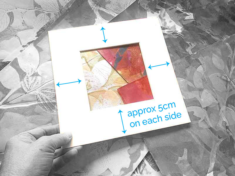
Your viewfinder can be a matt from an old picture frame, or you can make your own:
- Find a large sheet of card stock, or paper, that is larger than the final size you want your print to be.
- Cut a hole in the middle of the card stock that is the size of what you want your final print to be trimmed down to.
- I like to give myself approximately 5cm of ‘framing’ card stock around each edge of the cut hole (refer to the image below). This will keep your eye within the frame, making it easier to find your focal point and balanced composition. However, this framing space can be greater or less than 5cm. Work with what you have on hand.
 .
.
GEL PLATE MONOPRINTING ARTISTS TO DISCOVER
- Tara Axford – www.taraaxford.com
- Sandra Pearce – www.sandrapearce.com.au
- Linda Germain – www.lindagermain.com
- Seth Apter (mixed media artist) – www.sethapter.com
- Birgit Koopsen-Bernstein – www.instagram.com/birgit_koopsen
- Clare Youngs (mixed media artist) – www.clareyoungs.co.uk
- Julie Anderson – www.juliejulie.co
- Hannah Klaus Hunter – www.hannahklaushunterarts.com
- Mark Yeates – www.markyeatesart.com
- Jennifer Douglas – instagram.com/jenniferdouglas.art
If you know of other gel plate monoprinting artists who you think should be added to this list, please share them with me. Email me their names and weblinks (if you know them), and I’ll add them to the list.
BOOK REFERENCE
A great ‘getting started’ book, which we looked at in our first workshop – Gelli Plate Printing by Joan Bess. It is available from many online stores – shop around for the best price.
Another book I have on hand using home made plates was Making Monotypes Using a Gelatin Plate by Nancy Marculewicz.
Gelli Arts® Printing Guide by Suzanne McNeill has some fun tips and projects to work with, and shows my work in the Gallery section of the book 🙂
BUYING GELLI PLATES
The best pricing for gel plates I have found are at:
- Craft Online – www.craftonline.com.au/collections/gel-press-printing-plates
- The Art shop – theartshop.com.au/gel-press-mono-printing-plate
- Officeworks – www.officeworks.com.au
I can’t vouch for any brand other than Gelli Arts and Gel Press for the quality and performance of the paints in the context of how I use them. I have heard mixed reports about Speedball plates. I think they are designed specifically for Speedball inks, but I’m not sure.
If you are interested in buying a large plate but having trouble locating them, I may be able to get it for you from a wholesale supplier.
The largest gel plate – 16″ x 20″ is now available retail in Australia. I can get them for approx $300.
Jackson’s Art supplies (UK based, and deliver to Australia) have them for approx AUD$275
PAINT
I buy from here – https://www.thesydneyartstore.com.au/product-group/580-golden-open-acrylics-59ml/category/103-acrylic-painting
And here – https://theartshop.com.au/golden-open-acrylics-59ml
This is a great starter set – https://www.thesydneyartstore.com.au/product-group/2550-golden-open-acrylic-traditional-set/category/103-acrylic-painting
Oxlades (Brisbane and Noosa) and Alice West in Buderim also sell them.
You can buy Golden paints from (links at the bottom of the page):
- Oxlades – Brisbane and Noosa
- The Art Shed – Brisbane
- Alice West – Buderim
- The Art Shop – online only
The cheap paint I suggested to use with kids is Mont Marte SATIN acrylic. There is also a SILVER, but it is faster drying than the SATIN. Mont Marte also has an extender medium that you can add to their paints to slow down their drying time.
PAPER
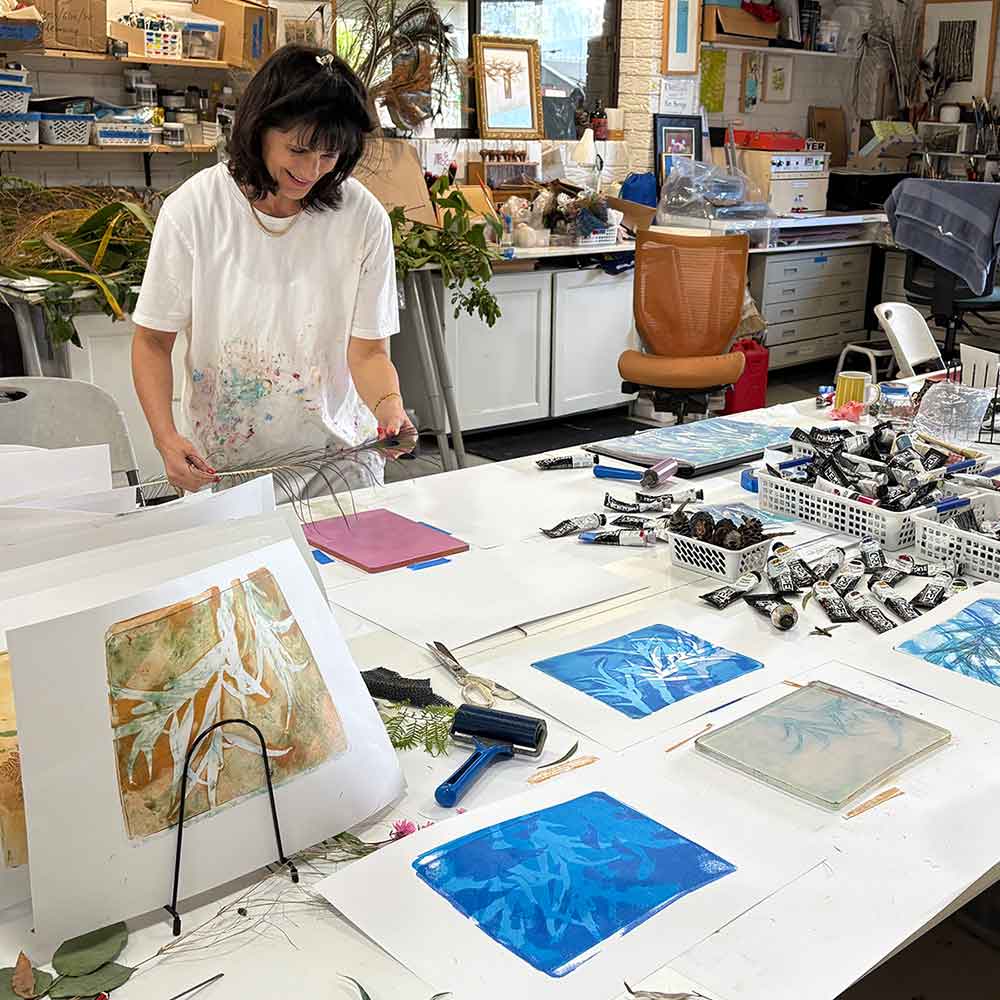
I love paper! The papers we used in our workshop were:
- A4 125 or 135gsm cartridge paper
- A4 140gsm Magnani Map or Hereford printmaking paper
- Hosho paper – the thin Kapanese paper
- Tracing paper
- Tissue paper
Below are links to a series of blog articles I have written all about paper. Beautiful, delicious, multi-purpose paper, with a focus on Printmaking paper:
- Paper Part 1 – What is Printmaking Paper
- Paper Part 2 – My Favourite Printmaking Papers
- Paper Part 3 – Storing Printmaking Papers (and answers to other questions you didn’t know you needed to know)
- Paper Part 4 – All About Paper Sizes
If you are looking for decorative papers to print onto and/or incorporate into artworks, click through to some of these links and fall down the delicious rabbit-hole of everything paper:
RESOURCES IN MY BLOG
Below are links to gel plate printing articles in my blog, referencing back to the first workshop:
IMAGE TRANSFER
You may have seen, or heard about, image transfers from printed material using the gelatin plate. I don’t do much of this in my own practice, but there are A LOT of people who do.
I work this process with some commercially printed material (magazines, brochures) and laserprinted (toner based) photos. I’ve found that Marie Claire fashion magazine photos work well, as do colour laser copies from my local newsagent. I have found that not all laserprints work – it possibly depends on the toner the printer has used. I have read that pages from National Geographic magazines work well for this process.
Below are some links to people who have shared their approach to the process via YouTube, using images they have printed on their own laser or inkjet prints:
- Gelli Arts – Beautiful Image Transfers on Gelli® Printed Backgrounds!
- Nitsa Creative Studio – printing photo layers
- Nitsa Creative Studio – Monoprinting photos with a gel plate
Using inkjet prints for image transfer with the gel plates:
WANT TO DO THIS ALL OVER AGAIN and again and again and … ? 🙂
My Beyond the Basics workshop went online in October 2023. Everything we covered in our in-person workshop is covered in the online workshop, plus a bit more.
Access to the online workshop is normally $137, being granted for the lifetime of the course. For students who have already attended this workshop in-person, access is $97.
If you enrol, you can refer back to the lesson content when you want or need to, in your own space and time. There is over 2.5 hours of video content, made up of 40+ videos.
Click here for full details about the online course or fill in the enrolment form at the bottom of this page and I will email your portal login details.

LETS GO SHOPPING 🙂
Below are links to different online stores where I buy supplies and equipment from:
- Craft Online – instore at Kunda Park, online
- The Art Shed Brisbane – instore West End, online
- Alice West – instore Buderim, online
- James Frames – instore Maleny
- Oxlades – instore Brisbane and Noosa, online
- Eckersley’s – instore Brisbane and Kawana, online
- The Sydney Art Store – Sydney, online
- The Art Shop – online only
- Art Store Online – online only
- Jackson’s Art Supplies – UK with a distribution outlet in Australia, online only
THE COLOUR WORKSHOP
Late 2021 I created an online text-based workshop looking at COLOUR. I offer it to all online students for free, and am now extending that to ALL students who have attended my in-person workshop.
This link will take you to the page going into a little more detail about the course. Something that started as a simple blog post idea morphed into a 5 module reading workshop. In the workshop I talk through colour theory, different types of colour wheels (including making your own), warm vs cool colours, and how to make grey using primary colours.
If you would like access to this workshop, email me and I will create an account for my online learning portal and send your login details.
I have created a private Facebook group ONLY for people who have attended my workshops. The idea is you can ask me questions, we share work, and I’ll share resources and information. Click the button below to join the conversation …
If you haven’t already shared your workshop feedback, click the button below to go back to that page …
