From the Bookshelf – Colour Reference Books
How often do you look through the reference books in your library? Small library, big library, it doesn’t matter … but a library all the same, with books of process, technique, inspiration and reference.
I’ve shared 3 of my favourite linocut reference books, and more recently some of the cyanotype reference books I have in my library.
Here I’m sharing 3 colour reference books that sit on my bookshelves.
Working and feeling comfortable with colour is something that I had to work at. I was scared of it. For a long time, graphite pencil and charcoal were my colours of choice. But after a commercial career in graphic design and marketing and a some self-imposed rules in my arts practice to force an understanding of colour mixing … I have found my own intuitive approach to colour.
With the launch of my new gel plate monoprinting workshop, I have been getting a lot of questions about colours from students. I’ve been looking back into my reference books to find better ways to explain colour and move beyond my ‘intuitive’ understanding.
Below are 3 of the colour reference books on my bookshelf.
*Note: I have provided links bookseller’s and publisher’s websites. They are not affiliate links, and I do not receive a commission for the sale of these books.
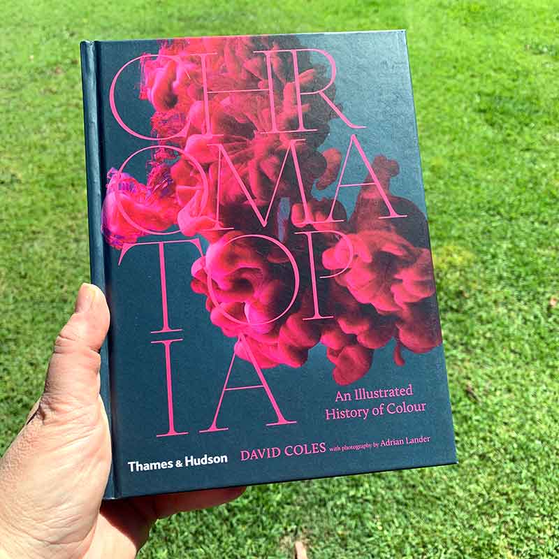
Chromatopia
An Illustrated History of Colour
David Cole, Adrian Lander
David Coles, founder and master paintmaker at Langridge Artist Colours, is one of the world’s most respected makers of artists’ oil paints. He is a Master of pigment, having been involved with colour his whole life. With this book he brings art and science together (I think a perfect match!!)), and shares the rich history and craft of colour throughout the ages.
Langridge Artist Colours is also the primary distributor of Golden products in Australia.
Its a fascinating book – exploring and explaining to origin of pigment. With names and colours I’ve never heard of before, along with others I know but didn’t know their origin.
Did you know that the Egyptians created the first synthetic colour; or that the noblest purple comes from a predatory sea snail? Throughout history, artist pigments have been made from deadly metals, poisonous minerals, urine, cow dung, and even crushed insects. From grinding down beetles and burning animal bones to alchemy and serendipity, Chromatopia reveals the origin stories of over 50 of history’s most extraordinary pigments. Spanning the ancient world to modern leaps in technology, this is a book for the artist, the history buff, the science lover and the design fanatic.
Industry Reviews
“In addition to providing a fascinating lesson in art history, Chromatopia is a superb introduction to the physical properties, cultural meanings, and emotional capacities of colour” Australian Book Review
“This book is as compelling for its strange facts as it is for the storytelling behind the origins of colour pigments. I treasure the depth and detail in David Coles’s concise new book Chromatopia: An Illustrated History of Colour.” The Australian
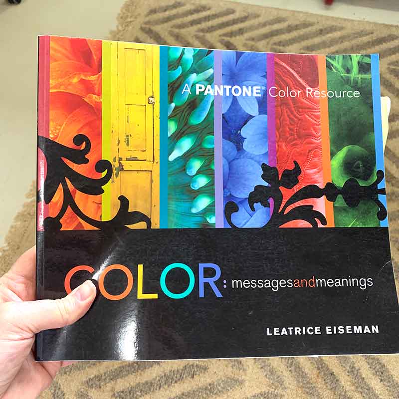
Colour: messages and meanings
Leatrice Eiseman
This book focuses on the Pantone colour range. Anyone with a background in graphic design or printing (pre-digital printing) will know about Pantone colours. That gorgeous array of colours identified by number. For a long time those numbers were how I talked colour; that and working with cyan, magenta, yellow and black percentages.
This book breaks down come colour basics, explaining the colour wheel, then taking it further explaining saturated, monochromatic, triad, and analogous colours.
Then it groups colours into “moods” like mysterious, exotic, assertive, seagrass, rich, eye candy – presenting suggested colour combinations to elicit that mood.
I don’t reference the book much anymore, but when I’m really stuck for some colour inspiration, its not a bad book to flick through.
I will admit that the imagery in the book feels a little dated, but the information still has value.
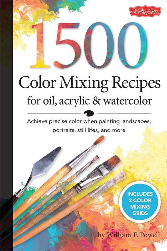
1500 Color Mixing Recipes
for oil, acrylic & watercolor
William F. Powell
I was told years ago that the best colour-mixers tended to be the poorest art students. They were the ones who could only afford to buy the primary colours and mixed all their colours from them.
I’ve never forgotten that.
For my linocut printmaking I use as base set of colours to mix ALL my colours – warm red, warm yellow, cool blue, white and black.
For my gel plate monoprinting I use mixed colours straight from the tube – because I like the spontaneity of working with colour without thinking about mixing. But while I don’t mix my colours for gel plate printing, I have learned that an understanding of how colours will mix really helps.
This book really appealed to me – I wanted to get a better handle on colour mix recipes – what went with that to make this colour.
The book has helped me ‘see’ warm and cool tones in some colours, and get my head around how some colours work together to create a range of tones and values. It has been a handy book to reference on my bookshelf.
We’re surrounded by colour, everywhere. We take it for granted. Light and bright, dark and muted. We all have our own relationship with colour. What’s yours?
I’d love to hear if you know of good colour reference books 🙂


