Onyx has a new home
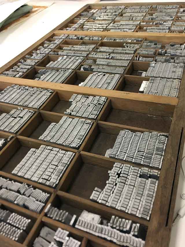
I am now the proud owner of 30pt Onxy. All 16+kg of her! I love explaining to the Australia Post ladies at my local why these little packages from so far away are so heavy! This lovely collection arrived after two separate purchases through eBay, all the way from the USofA.
I’ve unpacked her neatly into a Californian job case draw. I’ve sorted the letters. Followed the system. Lamented over a lack of ligatures. And now I stare at the drawer full of beautifully crafted lead, with a strong desire to print, but a mind-block as to what I want to print!?
So, to procrastinate and distract myself a little longer – lets look up the history of Onxy…
Designed by Gerry Powell, American Type Founders cut the Onyx font in 1937, followed by Monotype in 1955. She is a variant on the nineteenth century fat face theme. Onyx is highly condensed and a highly contrasted design. While the font’s style is stronger than readability*, its feeling of refined and measured elegance still make her a useful font in the right application.
I love slowly-slowly building my type collection. Letters and characters that could tell a thousand tales of the words and stories they have printed. The hands that have touched them to print, then touched the paper to read. I have attached a romance to each font, each individual character in the family.
Something has come to me … I think I shall compose her in a poem and print that. A lovely little poem about elephants written by a friend years ago. Now to print before it gets too late in the day…
*I struggled with ‘readibilty vs legibility’ here, so to distract myself even more … readability is a function of how typefaces are used; while legibility is mostly a function of typeface design. It’s a measure of how easy it is to recognize one letter or word from another and how easy blocks of text are to read.


